In 1966, the advertising industry in Singapore and Malaysia recognized the “Best Asian Designer” for the first time—the prize given by the Creative Circle, an annual award show organized by the advertising agencies in the two neighboring countries. This honor was presented to Miss Eulindra Lim. An art director at S.H. Benson—a British advertising agency that was one of the largest in the two former colonies—Eulindra was recognized to have distinguished herself among the local advertising workforce of primarily Chinese, Malays, and Indians. They worked in agencies traditionally owned and led by white expatriates from Australia and the United Kingdom, a legacy of how the advertising industry in Singapore and Malaysia had developed with colonial industrialization.
However, both colonies had become independent nations by 1966. The Creative Circle was established four years earlier to elevate local creative standards and ultimately nurture “top creative people to originate and lead in this field—in their own country.” While the award initially recognized only the best work in various categories each year, the addition of the “Best Asian Designer” prize from its fourth edition sought to spotlight local talents and attract more of them into the industry.
Mr. Peter Morgan-Harry, the managing director of S.H. Benson, said about Eulindra’s achievement: “As a career, any serious-minded young man or woman joining the business at the moment can look forward to a very bright and successful career. There is every prospect of the expenditure on advertising rising rapidly during the next ten years.”
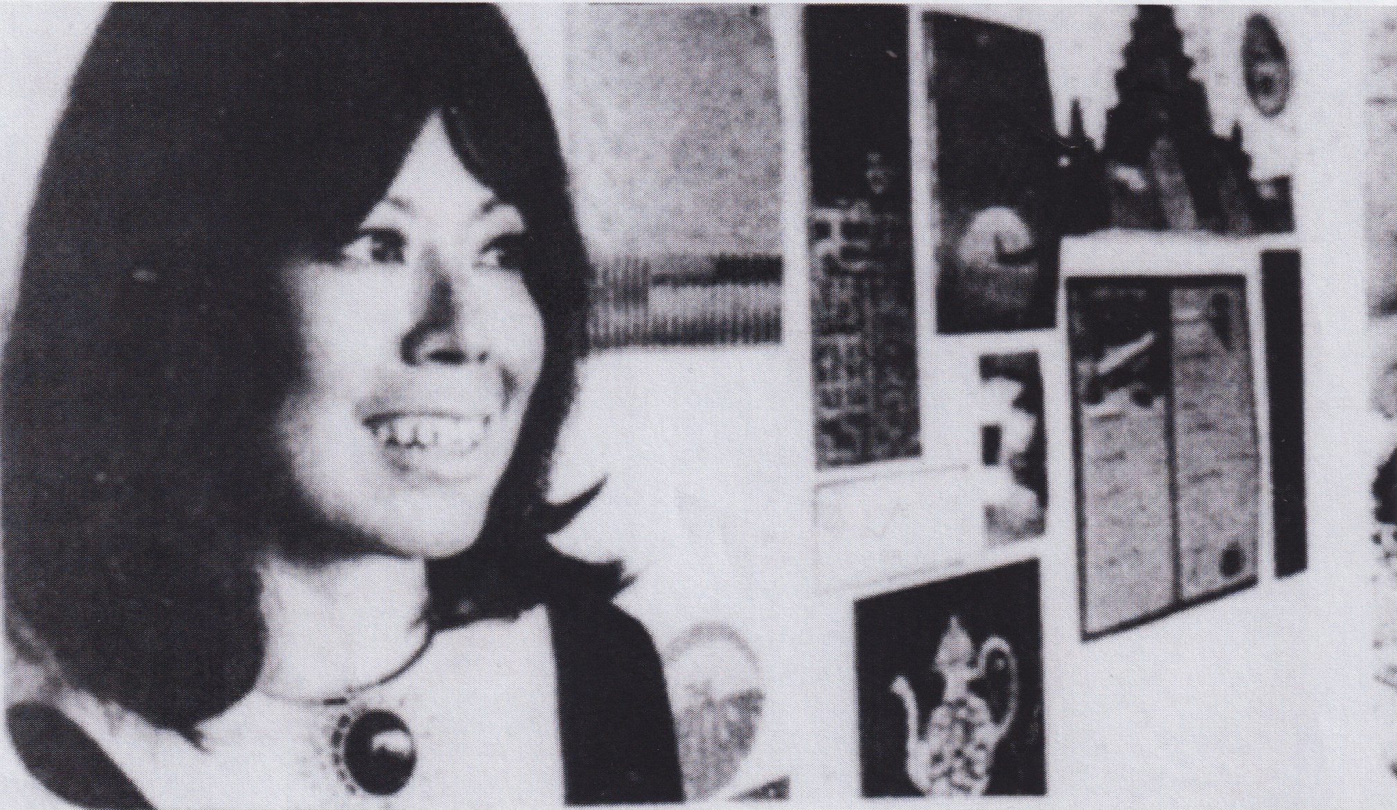
Besides an effort to localize, Eulindra’s win could also be read as the rise of women in Singapore’s advertising industry. In 1966, barely a quarter of the country’s economically active population of over 576,600 was female, and the majority were employed in the community, social and personal services. The advertising industry was no exception, having been long been “exclusively a man’s world” where women were thought to be not as capable as men. This began changing from the 1960s, when an estimated 100 females “held coveted executive positions.” In the 1970s, Eulindra joined their ranks when she started her design studio, Eulindra Designs, which worked on several significant projects that supported Singapore’s modernization into a global city-state. The studio’s success encouraged the rise of other female-led creative agencies that have become a part of Singapore’s creative community today.
➜ Read the full essay in Women Graphic Designers: Rebalancing the Canon