From just bus guides and bus poles with painted service numbers, Singapore’s public transport information has now evolved to a system of maps, guides, information boards and even a website – all designed with a visual language to make public transport a Singapore icon.
Taking a bus in Singapore on April 11, 1971, would have been an unforgettable experience for many. It was day one of the newly reorganised public transport system. All 130 existing bus services had been rerouted, replacing a system plagued for years with overlapping services, long journeys and uncertain fares.
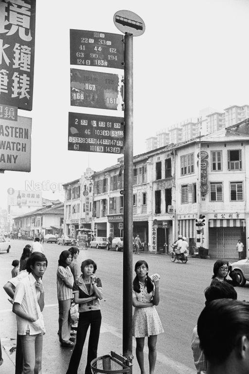
That Sunday, commuters crowded around newly erected poles topped with an oval plate painted with a bus’s side profile – the symbol for a bus stop. Attached to the pole were rectangular plates either in yellow, royal blue, red or green – the colours representing the four new bus companies and their corresponding coloured buses. Resembling flags, these plates were painted with the service numbers of buses that served the stop.
These new and plain bus poles could have symbolised a clean slate for a simplified public transport system. Instead, they became signs of a confusing public transport with little to offer. That morning, commuters were clueless about how to get around just by looking at poles with only service numbers. Although buses also carried plates painted with start and end destinations, people hardly had time to read the small print before the bus sped off. According to plans, commuters should have studied the new bus routes that were published in the newspapers, and in an official bus guide. However, the guides, that were released a week before, were sold out on the first day of sales – all 10,000 copies. Printers were still working overtime to meet a seemingly never-ending demand[1].
As a commuter pointed out to The Straits Times that day, a well-designed information pole would have helped that morning. “In the initial stage, bus plates next to the bus stops should not only show the number of the buses passing through, but also which routes they are taking,” he said. “After all, it is not the starting and ending points or routes that confuse people, but the ‘in-between’ that does!”[2] Indeed, the lack of a well-designed pole led to “confusion, anger, frustration, exasperation”[3], or, as The Straits Times screamed the next day: “Bus Chaos”[4].
IN THE BEGINNING
Ironically, bus chaos was what the 1971 revamp set out to eradicate. Since the Singapore Traction Company (STC) introduced public buses to Singapore in 1925, they had become the mainstay of public transport. Back then, getting around meant taking several different buses just to get from one point to another, as STC and some 10 other private Chinese bus companies carved Singapore into different territories, and they each dictated their own routes, fares and timetables[5].
The government-commissioned 1970 Wilson Report promised to change all that. The bus companies were streamlined into four regional companies and bus routes were redrawn to be efficient. As a reflection of a more organised public transport, the report also recommended “standardized signs be provided at bus stops indicating clearly the service numbers of all services stopping at each stop”[6]. Information about the actual routes, however, would continue to be published in an official Singapore Bus Guide that remained the only touch point for public transport information. This was why after the chaotic first day, the minister in charge of transport called on Singaporeans to “study the bus routes”[7], confident that a well-prepared commuter and regular usage would iron out the kinks.
However, public transport continued to be plagued by problems and complaints. The oldest bus company, STC, collapsed just eight months after the revamp. Then, in 1973, the remaining three companies merged to form the Singapore Bus Services Limited (SBS) in a bid to be more efficient and reduce costs [8]. To make sure things went right this time, a team of government officers were also attached to SBS to address commuter’s complaints. These included infrequent buses, poorly planned bus stops, reckless bus drivers, and “inadequate”[9] signboards on buses and bus stops. In 1975, SBS introduced new information plates on its bus poles[10]. These were the same size as the old ones, but printed next to each service number was also the major destinations of a service’s route.
GOING BEYOND BASICS
By the 1980s, Singapore’s public transport system was in a much better shape. Rickety public buses had been replaced, and there were even double-decker buses running on the roads. To keep SBS on its toes, the government introduced competition by letting Trans-Island Bus Services Ltd (Tibs) become Singapore’s second bus operator in 1983[11].
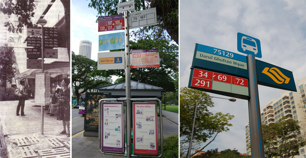
Keen to stay in the driver’s seat, SBS unveiled a new corporate identity that year and its chairman declared, “We are now looking beyond providing just the staples. Today we are striving for excellence, for a quality bus service – higher levels of passenger comfort, an even more courteous and caring crew and staff, a better service reliability and a readily understood bus service information system.”[12] This saw the introduction of a “more sleek and up-class”[13] bus pole in 1985. Like before, these new stainless steel poles retained the system of a bus stop logo with flag-like plates. The plates, red for SBS and yellow for Tibs, returned to only displaying bus service numbers. In addition, the bottom right of each had a fare stage number for calculating bus fares. Besides service number plates, bus stops at popular locations also had a separate plate with the name of a nearby building or road for easy identification.
The major improvement came in new ‘wings’ and boxes installed in the lower third of some of the new bus poles. These contained service information, such as the first and last bus timing, and bus frequencies. As they were updated by SBS alone[14], the board simply listed a service’s route destinations in its corporate colours of red and black on a white background. SBS had considered representing bus routes on a map, but thought it was difficult to read[15]. A map, however, was used to show tourists the bus routes to places of interests.
It was not the first time such information was made available to commuters. SBS had simply taken these out from its bus guides and put them on the bus poles, even its design! However, it marked the expanded role of bus stops as not just shelters, but nodes for transport service information too.
MAKING SPACE FOR THE MRT
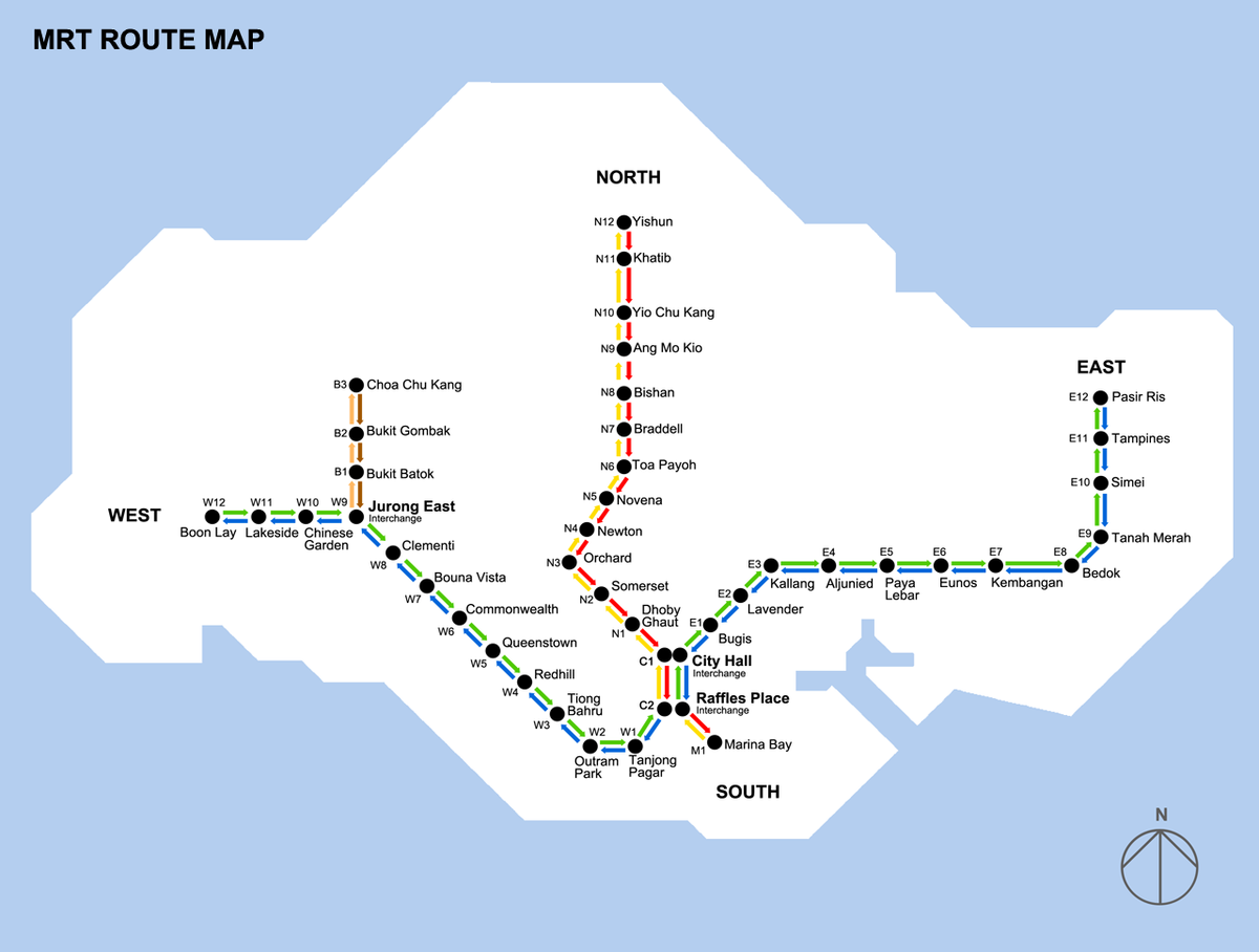
The building of the Mass Rapid Transit (MRT) system in May 1982 confirmed a design rule for public signage in Singapore’s multi-racial society. In 1984, it was announced that the MRT would have English-only signage. This “neutral language” [16] was chosen because, the alternative of having all four languages on signs, was deemed impractical. To help those who didn’t understand English, each station had an alphanumeric code. For instance, the city centre’s stations, City Hall and Raffles Place, were C1 and C2 respectively. Ang Mo Kio was N9 for being the ninth station from the city centre on the North South line. In the signage system designed by the Communication Design Group[17], four different colours were also used to represent the train’s different directions of travel. The yellow line went north towards Yishun, red headed south towards Marina Bay, green went east towards Pasir Ris and blue was westbound towards Boon Lay.
The MRT system map favoured simplicity of use over geographical realism. The coloured lines were placed in a featureless Singapore island that, in contrast, was outlined in detail. The lines traced the actual track, albeit its slack tightened and interchange points smoothed out to 45-degree diagonals. Each station, typeset in Helvetica, was represented with regularly spaced-out dots, ignoring the fact that the city centre was packed with more stations than in the areas outside.
Two years after the MRT was introduced in 1987, it was decided that there would be a common MRT-bus ticketing system and the three transport companies formed Transitlink to oversee its implementation[18]. This also led to several initiatives to integrate the services, such as common bus service number plates[19], a two-in-one Bus and MRT guide[20] and information boards at MRT stations about what buses to take to nearby attractions[21]. From 1994, nearby MRT stations also appeared in bus stop poles when SBS unveiled its new generation of information stands[22].
The new design consolidated the bus pole’s mess of plates into a single rectangular panel. The top was a dark blue strip containing the classic bus stop icon and the shelter’s location name. Next, the bus operator’s separate service numbers plates were integrated in a single grid. Each service number was printed in a background of the operator’s respective corporate colour. Additionally, SBS’s fully air-conditioned services were tagged with a blue bar. The fare stages, which used to be subscripts on each service number, were now in white boxes at the bottom right of each number. The stand’s final third continued to house additional service information. Some detailed improvements in that included different colour bars to indicate bus fares at various stages of the route and italicised names for bus stops near MRT stations in the route details.
The new stands were designed to hold a lot more information than the old bus poles, and were a reflection of how complex our bus system had become. However, the stands were never installed island-wide, but only at bus stops served by many buses, like those in the city centre. It was probably because of how expensive they were – at a cost of $2400 each, they cost some $900 more than the old bus poles[23].
AN EXPANDING PUBLIC TRANSPORT NETWORK
In 1996, the government outlined plans to develop a “world class land transport system” for Singapore in a White Paper drawn up by its newly created Land Transport Authority. A key to this was developing a quality and “seamless” public transport to encourage more to use it. This included expanding the MRT network and improving facilities to create a “complete door-to-door journey”[24]. These new directions led LTA to review the existing public transport information system.
A key point in the review conducted together with British design agency Citigate Llyod Northover, was the sustainability of the 1987 MRT map. In the years to come, the rail network was expected to grow from 85 kilometres to over 400 kilometres beyond 2030[25]. “Had we kept with the same graphic standard of two colours per line, we would have very quickly run out of colours,” says Mr Andrew Mead, a senior design manager at LTA who was involved in the revamp[26].
As a result, a new map was introduced to the public in 2001. It uses single-colour track lines like those in London, Paris and Hong Kong – three cities LTA studied for comparison. The North South line was now in red and the East West line in green. New colours, purple and grey, were used to represent the upcoming North East Line (NEL) and the Light Rail Transit (LRT) respectively. For commuters who used to depend on the multi-coloured lines for direction of travel, there were now End Destination Numbers instead. To head east towards Pasir Ris, a commuter looked for the line that was going to ‘1’ instead of the green line. Each station’s alphanumeric code was also renamed for the line it sits on rather than its direction. For instance, Tanjong Pagar is now ‘EW15’ instead of ‘W1’.
Another major issue was how to visually communicate a public transport of “integrated multi-modal services”[27] that would later see bus operator SBS run the NEL and rail operator Singapore Mass Rapid Transit (SMRT) take over Tibs. Moreover, the MRT logo, symbolic of Singapore’s rail system for over a decade, was now owned by a corporatised SMRT. Designed by an architectural draughtsman in the Public Utilities Board, the logo had a circle that symbolised the rail’s coverage of the whole island. It was cut in the middle by two bands to represent the North South and East West lines, and they were bent for the three ways the trains ran – on the ground, aboveground and underground.[28]“This logo that was the logo for the MRT generically suddenly became a company-specific logo,” says Mr Mead. “We couldn’t use this for the North-East Line as it was to be run by a different operator, yet everyone in the public when they saw that sign would think ‘Oh, it’s the MRT’, so we had a real big problem.”
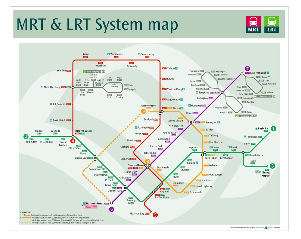
The solution was to design an entire visual system beginning with a symbol for the vision of an integrated public transport. Shaped like the island of Singapore, this yellow symbol on a green background had three wavy components that flowed into one another, conveying a sense of movement and seamlessness in travel[29]. This logo is Singapore’s public transport symbol. Each of the different modes of public transport is then represented with a pictogram and colour – red for the MRT, blue for buses, orange for taxis and lime green for the LRT.
To create a coherent voice, all signage were typeset in Hubert Jocham’s “LTA Identity Typeface” as the header typeface, and accompanied by “Ocean Sans” as a secondary font. After deciding on reverse coloured signage, as it is most easily seen, the team had to decide on a colour palette. “We wanted a sign system that is unique for us. Some places use black, Toronto, for instance,” explains Mr Mead. “We’re a tropical island, a garden city, so we used the dark greens. ‘Rainforest Green’ as we labelled it.”
In 2003, the NEL began operations with its stations using this 2001 signage system. However, as all its stations were underground, many of the older generation had trouble getting around with English-only signage, as they did not know how to read it. It led many to request for multilingual signage in the stations instead.
At first, this was shot down because it was “inconvenient and unwieldy”[30] and then Deputy Prime Minister Lee Hsien Loong suggested using more pictograms instead. However, a year later, when DPM Lee became prime minister, he announced that multilingual signs would be put up to help older Singaporeans feel more at home[31]. The 2001 signage system was tweaked to allow Chinese and Tamil station names to be placed alongside the English ones. Malay was regarded as similar to English as both used the Roman alphabet so it was left out. No mention was made of the effectiveness of alphanumeric station codes that were designed specifically to tackle this issue, and LTA continues to state that they work.
BRANDING THE PUBLIC TRANSPORT
The 2001 revamp created for the first time a system-wide visual toolkit for public transport. As LTA’s then deputy chief executive said, “I foresee that these guidelines play a key role in building a strong visual image for Singapore’s public transport system, in symbolising a tangible improvement in the average daily journey, thus contributing to Singapore’s progress as a world-class city.”[32] But, LTA’s implementation on the ground has been piecemeal. In LTA’s updated 2008 masterplan, it pointed out that Singapore’s public transport lacked an integrated service information, and a system-wide branding too[33].
It was only this year that all 4500 bus stops were given new bus stop poles that speak a common visual language with the MRT and LRT stations and taxi stands. The poles join similarly designed service information boards installed in every bus stop a few years ago. Together, they are the final pieces to help complete the grey bus shelters designed by architect Richard Meier, Ong & Ong Architects and RSP Architects[34] that were installed island-wide in 2001.
There are three different bus pole designs based on location. Those in the city centre resembled the 1994 bus stands. Same for the town centres, albeit smaller ones. The rest had poles structured like before, retaining the system of plates but updated with the 2001 look. The pole’s top is the bus mode pictogram and the public transport symbol. Then, comes a 5-digit bus stop code that can be used to check bus arrival timings via mobile phone. Next, is the description of the bus stop’s location, and information on any MRT or LRT station nearby. The clutter of service numbers plates is now consolidated in a single panel akin to the 1994 stand. The different bus operators are represented by the background colour that the service numbers are printed on. This reduced the mess of plates in the old design, and pointed to a single public transport system rather than one divided by bus operators. For clarity sake, the numbers are also larger in size, and no longer cluttered with tiny fare stages on its bottom right. The final third of the pole now displays announcements that used to be hung haphazardly around the poles. Details of the bus routes and other service information have been moved onto boards inside the bus stops. A most recent addition to some bus stops is the “Key Bus Services Map”, a redesign of the earlier tourist map that now resembles the Transport for London’s bus spider maps.
In the last two years, LTA has also moved public transport information online, in the form of PublicTransport@SG. While this website allows commuters to plan journeys, check out bus routes and download maps, it fails to provide a visual link with the current public transport infrastructure to communicate that it is part of a common system. For one, nowhere on the site can you find the public transport symbol!
Mr Mead admits that this was an “oversight” but LTA is working hard to ensure the graphic standards are used and properly implemented throughout the public transport network. “People need to be familiar that we present the same information to them no matter which information channel they go to,” says Mr Mead. However, it has been an uphill task convincing others of the importance of design. For instance, it took months of negotiation to ensure the public transport symbol would be placed on the new EZ-link cards to show that it is part of the public transport. “It takes time… (but) we won’t hold it back because the branding is not on it. The important thing is to get the information out to the public.”
Indeed, Singapore’s public transport today functions well, but the implementation of its graphic design pales in comparison to systems like that in London. The Transport for London uses a common visual language across a wider range of transport modes – bus, trains, rail, trams, bicycles, and boats – but has even extended it to its website, corporate materials and service announcements. This is one reason why whether Londoners love or hate public transport, they see it as a system that is part of London life. The public transport visual language has even become so iconic that it has can be found on t-shirts, games and even kitchenware!
In contrast, Singapore’s public transport continues to be seen as a collection of companies doing their own thing. This used to be the case, but with the government’s increasing involvement and push for an integrated public transport system, the heartware has to reflect the changing hardware. Like how it successfully entered the market to clear the bus chaos four decades ago, the government can do so again, this time to clear another chaos: a visual one.
———————————
Originally published in The Design Society Journal No. 01 (2010)
———————————
References
- [1] “Rush for Bus Guide: 30,000 Copies Sold Out,” The Straits Times, 3 April 1971.
- [2] “Bus Chaos,” The Straits Times, 12 April 1971.
- [3] Ibid.
- [4] Ibid.
- [5] Ilsa Sharp, The Journey: Singapore’s Land Transport Story (Singapore: Land Transport Authority, 2005).
- [6] R.P. Wilson, A Study of the Public Bus Transport System of Singapore (1970).
- [7] “‘Study the Bus Routes’ Call,” The Straits Times, 12 April 1971.
- [8] P.M. Raman, “So Slow Buses Merger Gets Nov. 1 Deadline,” The Straits Times, 26 October 1973.
- [9] “Govt Action on Bus Grouses,” The Straits Times, 14 August 1974.
- [10] S.M. Muthu, “Trial Run for Bus Service Number Plates,” The Straits Times, April 19 1975.
- [11] Bee Hwa Hsung, “Second Scheduled Bus Service by April Next Year,” The Straits Times, 13 March 1982.
- [12] “Forging Ahead with a New Logo,” Busway 9 no. 5 (1983).
- [13] “New Bus Stop Signage,” Busway, June 1985.
- [14] Ibid.
- [15] Ibid.
- [16] Gillian Pow Chong, “MRT Signs in English Only,” The Straits Times, 19 October 1984.
- [17] The Singapore Mass Rapid Transit, (Mass Rapid Transit Corporation
- Singapore Trade Development Board, 1990).
- [18] “More Bus Routes to Be Changed,” The Straits Times, 5 April 1992.
- [19] “Latest Bus-MRT Guide a Bestseller,” The Straits Times, 26 March 1992.
- [20] Ibid.
- [21] “Bus Information Panels Being Put up to Help MRT Passengers,” The Straits Times, 29 December 1992.
- [22] “A New Look for Our Service Information Board,” Busway, July 1994.
- [23] “Bus-Stop of the Future May Show Electronic Commuter Time,” The Straits Times, 30 June 1994.
- [24] “White Paper: A World Class Transport System,” ed. Land Transport Authority (1996), 6.
- [25] “The Signage System Receives a Makeover,” JOURNEYS, Sept/Oct 2001.
- [26] Interview on 7 May 2010.
- [27] “Oral Answers to Questions,” in Parliamentary Debates Singapore Official Report (Government of Singapore, 1999).
- [28] “What the Logo Means,” The Straits Times, 29 October 1983.
- [29] “Singapore Land Transport Authority Launches New Identity and Signage Designed by Citigate Lloyd Northover for Public Transport Network,” British Design Innovation, http://www.britishdesigninnovation.org/index.php?page=newsservice/view&news_id=3172.
- [30] “Pictures a Feasible Option for MRT Signs,” The Straits Times, November 10 2003.
- [31] Theresa Tan, “MRT Signs Going Multilingual,” The Straits Times, February 7 2005.
- [32] “Singapore Land Transport Authority Launches New Identity and Signage Designed by Citigate Lloyd Northover for Public Transport Network.”
- [33] “Annex B: Key Findings of the Singapore Public Transport Industry Structure Review,” in LTMasterplan (Land Transport Authority).
- [34] Hong Ling Lim, “New MRT Signage,” The Straits Times, July 10 2001.
The lead photo for “Where to?” is 1974. I was thinking of STC bus stop sign in 1950s. I remember there were two types of bus stop: Request Stop and Compulsory Stop.
Do you have a photo of these bus stop signs?
Thank you.