Category: Media

At home with the community

Singapore editor Andrew Loh is building spaces for all online, first with socio-political news website The Online Citizen and now publichouse.sg

At the age of 45, he has finally found his calling.

For some two decades, Mr Andrew Loh didn’t know what to do in life. He sold insurance, served as a waiter, opened a restaurant, taught yoga and even tried out as a rag-and-bone man, but he never stayed long in any of these jobs.

That is until he started blogging. What started as a means to voice his opinions and ideas has become his career. For the last four and a half years, Loh has worked full-time on The Online Citizen (TOC), an independent alternative media outlet in Singapore.

It all started in December 2006. Frustrated with what he thought was unfair coverage of the General Elections by the country’s mainstream media, he got together with fellow bloggers Choo Zheng Xi, Gerald Giam and Benjamin Cheah to start TOC as a platform to express their views on Singapore society. They had no “big plan” nor knew anything about publishing, but they have created what is regarded today as one of the leading alternative media for socio-political news in Singapore. Last year, the site received an average of  20,000 to 30,000 views a day, and currently, TOC’s Facebook page has received over 45,000 ‘Likes’.

Despite its politically charged beginnings and reputation, TOC did not set out to be so, says Loh who was its co-editor before taking over as Chief Editor in 2009. Pointing to TOC’s tagline which he came up with, “A community of Singaporeans”, he says: “Like what the tagline says, it was supposed to be a hothouse for different interests and people to come on the same platform. It wasn’t just for a community of politicised Singaporeans.”

A huge reason for its current popularity is its anti-government editorial stance and willingness to champion causes in a tightly-controlled city-state, including fighting for the homeless and abolishing the state’s death penalty. But Loh also points out that its following is nothing compared to what the mainstream media commands, and its controversial reputation is also limiting its inclusiveness. “When you’re perceived as political, people steer away from you,” he explains.

It was this desire to create an inclusive space online that drove Loh to set up publichouse.sg in August this year. He embarked on it after resigning from TOC in June after disagreements with the team. Loh declined to say more, only that both parties have since moved on. Instead, he is eager to introduce publichouse.sg, a website that features inspiring stories of people and communities in Singapore. Comparing it against TOC, he said: “Publichouse.sg is not a political website, it’s a people’s website. I wanted to move away from being always negative and finding fault. This is something that not just I think, but others have told me about TOC,” he says. “It was very tiring inside to be honest.”

What kept Loh working on TOC all these years — surviving financially only on his savings and what little the website got through advertising and donations — was not the site’s fiery opinions against the state, but the stories it published of ordinary people struggling in society. One of his most memorable TOC story was the series they did last year on “beach communities” in Singapore. A tip-off led Loh and his team to discover a community of homeless people living in Singapore’s public parks and beaches. TOC doggedly pursued the story for months, exposing how these people had fallen through the state’s public housing policies. The issue quickly caught the attention of the mainstream media and the authorities.

“A lot of people do charity work to help others, but maybe my contribution is being able to tell their stories through writing. I can’t take care of the elderly in a nursing home, I’m not programmed that way, but I can tell stories,” he says.

BUILDING A HOUSE FOR THE PUBLIC

Five years ago, Loh never thought he would be running his own website. He was running a restaurant with his brother when he started TOC, but unlike his previous jobs, Loh enjoyed this one so much that he left the business to work on the website full-time.

Looking back, he says that this passion for publishing probably comes from his love for current affairs that began when in his 20s. He only studied until his O-Levels, but grew up reading magazines like Time and Newsweek and listened dutifully to his small radio with a long antennae as the BBC brought him breaking news of a changing world in the late ‘80s, from the unfolding conflict in the Middle East, the Tiananmen Square protests, to the fall of the Berlin Wall.

Never being able to settle in a job has also turned out to be a blessing in disguise, he says. By trying anything that came along the way, Loh met people from all walks of life. “When I look back now, all this adds up to what I am doing, I can empathise with the people at the lower end of society when I do stories about them,” he says.

While he was passionate about TOC, running it wasn’t easy. The biggest challenge was not pressure from the government because of its critical stance,  as many would think, he says. In fact, Loh says they never heard from the government until this year when they were gazetted as a political association. This meant that the website had to register names of people who would bear responsibility for it, and TOC was also barred from receiving funds from foreign donors or letting foreigners take part in its events.

Rather, Loh says it was tough running a small-time newspaper with little experience and expertise. Early in the site’s history, the team ran into sagas including accusations of being a media vehicle for an opposition political party. This arose because Loh was TOC’s co-editor and also a member of The Workers’ Party. In 2008, Loh resigned from the party to put the matter to rest, although he adds that he was unhappy too.

TOC trudged on and grew in readership because of the help and support of volunteers, says Loh. “In my years there, we had some 400 plus volunteers writing pieces and supporting us. This is something I am proud of, that Singaporeans are not afraid to help us.”

But relying on volunteers is also one reason why websites like TOC have been looked upon suspiciously as part of a “cowboy town” in the online space, where only those in society’s fringes lurk. Loh disagrees, instead, he thinks Singaporeans are just not used to hearing from a diverse community. But he does agree that the online space is young and still lacks a certain level of maturity. “If you read online, it’s as if the government is wrong about everything,” he says.

With a younger generation that is more expressive and less fearful, Loh thinks Singapore will have to learn how to deal with the mess of opinions. He also feels strongly that Singapore needs a professionally-run alternative media site such as Malaysiakini, The Malaysian Insider and The Nut Graph in Malaysia. Neither TOC nor publichouse.sg qualify because both do not have the necessary resources and expertise. Sounding exasperated, he says: “We have a lot of ex-journalists and very smart people in the media industry, but why are they not starting something like that? Maybe they find it financially unsustainable or they are fearful, but I really hope there will be such a site.”

After five years of learning how to publish online, Loh is realistic about what his websites can achieve. While he believes that alternative online outlets are important because the mainstream media is controlled by the government, he admits that most Singaporeans still trust less what they read online. He also cites a recent report by The Institute of Policy Studies, a think-tank in Singapore, which concluded that despite the flurry of activities online, the Internet had little impact on the results of the state’s recent elections too.

But for Loh, creating and running online spaces like TOC and publichouse.sg have certainly changed his life and views about the community around him. “Having worked with people in the lower strata of society, you realise that no matter how hard their lives are, they carry on. You ask yourself: ‘If his life is ten times harder than yours, what gives you the right to sit on your butt and complain?’”

“If you really care about these people, the issues, and the policies that affect them, then do something. That’s where I am coming from,” he says.

———————————
A feature written for FIVEFOOTWAY magazine’s issue on EVERYONE.
Lookback: Singapore Design Magazines

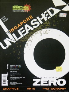
The media is often regarded as the first scribes of history, and is a resource in understanding what things looked like at a certain period of time. A friend recently shared Singapore Unleashed, a 2008 publication that prided itself as the “The first magazine featuring only local designers<artists<photographers”. In it, founders Remie Ng and Eric Wan lamented on the fact that there are “so many wonderful designers, artists and photographers in Singapore”, but most people could not name any. Its magazine would be “a platform for our creative people to showcase their works” and it was a firm believer in the ability of print to show graphics and photographs even though it recognised the power of the Internet. In its inaugural issue, the magazine conducted interviews with artists who were part of the Singapore Biennale 2008 that year,  design agency 19Blossom and also then a newly-opened 2902 Gallery.

This publication stands in contrast to another Singapore-based magazine, SPUNK UNITED, which showcases art and culture around the world. This annual online-only publication run by editor Max Hancock seems to have started around 2005, and featured interviews with local creatives such as fFurious, Daniel Koh, and Eeshaun, providing a fascinating insight to their beginnings.

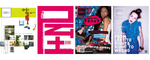
Sadly, neither of these two magazines are still around today — it seems Singapore Unleashed never went on to its second issue, while SPUNK‘s last update was in 2009. There were perhaps two other Singapore-based design magazines that made a deeper impression and impact. iSh magazine was a forerunner when it first came out in 1999, featuring “fragments from an urbanscape” including architecture, interiors, design and art all in one publication, a rare view of design as multi-disciplinary and surrounding our everyday lives then. Kelley Cheng started this bi-monthly on her own and continued to run it for a decade, even after she joined the Page One Group, a Singapore publishing house, in 2001.

Covers of issues 1.1, 2.6, 6.6 and 9.1. Check out all the covers here.


Kelley was also involved in the founding of designer, which she co-published with the Designers Association Singapore (DAS) in 2001.

This non-profit quarterly publication aimed to be “a forum for discussion and the exploration of new ideas in design from Asia and further afield”. (Read DAS president Nigel Smith’s first editorial message here). Later on, local design pioneer Allein Moore tried to run designer as a commercial title, but it closed in 2008.

While it seems Singapore design magazines have struggled in the past to survive, more publications that focus on design in Asia and Singapore have emerged in recent years. This genre includes magazines that document and, to a certain extent, analyse the creative scene, rather than ‘sell design’ such as in consumer-oriented publications including Home and Decor (since 1987!), Lookbox Living, and more recently Dwell Asia. Instead, think of the Asian edition of Surface magazine (by New Media Investments (Asia) Pte Ltd, same company that brings in Dwell Asia), Cubes, (started by Concepts Asia Publishing Pte Ltd in 2001 and recently bought over by Australian-based Indesign Media. Also sister publication of Lookbox), Culturepush (since 2007), and Thailand-based magazine art4d’s latest regional offering online, art4d.asia.

What’s driving the emergence of these new titles? The expansion of design in this part of the world is possibly making it a very lucrative market financially. Whether these titles will still be around in the years to come and they kind of impact they will make in Asia’s design scene and designers — besides selling design — remains to be seen.

TODAY redesigns for the information age

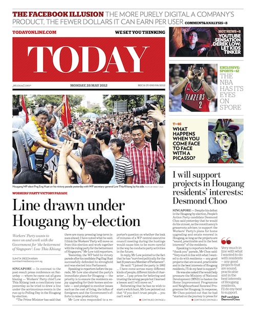
Cover of the first redesigned issue on 28 May.

Just 10 days after The Straits Times unveiled their redesign at the end of May, TODAY announced they had spent the last nine months undergoing a redesign led by internationally-acclaimed newspaper designers DaniloBlack. I recently caught up with TODAY’s night editor Razali Abdullah to find out what went on behind-the-scenes.

What prompted this redesign?
It’s been three years since the last redesign, and it seems like a long time. In the last three years, a lot of things have happened. The way people consume news has changed, more people now are reading news from their smartphones and mobile devices than three years ago. And three years ago, the iPad wasn’t born! For us, it wasn’t just about changing the look and feel, but also the content. We wanted to re-engage our readers and attract new ones. The redesign is more than just an overhaul of the look, we wanted to relook the way we produce content. We needed new tools to showcase new content.

What are some of the main changes in this redesign?
First we have the floating column — the white space between stories that also serves as a place where we can put value adds to stories. This design element is a tool for us to include nuggets of information. This device forces our sub-editors to think of what to fill it with.

We also have new sections such as “Youth”, “Education”, “Silver” and even “China & India”. Having these sections ensure that we constantly have content dedicated to these segments.

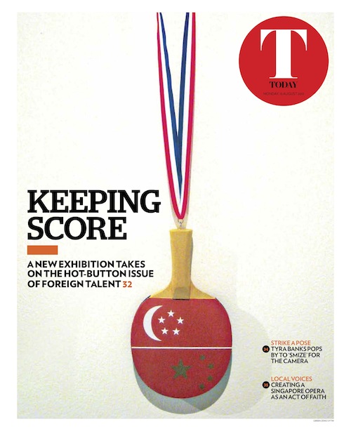
Cover of “T”, the culture and lifestyle section of TODAY.

We have different colour schemes for different sections. And the new suite of colours that the designers have come up with is very refreshing.

A lot of readers also said they couldn’t find our sports pages, so we added a green background to differentiate the section. Plus headlines in sports are now in uppercase, which adds to the drama and the emotion that sports stories bring.

The body text has also been increased by a point because we have received feedback that it was too small in the old design.

Of course, the biggest change is in the masthead, for both the main paper as well as the “T” section.

We used to divide the paper into eight columns, it is now nine to give us the floating column. As our ad sizes have stayed the same, this means there is also more white space between ads and editorials, which reduces clutter and helps readers navigate through the paper better.

Does this mean TODAY will no longer do innovative ads that intrude into editorial?
We will still do creative advertising, where advertisers who want association with certain types of content can buy into the environment.

What were some issues with the previous design?
We wanted the new design to take the paper forward. We wanted devices that can serve as a window to cyberspace, so we now have boxed elements about what’s trending and what’s hot in cyberspace. Knowing that space for stories will be less, we needed new tools to flesh out various points in the story. So the reader has various entry points, as not every information is contained in the story. The old design didn’t have such tools.

One thing about the floating column is it gives readers a lot of breathing room, something the old design didn’t have. In the past, we tried to cramp too much into the space we had, often at the expense of pictures and infographics. There was a reluctance to cut text and you could see it in the old paper. Design wasn’t really a key thing then.

A photo essay in the Sports section of TODAY about Singapore Olympic weighlifter Helena Wong.

With the addition of the floating column and more white space, did you have to sacrifice the number of stories as well as their length?

Yes, the stories have become shorter but readers get more bite-sized information in the sidebars and info boxes. We have fewer stories but the trade-off is the quality of the stories has gone up as only the best ones will make it. The story selection is tighter now.Also, there is more real estate for photos. A common gripe from our photographers in the past was they would shoot an event, but we’ll crop their picture into a face cut. That doesn’t happen anymore.

Did you consider becoming a bigger paper to fit the design and the content?
I think the advertisement ratio is very important because it keeps us profitable. It’s what has kept us afloat. We broke even in four years, which is very rare if you look at newspapers around the world. If we open up more pages or become bigger, it means the paper’s ad ratio will drop.

What were some of the main guiding principles in this redesign?
We wanted it to be more reader-friendly. It’s got to be easy on the eyes. I wasn’t involved in the initial discussions. My involvement began when DaniloBlack came back to us with two sets of designs. That was when the editors picked the elements they liked from each design and we reached some sort of compromise. One of the designs was more contemporary, while the other was more cutting edge. The final design is a nice blend between the two.

Why work with DaniloBlack? How was the experience?
We wanted to freshen the paper up, we needed a design that will tie all our products together — newspaper, mobile app and website — and DaniloBlack is perfect for this. They don’t just do print design. They design apps for tablets and all kinds of digital applications for some of the world’s biggest papers.

It was overall a great experience. They were very accommodating and understood our needs and were able to come up with solutions to our problems. We worked via Basecamp, they would send us PDFs of what they had done and we would revert with our comments every week or so. The final month before the launch, it became more intensive because we started to test the designs with real content, and real ads. It took about nine months in total.

Besides design, what else has changed about the paper?
The approach for the stories has changed. Because of how fresh the paper looks now, we can’t rely on the old way of doing things. A big challenge for us is competition from online sources, people are now getting their stories from everywhere. What are we doing so different that readers will come back to us? It’s the thinking behind the news selection, and how to take stories forward.

Was your redesign also reacting against your competitor, The Straits Times?
It’s not just about The Straits Times, but also about how news consumption has changed. You can get news from anywhere, what we try to do is to find our unique selling point. The old thinking was that we could not miss any stories that were published elsewhere. Now it’s not so much about missing stories, but do we have a better story?

In the last redesign, the masthead/nameplate set in Times New Roman was one element that could not be changed. Why the change of heart?
We wanted a total overhaul, so we basically told them there were no sacred cows. We wanted something fresh that could tie the whole paper together. So you see the stripes in the background of the masthead, those appear in our “Business” pages too.

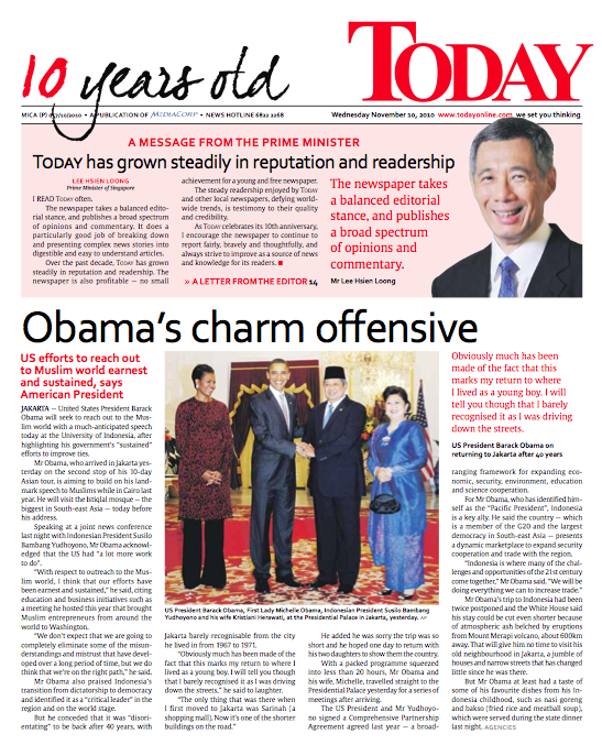
TODAY’s previous logo since its establishment in 2000 (left) and its new logo (right).

Do you think the new sections are unnecessary? Some of them are just one- or two-pages.
We feel that some segments deserve a section of their own. The youth, for example, many of them are doing good things, coming up with good initiatives, that don’t get highlighted enough because they’re competing with hard news stories. The “China & India” section is also crucial because people are looking at these two emerging economies very closely — whatever happens there tend to have an impact on the rest of the world. In terms of advertising, it is crucial for us. Some advertisers want to be associated with certain sections, so we try to give advertisers a wide spread.

What is one element about the redesign you like to highlight?
For me, it’s the way information is being presented now. You don’t have to read the entire story to be able to pick out the key facts and figures: Those you would find in the sidebars, or presented as bullet points, or in the info boxes in the floating columns. We are doing a lot more value adds: Adding video links, web links to stories, providing background information to stories. It’s a refreshing change from the past where we tried to cramp everything into the main copy. For someone who comes from a design background, these are exciting times. I hope the readers like it.