When Microsoft stopped support for its Windows XP operating system in 2014, the corporation made an unusual tribute: to its desktop image.
For 13 years, the sight of green rolling hills and blue skies greeted new Windows XP users when they turned on their computers for the very first time. This default desktop image of Microsoft’s 2001 operating system was seen by so many millions of users that the corporation claimed it was the “one thing everybody will always remember of Windows XP.”
Regardless if it is a single color, an abstract pattern, or an actual photograph, all screen-based devices from computers to cell phones come pre-loaded with a default desktop image. Omnipresent, yet never the main presentation, these images in the background have gone beyond mere surfaces and become stages for technology companies to brand their devices instead.
Early desktop images were limited by display technology, and the first versions of Microsoft Windows and Apple’s Macintosh operating system in the 1980s featured solid colored backgrounds that were more functional than fun. Such unobtrusive imagery helped users fully immerse in the new worlds of graphic user interfaces by supporting what happened on them — just like desktops in real life.
The shift towards desktops as displays for branding arrived with Apple’s Mac OS 8 in 1997. The operating system’s default desktop image was a tiled pattern of a smiling Macintosh face — then the new icon of Apple’s software. This began the company’s tradition of branding every new version of its operating system with a unique desktop image.
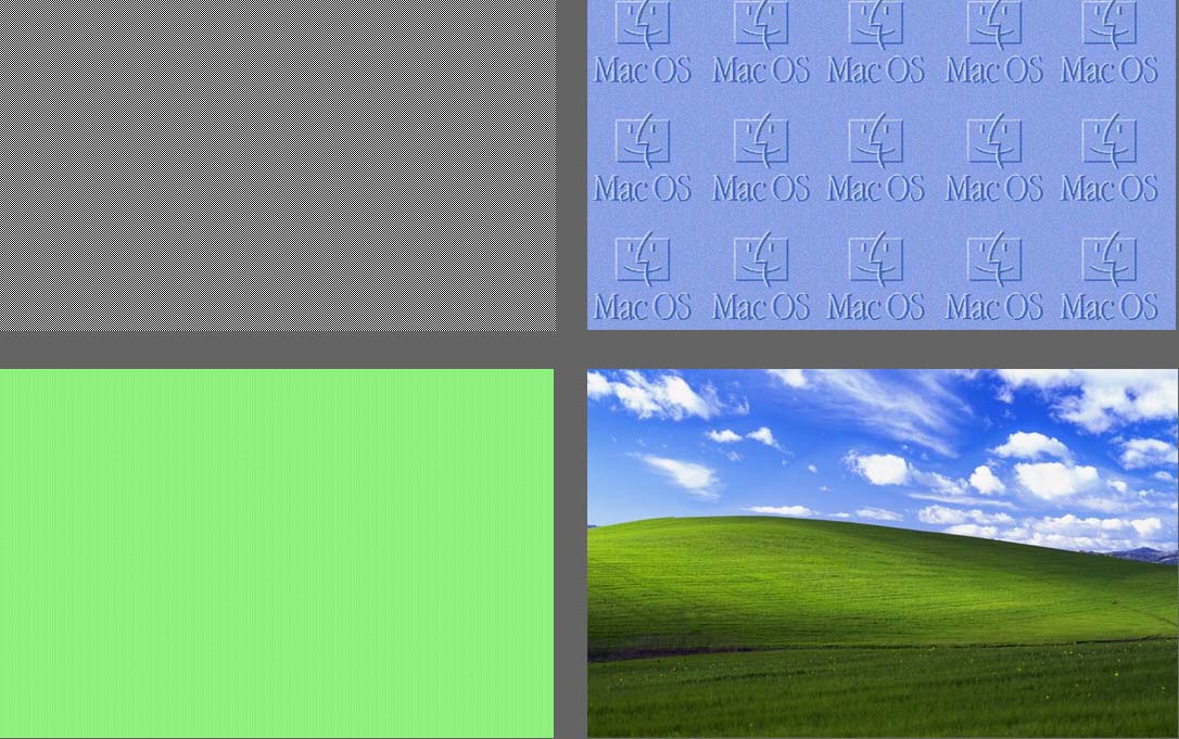
In contrast, Windows users continued to be greeted by solid backgrounds throughout the 1990s, first in teal (Windows 95 and Windows 98) and then blue (Windows Millennium Edition). It was only in 2001 that Windows XP came bundled with photographer Charles O’Rear’s now iconic scenery shot in southern Sonoma County, north of San Francisco.
Yes, Microsoft’s desktop image is actually a real photo known as “Bliss” that the company paid O’Rear to bring it over himself because no courier service was willing to take liability of transporting such a highly valued package.
Calling such desktop images “default” belies the careful selection process undertaken. There seems to be a trend towards picking imagery of nature that will give a piece of technology a benign face. Apple went from blatant logotype patterns to abstract high-tech graphics, and more recently, photos of galaxies and stars. The default desktop picture for the newest Mac OS 10.9 is the photo of a wave, a homage to the software named after the Californian surf break “Mavericks.”
With the rise of a digital wave, our experience of technology is increasingly mediated through the virtual rather than the material world. When Apple and Samsung’s mobile devices look so similar to one another — essentially flat rectangular screens — it is what appears on them that matters. Default desktop pictures and lock screens become vital in setting the context for experiencing each brand’s device. While Apple favors documentary-style photos of nature that convey some kind of “authentic” truth, Samsung devices typically carry vibrant, colorful background patterns that hold the promise of endless creative possibilities.

Our devices may come preloaded with desktop images, but we have the option to change them too. This simple act of personalization brings forth the background, reminding us that technology is full of “default designs” that guide users in how they experience the increasingly digital world we live in.
View a collection of Default Desktops on my Pinterest board.


