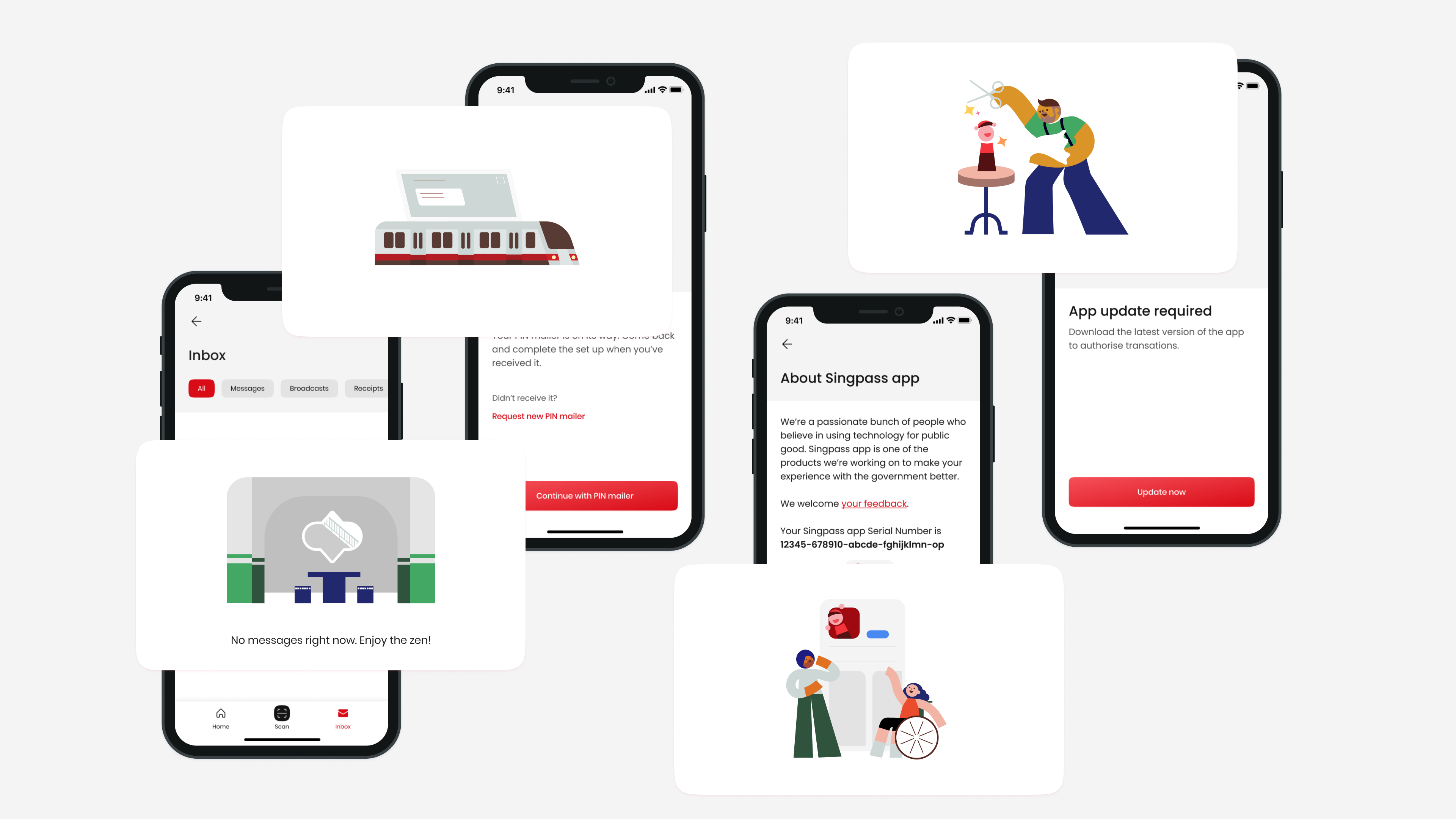
From a public housing block to an otter, familiar sights and scenes of Singapore help create a delightful user experience in the redesigned Singpass app.
Void decks are a common sight at public housing estates of Singapore where most Singaporeans live in. These ground-level spaces are typically open and empty, except for a few sets of public furniture, to allow for various activities like weddings, funerals or simple hangouts with fellow residents. Now, void decks can also be found in the Singpass app!
The new Singpass reframes the app’s role as Singapore’s trusted digital identity platform while allowing space for its future expansion.
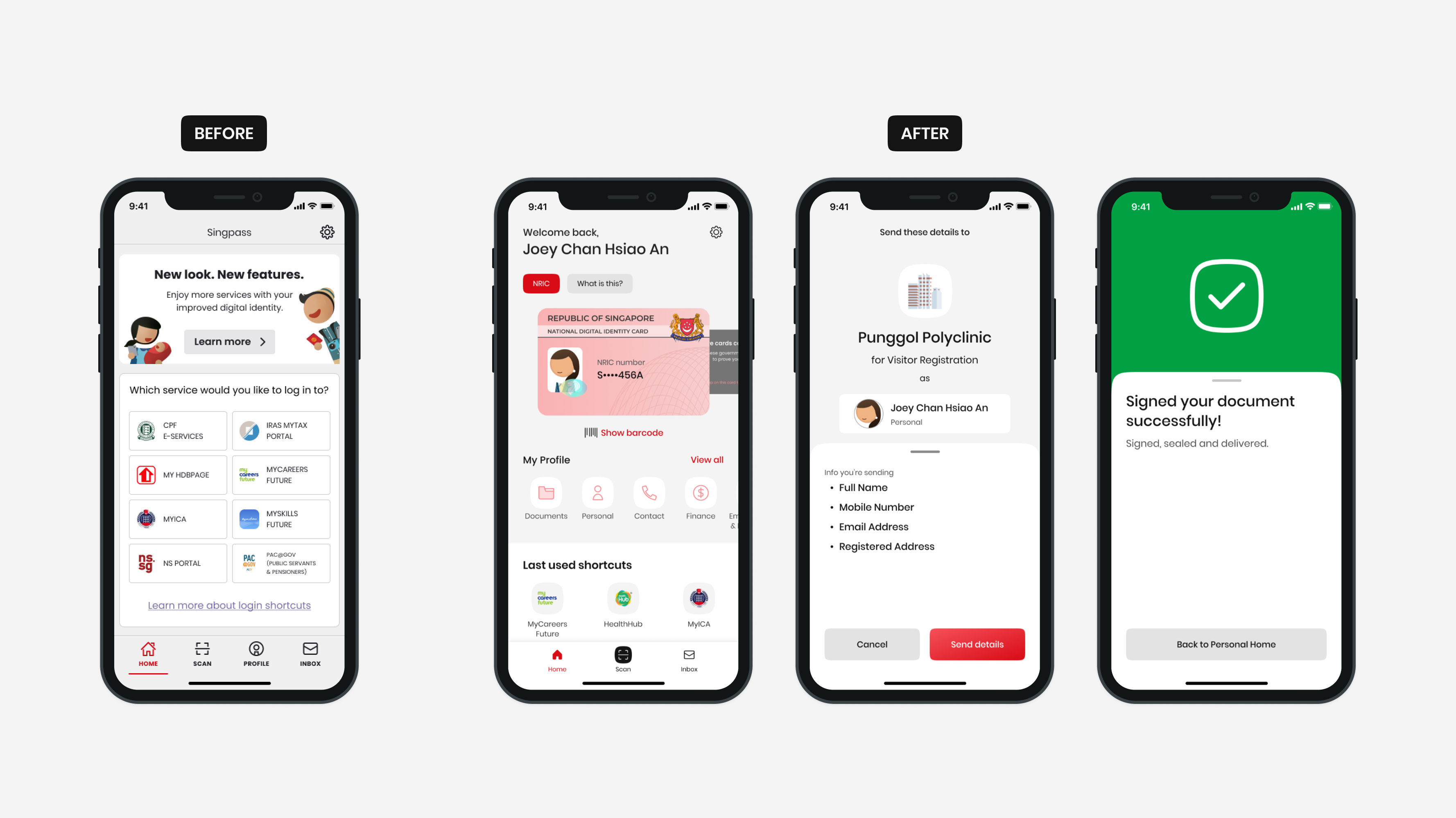
Every Singaporean and resident holds an identity card as proof of one’s citizenship and identity. Now, they can also have a digital version on their smartphones by downloading the Singpass app.
While this Digital Identity Card (IC) was introduced in Singapore’s national digital identity app in May 2020, few of its then over 2.5 million users knew of its existence then. Singpass had also been associated with simply authenticating and logging into government services online. However, the service set up by the Singapore government in 2003 had always been conceived as a national digital identity platform.
With the rebranding of Singpass in early 2021 to mark its evolution of becoming Singapore’s trusted national digital identity, the designers at Government Technology Agency (GovTech) decided it was timely to redesign the app.
A speech bubble with the theme “We Are Singapore” is an “enduring” logo that is “the voice of Singaporeans proudly proclaiming who we are as a people, as a country and that this is our home,” said chairman of the organising committee, Brigadier-General Alfred Fox.
The National Day Parade is announced with much fanfare every year. Along with the line-up of performances to celebrate Singapore’s birthday, the organising committee also unveils the theme for the year. This is typically accompanied by a theme song and logo — the latter which typically disappoints most graphic designers.
This year’s logo was no different: A cartoonish speech bubble with the theme “We Are Singapore” mashed up with five stars and a theme. But instead of complaining, a group of designers decided enough was enough. Days after the unveiling of the logo, they launched The REAL GeBIZ to “repair” logos of government agencies, including that of the NDP eventually.
The project’s name is a satirical take on the name of the electronic portal used by the government to procure goods and services. But rather than a critique of this process, the anonymous design group simply seeks “to demonstrate to non-designers how these (familiar) logos can be like when cleaned-up or ‘repaired'”. This is showcased via its Instagram page in a after-and-before format.
Unlike previous tongue-in-cheek efforts to make the government look hipster and the public meme outpouring over the National Gallery logo that some deemed to be childish, The REAL GeBIZ has thus far showcased 10 cosmetic fixes that could be immediately adopted. Curious about their intentions and approach, I reached out to them recently to conduct this e-mail interview:
How did this project come about?
We were quite upset when we saw this year’s NDP logo. Someone actually told me that “we have hit rock bottom” in terms of design sense. It was out of that frustration this project was born, and we felt it could be a good design exercise for us.
What’s wrong with existing government logos? Why do they need to be repaired?
Most of what we identify as ‘bad’ or ‘wrong’ are mostly on the side of practicality.
The logos have varying degrees of being illegible, lacking in contrast, looking bad in small sizes, awkward curves and so on. These factors affect how the logo is being applied and seen.
Others seem to lack in character by looking too generic in their symbol (or the lack thereof), choice of typeface, or both.
That said, our ‘redesigned’ logos are all based on our collective opinions on the parts that can be better. It was not our intention to come across as an absolute authority to dictate what is good or bad.
You write that you are repairing “procured” logos. What’s wrong with the existing process? Why target the output but not the process?
We were very intentional when we use the word “repairing” — we weren’t trying to redesign the logos from scratch.
Why name yourself the “REAL” GeBiz? What’s unreal about the existing platform?
We were going between “The FAKE GeBIZ” and “The REAL GeBIZ”, and decided on the latter for its slight satire feel. It is more of a tongue-in-cheek thing than us wanting to imply that GeBIZ is “unreal”.
GeBIZ is a platform designed to be efficient, fair and transparent — which is good, and there is nothing wrong with that. Unfortunately, it tends to encourage an unhealthy obsession with lowest quotes, speculative work in the form of pitches, and over-zealous officials who assume the role of art directors during the design process.
While there were many great designs that were done through the GeBIZ platform, the bad ones (in our opinion) grossly outnumber the good.
How do you go about repairing each logo? Many are quite subtle but some like MinLaw and GeBiz are rather extensive. Can you walk us through your process/thinking behind one of the works?
When setting parameters around the projects, we want to keep the essence (concept, representations, general form and colours) of the logo as much as possible, instead of doing an overhaul (unless there is absolutely nothing to be inspired from the existing logo).
Sometimes a small tweak is all it needs to go from okay to great — like how we added a small gap in LTA’s loop mark to make one band appear to float above the other (like a flyover).
Most logo rationales aren’t well documented (especially the older ones). The ones we found are riddled with abstract associations peppered by bureaucratic-speak. So we had to improvise and make a good guess on what the elements on the logo could mean.
For example, MinLaw’s logo at first glance looks seemingly corporate and plain. But upon further scrutiny, we suspect that the box with a line cutting across appears to be an abstraction of a balance scale, commonly associated with justice and law. So we made that into a symbol.
The Elections Department was particularly a fun one because the existing logo was so bad — so so bad. We saw the opportunity to form “E D” out of the existing shape, killed the awful ballot box, and made the middle stroke of the letter “E” look like a poll ticket — not a bad upgrade I’d say! Side note: we still couldn’t figure out why “Singapore Elections 21” is on the existing logo.
Why do you try to retain the original concept? Aren’t there logos that require an overhaul?
That’s the challenge! It is always easier to start from scratch — come up with a good, sound idea and execute it with trendy, clean graphics. But we don’t live in a perfect world.
But the reality of working with the Government or big corporations is that we have to be receptive to their ideas or organisational agendas and sometimes, ‘bad’ ideas.
As such, the project seeks to be a demonstration that a concept (whether good or mediocre) can be dressed up and cleaned up to look at least decent by general ‘rules’ of what is beautiful and effective.
On that note, it is true that design and aesthetics are highly subjective, but I believe that the rules and requirements that govern what is a good, effective logo are pretty straightforward — one that communicates a simple idea about the function or values in a clean, legible form.
Are there any logos that do not need to be repaired?
This logo by design David Ng Soon Thong was the winner of a 1993 public competition organised by the National Arts Council.
National Arts Council (NAC) [right], National Environmental Agency (NEA), Ministry of Communications and Information (MCI), Lion head symbol, SG50, to name a few.
What is the ultimate goal of this project?
To demonstrate to non-designers how these (familiar) logos can be like when cleaned-up or “repaired” as a show-and-tell.
What if an agency adopts your logo without paying?
Anything lah! We’ll feel flattered and treat that as our National Service.
Finally, why remain anonymous? Don’t you want to get hired?
It’s more fun. More importantly, the real us won’t be subjected to everyone’s judgement and scrutiny as a group. It frees us up that way. Who knows, we may even take in submissions eventually!
PS: Keep a lookout in the month of July for a series on our NDP logos repairs — We predict it is going to be a real challenge for us.
 E
E