Category: Media

A Design of Its Time — 1970s

Keeping up with the times – the changing look of Singapore’s longest surviving English newspaper The Straits Times.

— — — — — — — — — — — — — — — — — — — — — — — —
Introduction } 1960s } 1970s } 1980s } 1989 } 1998 } 2000s
— — — — — — — — — — — — — — — — — — — — — — — —

ST1972cover

The Herald of a new face

The arrival of the Singapore Herald into the local newspaper market in July 1970 introduced competition to ST for the first time since its last competitor, The Tiger Standard, closed in 1959.

To take on the Herald, Khoo was sent back to Singapore from its Malaysian office to “brighten up” ST.[i] But the competition never quite materialised as the Singapore Herald was closed down amidst much controversy a year later.

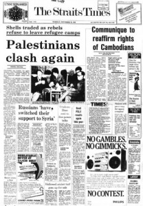
As if assured of its monopoly, the paper stayed largely the same. In September 1972, ST became a Singapore-based paper when it parted company with its Malaysian assets, which became the New Straits Times.

ST’s design was changed to reflect this new status. To distinguish itself as a Singaporean paper, news from Malaysia was grouped into a section, Across the Causeway. In September 1973, the paper unveiled a new nameplate typeset in the modern-looking Bodoni and dropped its tagline altogether.

But the new nameplate was overshadowed by the paper changing to a ten-column grid from its previous eight because of a world-shortage of newsprint[ii]. An earlier switch to nine-columns was deemed insufficient with worsening strikes in the paper mills. With narrower columns and no luxury of white space, the paper became harder to read. Moreover, it was still using a mixture of typefaces to express variety and dramatisation of news, creating a cacophony of headlines for the reader.

By the second half of the 1970s, the paper had grown to over 30 pages from a 20-page read in 1959. It now had a regular Forum section to house readers’ letters. To aid the reader’s navigation of the thicker paper, an index, INSIDE, was introduced on the cover in March 1972.[iii] As and when it was necessary, the paper would also come in two parts.

One year after ST adopted its first formal editorial policy in 1977, it began carrying out its new stated mission “to inform, to educate, to activate and to entertain.”[iv]

The second part of ST was officially designated its leisure and educational supplement known as Section Two[v]. Inside, were the Leisure Page, Woman Plus, and the Bilingual page where readers could learn Chinese. However, the bulk of this new four to twenty-page section were actually just pages chock-full of advertisements.

To succeed in the Singapore market, ST wanted to provide content with mass appeal and quality to garner a maximum readership to attract advertisers, but its design, which was largely unchanged since 1959, was not keeping up with this new vision.

— — — —

  • [i] Turnbull, 287.
  • [ii] “From Today a Tenth Column,” The Straits Times, September 3 1978.
  • [iii] First observed in The Straits Times, March 14 1972.
  • [iv] Turnbull, 318.
  • [v] “Change with the Times for Easier Reading,” The Straits Times, September 25 1978.

— — — —
A Design of Its Time — 1980s

Keeping up with the times – the changing look of Singapore’s longest surviving English newspaper The Straits Times.

— — — — — — — — — — — — — — — — — — — — — — — —
Introduction } 1960s } 1970s } 1980s } 1989 } 1998 } 2000s
— — — — — — — — — — — — — — — — — — — — — — — —


ST1983coverModernising the newspaper

The spur to modernise ST’s design came when a competing newspaper, the Singapore Monitor, entered the market in 1982. By then, Khoo had already retired from ST a year earlier and the paper was now helmed by Peter Lim as group editor[i] and Cheong Yip Seng as editor.

The new team increased the size of the paper[ii] and adopted a “new and more flexible”[iii] editorial voice. Instead of two separate editorials in an issue, it reduced it to just one with the title “The Straits Times says…”.

Lim’s direction for ST was “to design the front page for mass-appeal with in-depth reports on the inside pages, and to make one section popular, while concentrating serious quality material in the other.”[iv]

Such a view was steeped in scientific management, a call for order and efficiency that was also guiding Singapore’s developmental aspirations then.

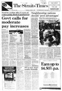
Prior to this, the paper had developed a page flow over the years: top news, foreign news, local news, sports and entertainment. It was only from December 1983 that these sections were made prominent. Each page was headed with a livery containing its section name typeset in Helvetica and accompanied by an icon.

News snippets, which used to clutter spaces leftover from the main stories, were all housed in mini sections such as World Briefs. Similarly, small advertisements came under a Classifieds section that eventually moved out of the main paper and stood as the third part of ST. These changes gave each page a more regular look – usually one or two big advertisements accompanied by three to four news stories.

To create a more efficient read, the assortment of headline typefaces was replaced with just one in several weights. The index was fully expanded to a full-page In Summary and moved to page two of the now forty-page production.

Forced out of its complacency by the Singapore Monitor, ST became a livelier-looking paper. But this competition came to a close in 1984 when the English, Chinese and Malay newspapers in Singapore came together to form the Singapore Press Holdings (SPH) to avoid battling for scarce resources. A year later, as Singapore entered its first recession since independence, the money-losing Singapore Monitor was closed.

— — — —

  • [i] Turnbull, 326.
  • [ii] Ibid., 331.
  • [iii] Inside the Editorial,” The Straits Times, October 28 1981.
  • [iv] Turnbull, 332.

— — — —

A Design of Its Time — 1989

Keeping up with the times – the changing look of Singapore’s longest surviving English newspaper The Straits Times.

— — — — — — — — — — — — — — — — — — — — — — — —
Introduction } 1960s } 1970s } 1980s } 1989 } 1998 } 2000s
— — — — — — — — — — — — — — — — — — — — — — — —


ST1990cover

Designing a commercial paper

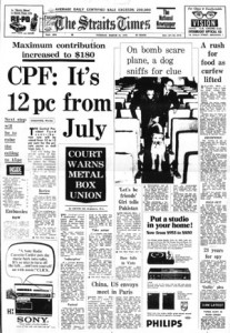
It was only in June 1989, that the paper introduced a “new format.”[i] The first three pages of ST now housed a selection of the day’s top stories and a scaled down summary index in a section called News Focus.

As a sign of how important business interests had become in Singapore, ST’s financial section, Timesdollar, now fronted the back page usually reserved for news. “If you want to get to business and economic news first, you might want to read the paper from back to front – which is the way the business and stock market news has been arranged,” the paper wrote.[ii]

In March 1990, the paper updated itself again and it declared ST to be more “reader-friendly.”[iii] A more consistent look was implemented with standardised logos, writer bylines and tags. In addition, perhaps to differentiate itself from the local financial publication, Business Times, it renamed its economic news section Money, and the paper, which once referred to itself as Times, now called itself ‘ST’.

These changes also reflected a strengthening of its business and brand. ST was now part of SPH that was led by chairman Lim Kim San. The former civil servant introduced a business-like attitude to the newspapers, and to him, a “commercial success was not only respectable but essential for a newspaper.”[iv]

A 1990 design change registering this new direction saw a reduction by one-inch of its width to fifteen-inches. The smaller paper size, it explained, saved newsprint and was in line with newspaper sizes worldwide.

And it also meant advertising sizes that were friendlier to the growing number of multi-national companies in Singapore. The size change also coincided with SPH’s adoption of a multi-million dollar computerised advertising network system that connected it to regional advertising agencies.

The paper also returned to an eight-column grid. While, this made it more readable with wider columns and fewer stories cramped into a page, editorial space was reduced as well, especially with the smaller newspaper size. To make up for this, liveries were simplified. However, this was not too much of a constraint, as compared to twenty years ago, ST now had two times more pages and was regularly running over eighty pages per issue.

Finally, Section Two was renamed Life and the paper pledged to feature a “stronger commentary on the arts.”[v] This was in line with the government’s recognition of the importance of arts and culture in Singapore society after the 1989 Ong Teng Cheong report.[vi]

— — — —

  • [i] “New Format Today,” The Straits Times, June 1 1989.
  • [ii] Ibid.
  • [iii] “ST Is Now More Reader-Friendly,” The Straits Times, March 1 1990.
  • [iv] Turnbull, 369.
  • [v] “ST Is Now More Reader-Friendly.”
  • [vi] Teng Cheong Ong, Robert Iau, Kheng Soon Tay, Edwin Thumboo, Seng Teck Yeo, Arun Mahizhnan, Kee Koon Chia, Hawazi Bin Daipi, Kwong Wah Er, Leslie Fong, Kwong Ping Ho, Haji Suhaimi Jais, Cher Siang Koh, Teck Juan Loy, Siok Tin Wong-Lee and Vincent Yip., “Report of the Advisory Council on Culture and the Arts,” Singapore: 1989, 3.

— — — —