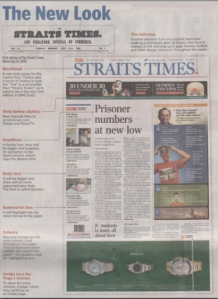
One point, or approximately 0.04 cm, was all it took for readers to find the recently redesigned Sunday Times a comfortable read again. After its redesign in April 2008,several readers complained that it was hard to read the paper’s body copy so designer Peter Thomas Williams increased its leading (amount of space between lines of text) from 11 point to 12 point and to his delight, the week after, a reader sent in an e-mail saying it was much easier to read it.
This is why Peter, who has redesigned ST (twice), The Sunday Times and designed tabla! and my paper, starts every project by working on the typography of its body copy. My Paper proved a challenge for the Irish because he had to design a newspaper that incorporated both the English and Chinese language. He did this by using similar colours and grid system, and picking matching typefaces that unified the disparate languages on to one paper.
 While he says that “proper” redesigns usually take up to a year, the recent ST redesign was done in six months, partly to coincide with the launch of ST’s new video news platform Razor TV. A redesign should not be rushed because it is not just a matter of deciding on a new look but it takes time to introduce it to the sub-editors and into the computer systems, “You can’t just redesign a newspaper and walk away, the hard part is implementing it down the line.” he said.
But didn’t ST redesign in 2004? Peter said that newspapers today redesign every 2 to 3 years in an effort to stay relevant to its readers. In fact, in the most recent redesign, they considered reducing the nameplate to just “ST” because it was known to most of its readers as that.
On a daily basis, one of the biggest challenge in designing a page is working around advertisements says Peter, “The less ads the more beautiful your pages are going to be… SPH (papers) are full of ads.”. He pointed out that the winning designs awarded annually by the Society of News Design rarely have any advertisements on them, but the design editor of my paper is realistic, “That’s where we get our bonuses and your paycheck, so we can’t really complain that much.”
—
In the previous part of this interview, The Paginator asks Peter the importance of typography in news design and how the papers of Singapore Press Holdings chooses its typefaces
One comment