Keeping up with the times – the changing look of Singapore’s longest surviving English newspaper The Straits Times.
— — — — — — — — — — — — — — — — — — — — — — — —
Introduction } 1960s } 1970s } 1980s } 1989 } 1998 } 2000s
— — — — — — — — — — — — — — — — — — — — — — — —

Designing a commercial paper
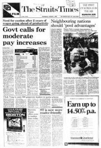
It was only in June 1989, that the paper introduced a “new format.”[i] The first three pages of ST now housed a selection of the day’s top stories and a scaled down summary index in a section called News Focus.
As a sign of how important business interests had become in Singapore, ST’s financial section, Timesdollar, now fronted the back page usually reserved for news. “If you want to get to business and economic news first, you might want to read the paper from back to front – which is the way the business and stock market news has been arranged,” the paper wrote.[ii]
In March 1990, the paper updated itself again and it declared ST to be more “reader-friendly.”[iii] A more consistent look was implemented with standardised logos, writer bylines and tags. In addition, perhaps to differentiate itself from the local financial publication, Business Times, it renamed its economic news section Money, and the paper, which once referred to itself as Times, now called itself ‘ST’.
These changes also reflected a strengthening of its business and brand. ST was now part of SPH that was led by chairman Lim Kim San. The former civil servant introduced a business-like attitude to the newspapers, and to him, a “commercial success was not only respectable but essential for a newspaper.”[iv]
A 1990 design change registering this new direction saw a reduction by one-inch of its width to fifteen-inches. The smaller paper size, it explained, saved newsprint and was in line with newspaper sizes worldwide.
And it also meant advertising sizes that were friendlier to the growing number of multi-national companies in Singapore. The size change also coincided with SPH’s adoption of a multi-million dollar computerised advertising network system that connected it to regional advertising agencies.
The paper also returned to an eight-column grid. While, this made it more readable with wider columns and fewer stories cramped into a page, editorial space was reduced as well, especially with the smaller newspaper size. To make up for this, liveries were simplified. However, this was not too much of a constraint, as compared to twenty years ago, ST now had two times more pages and was regularly running over eighty pages per issue.
Finally, Section Two was renamed Life and the paper pledged to feature a “stronger commentary on the arts.”[v] This was in line with the government’s recognition of the importance of arts and culture in Singapore society after the 1989 Ong Teng Cheong report.[vi]
— — — —
- [i] “New Format Today,” The Straits Times, June 1 1989.
- [ii] Ibid.
- [iii] “ST Is Now More Reader-Friendly,” The Straits Times, March 1 1990.
- [iv] Turnbull, 369.
- [v] “ST Is Now More Reader-Friendly.”
- [vi] Teng Cheong Ong, Robert Iau, Kheng Soon Tay, Edwin Thumboo, Seng Teck Yeo, Arun Mahizhnan, Kee Koon Chia, Hawazi Bin Daipi, Kwong Wah Er, Leslie Fong, Kwong Ping Ho, Haji Suhaimi Jais, Cher Siang Koh, Teck Juan Loy, Siok Tin Wong-Lee and Vincent Yip., “Report of the Advisory Council on Culture and the Arts,” Singapore: 1989, 3.
— — — —


