Category: Design

Democratising Singapore Design

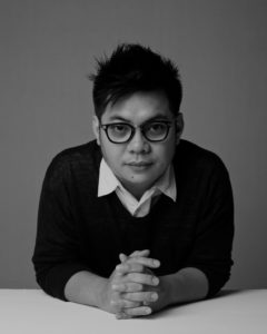
In the three years since S u p e r m a m a opened in 2011, it has expanded from a design retail store to an incubator for Singapore designers and designs as well. It recently re-opend its original store at Seah Street, which had been turned into a workspace for designers and artists for over a year.  We spoke to S u p e r m a m a founder Edwin Low about the renewed vision for his store, and how it will stand out in an increasingly crowded market of Singapore design products.

A former design lecturer at Singapore Polytechnic, Edwin and his wife quit their jobs in 2011 to open S u p e r m a m a. | S u p e r m a m a

Why is Supermama@Seah Street re-opening as a store after it was turned into a residency space in November 2012?

We shifted our retail operations to the Singapore Art Museum (SAM) after running our flagship store at Seah Street for two years. While the retail store at SAM creates a greater awareness to local and international audiences, I find the customer’s pace of interaction (people-people, people-object, people-space) within the shop pretty rushed. I kinda missed the pace in Seah St where customers literally slow down just by stepping into the shop — which creates a more intimate and natural setting to form conversations over the products we carry.

There is also a practical reason as we are transiting from the current shop space at SAM’s 8 Queen Street to the official SAM shop within the main building. We will be taking over the official SAM shop from September and re-opening Seah Street allow us to reframe our approach, and create a better retail/gallery experience before embarking on the next one.

How is the re-opened Supermama@Seah Street different?
Previously, we ran  it more like a select shop where we curated a range of labels within a space — a credible, but not exactly sustainable model for a shop. In the past year, we have gained significant access to many craft facilities in Japan and also created our own label, Democratic Society (DS). Currently, we are focused on presenting our labels and the maker’s production capabilities to our customers.

We have also retained the residency space, and I think it is pretty refreshing for customers to actually have a glimpse into the work studio of artists and designers.

Who has taken up residency in Supermama@Seah Street and what were some projects that have come out of it?
So far, we’ve had Dawn Ng (artist), Olivia Lee (industrial designer), Melvin Ong (desinere), Tiffany Loy (parasol bags),Jotham Koh (photographer). Their projects include collaborations under our DS Label, e.g. Dawn created a collection of tea towels using fabric made with a textile company based in Nagoya, Japan. Melvin was one of the designers who took part in our “Singapore Icons” project, a collection of porcelain produced with a label in Arita, Japan. Tiffany did an exhibition on “textile embroidery machine,” while Jotham’s is currently presenting his first public work,  “Craftsman,” for our re-opening.

You’ve been involved in creating Singapore design products for some time, beginning from “Singapore Souvenirs” (2009), a speculative proposal on what gifts from this city-state could be. Is the Democratic Society label you’ve started a successful implementation of these early ideas? How is it different?
For DS Label, it is strictly about stories (past or current) that can be communicated through objects. I’m intrigued by the study of material culture in our social context — I like the fact that objects which surround us are an extension of who we are, which ultimately defines us. For instance, I visited Arita, a porcelain town in Kyushu, Japan, and I was totally bemused by how a material — porcelain — plays such a huge role in defining the culture and lifestyle of the people living in the town. So for DS Label, I wanted to introduce a new material typography in Singapore and see the reaction to it. Can it be accepted? Can I create a new identity? Can this collection go into the daily lives of people? How would they fit in, etc.As industrial designers, it is only natural for us to want to create a label much like Muji, however, there is not much context for us to do so. Not until the Singapore Souvenirs (SS) project. I would say that the DS Label is a progression from SS. For SS, it was a pretty green attempt by a local design collective to create meaningful content, and many of the ideas were one-off, almost random, and across many mediums — which is probably the beauty of the project.

How have DS products been received by both Singaporeans and tourists? Are they selling well?
Pretty overwhelming, I must say. As I wrote this reply, I met a customer who tore out the page with a writeup of our products from the Singapore Airline in-flight magazine to look for us. To be blunt, the DS Label is possibly the only label and collection of products I have in my shop that is commercially viable.

DS is not the only producer of Singapore design products these days. What differentiates your products from others?
Personally, I find most producers still skimming the surface, mostly playing up on bold colours and nostalgia to sell. I think we can go beyond that.

Accompanying DS Label’s newest porcelain plate, “One Singapore,” is this booklet consisting of archival images from the National Archives of Singapore. The book is not for sale because of copyright restrictions but can be obtained when customers order the plate. | S U P E R M A M A

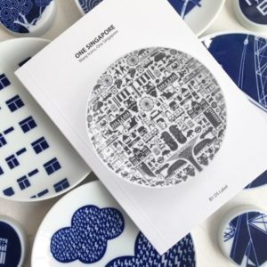
For DS Label, I think about longevity — both in its artistic direction and as a business model, which is why the tie-up with multi-generational craft facilities in Japan plays a vital role in the setup. We also spend considerable amount of time researching (sometimes with support from the National Archives of Singapore (NAS)) and communicating the rich content behind every artifact. Take our recently launched “OneSingapore” porcelain piece for example, we did not just provide a writeup on the icons, but worked closely with NAS to sift out archival images to create a story booklet that communicates the stories behind the icons — so much so that I have customers requesting to purchase the booklet too.

Another approach I take is to involve as many designers as possible. This is why I decided on the name “Democratic Society”, it is a label defined by many designers and artists. That is when the design language for the label become “democratised.” It’s a language owned by many people. With this, I can potentially reach out to a wider audience.

The DS model of applying concepts by Singapore designers on to Japanese crafted products seems to play to the strengths of both countries’ design capabilities. As an industrial designer yourself, do you think this is the best model forward for Singapore’s design industry or should we also develop made-in-Singapore products too?
I think it differs from industry to industry. For an industry which involves years of training or requires a large amount of space, we have to take a collaborative approach. Porcelain is one such product type/ industry. The facility in Arita is so massive that it’ll not make sense (cents) to have it in Tokyo, let alone Singapore. However, if you are looking at a trade such as leather making, letter press, etc., then it makes sense to develop the capabilities of making in Singapore.

We do also need to look at production volume. Personally, I feel that it is good to develop artisanal facilities in Singapore.

You’ve run a business retailing Singapore design for three years now. What are some challenges and issues you continue to face?
I do not want to sound pretentious, but I was completely dumbfounded by this question. I enjoyed what I do so much that I don’t see challenges as separate from the joy of running the business. I wish to say high rental cost blah blah… but these issues are not unique to my trade, everyone is facing the same thing, so it’s not exactly an issue when everyone is facing the same issue, isn’t it?

Thinking Outside the Shipping Container

Giuseppe Lignano
ARCHITECT MAGAZINE

Giuseppe Lignano has no architect friends. When not at work, the founding partner of architecture firm LOT-EK would rather hang out with people outside the industry instead.

School teachers, businessmen, chefs and even housewives — his love for meeting people from diverse backgrounds and cultures mirrors the industrial bricolage his studio has become famous for. While most architecture firms design buildings to be made of glass, concrete and steel, LOT-EK has used kitchen sinks as cabinets, petroleum trailer tanks as bedrooms, and stainless steel truck bodies as homes. Over the last two decades, the studio Lignano started with his long-time collaborator, Ada Tolla, has been turning non-traditional architecture elements into standout designs.

“I like to be more of an outsider in everything I do,” says Lignano, looking smart in a fitting blue shirt and dark denim jeans. Even the clothes on the 50-year-old reflect how the gay man has always seen himself outside of New York city’s straight “white-male dominated” architecture industry with “their all black outfits”.

Lignano first came to the United States with Tolla after they graduated from architecture school in Italy. Bowled over by how modern New York was compared to their hometown in Naples, the duo moved to Manhattan for a postgraduate fellowship at Columbia University in 1990. Three years later, they set up LOT-EK to pursue their fascination with the city’s industrial landscape, which has defined their design vocabulary ever since.

Fire escapes, airplane fuselages, steel ducts and other detritus of the industrialized society are examples of the “Roman aqueduct now seen in the making,” says Lignano, proof of how we live today when archaeologists dig up the ground in 2,000 years time. But rather than leave them to waste till then, he sees the perfect building blocks for design.

“As a civilization, we would feel much less guilty if we had the ability of looking at what we make with enthusiasm and say we could do this with this, instead of just freaking out that we are accumulating millions of containers,” he says. “I think it would be a great thing, a really beautiful thing not only in architecture.”

Mixer| LOT-EK
Mixer| LOT-EK

This palpable love for human creativity — measured by his distinct left eyebrow that arches upwards whenever the grey bearded Lignano speaks excitedly — can be traced back to when he decided to become an architect. Barely ten years old, he had visited his uncle’s newly renovated apartment, and was blown away by how the architect had transformed the space. Uncle Franco became a huge inspiration in Lignano’s pursuit of wild and imaginative designs, which went so far that even the mentor said his nephew’s works were “completely crazy” and unacceptable to the world.

From turning an airplane container cargo into a personal workstation and using a cement mixer as a cocoon for watching television and playing video games, LOT-EK has gone from designing such installations for art galleries and museums to building architecture, most notably with the shipping container. The studio has converted them into mobile retail stores for PUMA and Uniqlo and will be inserting into New York’s Pier 57 some four-levels of containers filled with — not goods, but — a market, restaurants, and studios for artisan businesses that will turn the former shipping hub into a cultural and civic center. 

More recently, LOT-EK has also gone beyond repurposing the shipping container to building with them. Lining one side of its container-like second-floor studio along Chrystie Street are various architecture models that are as arresting as the neon yellow and grey interiors. What looks like New York’s winding Guggenheim museum turned on its side is a proposal for a public library design consisting of 170 containers sliced, carved and stacked to create seven wheel-like structures joined together. Another model resembling a floating spaceship is actually an art school built in South Korea where LOT-EK sheared eight containers along a 45-degree angle, assembled them in a fishbone pattern, and elevated the entire structure. 

APAP OpenSchool | LOT-EK

These works are more than just futuristic-looking. Lignano takes down each model to explain how LOT-EK is “creating space by removal,” working like “skillful butchers” to cut open rectangular containers to different shapes, and combining them to make out-of-the-box buildings and spaces. This radical approach has gained LOT-EK media attention and helped it win prizes, including being a finalist for the National Design Awards in 2008. But up till today, the studio still struggles to get clients.

“A lot of people that have started much later than us have completely gone so much more than we have from a business point of view,” says Lignano. “The hardest part has been the fact that there is a lot of people they call because they think this is a very cheap way of building. So in a way they call for the wrong reasons. Because we don’t do this because it is cheap, we do this because it is smart for what it is.”

But beyond an ecologically smart way of design, or what it now markets as “upcycling,” Lignano believes in his approach because of how creative it is. It is what has kept him going for so long despite the lack of major commercial success until recently. This belief has helped LOT-EK grow from just Tolla and him working by day and waiting tables at night, to a team of 15 now serving clients in the US, Holland, Japan and China. 

In that twenty years, New York city has also grown up as polished skyscrapers now overshadow its once chaotic industrial landscape. Even as his sources of inspiration are cleaned up, Lignano sees opportunities for LOT-EK’s works which has “more grit, more personality,” unlike the “boring” New York architecture scene which he likens to Wall Street. 

In this sense, Lignano is no outsider. LOT-EK’s diverse, layered and a little rough around the edges architecture is exactly what New York city is — once you’re on the inside.

———–
Written for Adam Levy’s Art of the Interview class at D-Crit.

Design for the Real World: The NYC Trash Can

New York magazine’s architecture critic Justin Davidson shares how the trash can holds more than just garbage!

What does the NYC trash can look like?

It’s a very efficient design, and you can see all of the decisions that went into making it as lightweight, rugged and efficient as possible. It is made of perforated metal so that it’s really made mostly of air. It is lightweight because the trash collectors have to pick it up, turn it over and dump it into a garbage truck. In order to minimize waste, it doesn’t have a big plastic bag inside that would become part of the landfill, so the perforations have to be small enough that the litter doesn’t fall out out. It’s really constructed like a barrel with ribs, and it takes up the smallest footprint on the sidewalk so that the top is wider than the bottom. It’s a conical shape. It’s got a wide rim that says “Keep New York City Clean”, so it’s got a place for a slogan to exhort people to use it and throw trash into it.

For all those reasons, it is a very efficient machine given how trash moves through the city. It’s the most basic low-tech kind of trash can imaginable. It’s elegant enough by virtue of its efficiency to take its place on the city streets, but it’s not so attractive a piece of high design that people would want to steal it. It’s just not that good looking. And I think for the purposes of a NYC trash can, it’s a benefit.

What are the trash can’s most iconic features?

Its simplicity and its really basic efficiency. The words prominently displayed on top of it are also iconic, although I’m not sure how many people if you blindfolded them would remember if it says anything at all, let alone what the slogan is.

It’s kind of forest green so it doesn’t assert itself, and yet you know what exactly it is for. It’s just that really basic design combined with its perforation that makes it really rugged and present, but not an eyesore. I don’t want to say it disappears, but it’s clearly meant to be self-effacing.

What is the role of the trash can in this city?

One interesting thing is the number of trash cans in the city and how people used them have waxed and waned. A couple of decades ago, this was a dirty city and there was trash everywhere. One reason was because there weren’t enough trash cans and they weren’t emptied often enough. So people got into the habit of throwing litter on the sidewalk or in the subway. The city increased the number of trash cans on the street and made sure there was one on every corner, throughout the subway system, and the parks. They were also picked up regularly. There was also a whole campaign to get people to stop littering. It was successful and the amount of littering actually went down.

The interesting thing was having habituated people to hold on to their trash or pocket litter just long enough to deposit it in a trash can, they realized that the habit was going to remain even if they saved some money by lowering the number of trash cans or picking them up less often. They counted on people’s habits, that they would hold on to their litter just a little longer — maybe an extra block — until they found a trash can. So there’s always this kind of pushing and pulling. It has been very effective in the subways and they managed to save a lot of money by lowering the number of trash cans without increasing track litter.

IMG_8179

What does the NYC trash can say about the city?

One of the things a trash can tells you is a little about the trash once you put it in. A basic element of the trash can is the mechanism which the trash gets emptied. This is clearly an object that somebody is going to muscle up in the air, turn it, and dump the contents into a garbage truck. In this day and age, that is a completely primitive way to deal with trash. It’s also not necessary, and it’s not even common. Europeans use a lot more advanced trash can designs that lock on to the garbage trucks and get automatically turned over. 

As basic as the NYC trash can is, it fits into a system that relies heavily on staffing and the running of trucks through the city on a regular basis. There is the spilling of pollutants when the trash is brought to the central sorting points. So one way this trash can is not efficient is its indication that in a city that presents gigantic amounts of trash — most of it household trash, and not the kind of street litter these cans are for — it still hasn’t figured out an optimal way of how to reduce the waste we produce.

Do you have a personal story to share about the NYC trash can?

Every morning, I go to either to Riverside or Central Park with my dog, and of course, you’ve got to pick up after your dog. So all these dog walkers have these plastic bags full of dog poop that they have to dispose of. It’s been cold and freezing, and there’ s been a lot of snow which has impeded trash collection. There is something amusing about watching people trying to diligently pick up after their dog, bag the poop, and try to dispose of that bag in a trash can that is at this point not conical but pyramidal because the cone has been reversed. It is now a structure that contains a tower full of plastic bags that is rising considerably higher. You see all these people circling the trash can trying to figure out where they can deposit this bag so it won’t roll off the side and onto the ground. So you can see how sensitive the trash can design is to the efficiency of the pickup. If it’s not done, even in a day or two, you start to have a problem.

NYC-trash-Cans6
Central Park’s new trash can designs by Landor Associates. PHOTO: INHABITAT.COM

Any thoughts on the increasing variety of trash can designs in the city?

For most people, their experience of a New York City trash can is one of many New York City trash cans. There is really a lot of variety. There is the basic standard one we’ve been talking about, but business improvement districts have their own design, often with sponsorships on the side, so it’s a form of advertising. The Central Park has its own kind of trash can that was designed in cooperation with Central Park Conservancy. Bryant Park has a much more elaborate kind of trash can with higher design elements because they have the staff to deal with that. So really, as you move throughout the city, it’s not a standardized appearance. You can practically tell where you are just by looking at a trash can. It’ll give you a lot of information on location.

Should trash cans become beautiful design elements in a cityscape?

It really depends on the context. When you are dealing with something that has to work on an urban scale and be produced in large quantities, the priority is on increasing the ease of use and minimizing cost. The trash can we have, given all the constraints I was talking about — how the trash is picked up and what happens to it afterwards — is a pretty good set of compromises. It’s not beautiful, but it serves a good function. When you get trash cans that are supposed to represent the neighborhood or a particular park, and become a design element in a kind of landscape, that’s fine and great, but it requires there to be a maintenance force which is costly. What you are doing is undoing a citywide standardization so that the trash can becomes an element of pride in that locality. In areas where there is a private business improvement district or conservancy that can deal with the implications of beautifying the trash can, that’s fine. But if you are going to beautify a neighborhood and rely on the city to pick up the implicit costs, then I don’t think it is a good idea because any money you are spending to beautify the trash can is taking it from some place else. It’s zero-sum game. The city has the responsibility to spread out this functionality evenly. It’s important that the city has created a trash can design that is city-wide and instantly recognizable by everybody.

——————

Written and recorded for Leital Molad’s Radio and Podcast class at D-Crit. The Q&A is an edited excerpt from a longer interview recorded in February 2014 . Thank you Justin Davidson for allowing me to share this.