Category: Media

Monocle magazine: Advertising its singular view of the city

Monocle-SCCM2

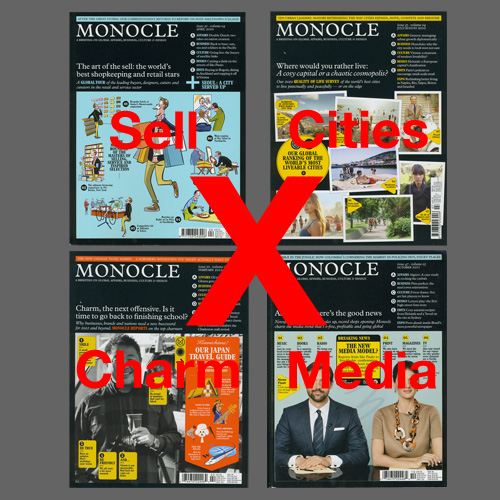
A monocle is a single eyeglass kept in position by the muscles around the eye. The same can be said of Monocle magazine, a publication fixated on how cities should all be built in style and for conspicuous consumption.

Since launching in 2007, this publication by journalist-turned-media entrepreneur Tyler Brûlé has become a celebrated design bible for urban planners and the elite. Before Monocle, creating an attractive city worth living in never seemed so simple and stylish.

From its format down to design and content, Monocle smoothens over the complex subject of urbanism in a smart and attractive-looking publication. It’s Brûlé’s vision of a cross between the The Economist and GQ, a perfect status accessory for the modern executive—best displayed when one is dressed in tailored suits and leather shoes.

Monocle calls itself “A briefing on global affairs, business, culture & design”, but each issue reads more like Brûlé’s personal travel blog (he is known to travel more than 250 days in a year) printed on uncoated stock — all 300 pages of it, including booklet inserts and advertisements. A glossy spirit of optimism pervades throughout this magazine stuffed with informative blurbs, clever lists, one-page profiles, as well as question-and-answer interviews. Whether it is a survey on the world’s most livable cities, an interview with a politician or a shopkeeper, or an advertorial on Samsung’s latest phone, there is little difference. Everyone and everything on Monocle is selling their suggestions in creating a better city. Nothing seems problematic, not even the fact that almost everything Monocle features as good examples of city living are unaffordable to the rest of the 99%.

Despite its marketing stance, Monocle tries to look like it is delivering on its promise of “quality journalism” through design and art direction. Its commissioned photography borrow the visual language of objectivity, while its illustrations project a sense of simplicity. Documentary style photos of places run alongside straight-up style portraits of business owners, shops and products, creating a veneer of honesty over the fact that Monocle is promoting them to readers. Many of the magazine’s illustrations of city life display a charming LEGO-like simplicity, rendered in a uncomplicated style of elemental forms reminiscent of Isotype. Like this international picture language, Monocle’s illustrations smoothen out differences and diversity within and across cities, falling back on outmoded national costumes and stereotypes to fit a trans-national universe the magazine is building. From page to page, the images and short texts are packed into a three-column grid creating a sense of sameness regardless of who, what or where, which only encourages reader to skim rather than read seriously.

Most telling of Monocle’s journalistic aspirations is the typeface the magazine and brand has chosen to be set in: Plantin. The magazine’s creative director Richard Spencer Powell wanted a nod to “old journalistic values”, and this early 20th century typeface also gives the brand instant tradition, reinforcing why Brûlé had picked the archaic object of the monocle as its name. Despite establishing such origins, Monocle is uninterested in practicing journalism the old school way. The profession’s cardinal rule of separating editorial from advertising is discarded because Brûlé once said that “all good journalists are good salespeople too”, and Monocle’s editors often accompany ad directors to sales calls. It shows. This magazine’s advertorials are difficult to distinguish from editorial content. The only indication is a “(Brand name) X MONOCLE” tag at the bottom of the page, an ambiguous line that could also read as endorsed by Monocle.

But this magazine has no qualms about mixing the two. It is good business for Brûlé, who is also chairman of the branding and design agency, Winkreative. Monocle is a great advertising platform for the agency, as editorial subjects such as the government of Thailand have become clients too. In Monocle, Brûlé has created a marketing darling that has been recognized by Advertising Age which awarded him “Editor of the Year” in 2011, as well as, Adweek which named Monocle the “Best brand for living the good life” in 2012.

This commercial success is undoubtedly Monocle’s great achievement in a print media industry puzzling over how to survive in the digital age and has made it a model for many publications to follow since. But it comes at a cost: real quality journalism that helps us understand cities as citizens and not just consumers. Unlike those who live in Monocle city, these are ideals most of us cannot afford to buy nor lose.

———–
Written for Rick Poynor’s Critical Takedown workshop at D-Crit. This essay was later published on Design Observer.
Planet Hillary: A great meme, not cover

Planet-Hillary

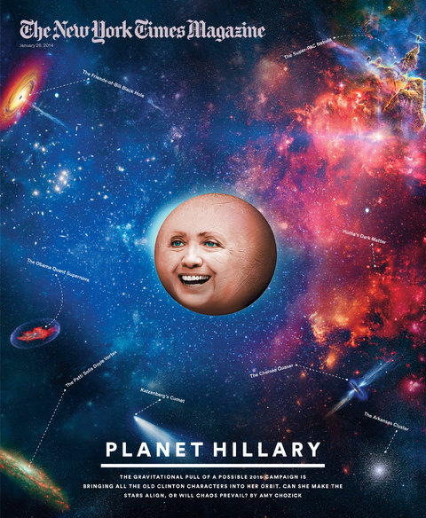
It looks like a head about to explode. Smack in the middle of a recent cover of The New York Times Magazine was the face of Hillary Clinton blown up into planetary proportions. This was for “Planet Hillary”, a story on the vast network of allies, friends and supporters that Hillary must manage if she was to successfully run for president in 2016.

Using the analogy of the universe, the cover turned Hillary into a planet surrounded by other cosmic elements such as “The Super-PAC Nebula” and “The Friends-of-Bill Black Hole”. While this concept sounds decent in theory, the cover looks less than stellar in reality.

Instead of resembling a celestial object, “Planet Hillary” looks more like a bloated orange juxtaposed against an image of the galaxy. The background is what defines the context and cover. It is also not immediately obvious whose face this is as we are only given a pair of eyes, a nose and a mouth to identify the subject. Even though the planet is the anchor element of this cover, it is the title, “Planet Hillary”, that tell us what we’re looking at.

Although some may take issue with this unflattering portrayal of the politician — and one wonders if there is an intention to poke fun at Hillary — the bigger problem is the cover is not very pretty. Not that all design has to be beautiful, but this looks like a crude rendering of the very first concept that came to the designer’s mind. Perhaps it was also a poor choice to use photography to execute this. It sets up an expectation of realism that is let down by how unreal this image looks. An illustrator might have been better in bringing out the fantasy universe this cover is trying to take us to.

The overall direction of this image also looks out of place with the style of Times Magazine covers. A glance through past issues show an intelligent use of photography and typography, as well as covers that have more depth and are open to interpretations. In contrast, the “Planet Hillary” cover is literal and one-dimensional, offering nothing more after the first look.

The one redeeming factor of this image is how absurd it looks — Hillary as a planet? While it fails to impress as a cover for the Times Magazine, its gimmicky visual messaging makes it prime for a few rounds of sharing and retweeting as just another slick Internet meme.

———–
Written for Steven Heller’s Researching Design class at D-Crit.

Power Platforms: Raising SG Creativity

Just over a decade ago, Singapore unveiled the Creative Industries Development Strategy to build its creative economy. Today, this cluster consisting of the arts and culture, media and design has  grown and given the city a creative vibe. But while the  talents and their works draw the most attention, an important component are platforms that help to nurture these individuals and groups, raise their profile and support the design ecosystem. These range from the media, community-building initiatives, creation and collaboration programmes as well as institutions and shops. Over the next week, I will attempt to map out the platforms that underpin Singapore’s thriving design scene, starting today with the media.

———–

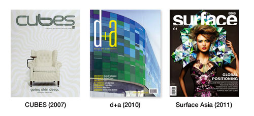
From blogs, websites, magazines to publications, the Singapore design media has grown substantially from a decade ago. Today, design is featured regularly in mainstream newspapers as well as lifestyle magazines, and there are many local publications dedicated to it. In the early 2000s, the advent of iSh (1999),  d+a (2000), CUBES (2001) and a smattering of other initiatives breathed new life into a scene where design magazines meant interior design and fashion rags or the academically-driven Singapore Architect.

Since then, the local design media scene has grown tremendously with websites like DesignTaxi (2003), THEARTISTANDHISMODEL (2005), Culturepush (2007) as well as indie print magazines kult (2009) and Bracket (2010). They are also joined by the Asian offices of international design magazines such as Surface Asia (2010) and Dwell Asia (2011) that a licensed by MPG Media Publishing, as well as Australian design media brand INDESIGNLIVE who acquired CUBES when it expanded into Asia in 2011.SG-Magazines

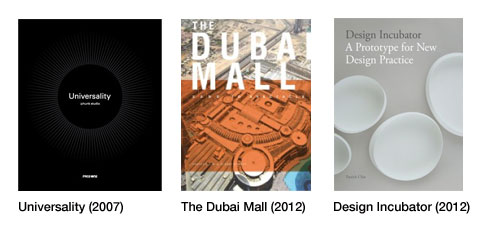
Besides a growing mass media, the design book publishing scene has also grown. While local design book publishers such as PageOne and Basheer Graphic Books might have published the occasional monograph for a Singapore design studio — such as :phunk studio’s Universality (2007) — they were more keen on earning from reprints of  popular titles from the West. That has changed in recent years as overseas publishers have started looking more closely at the design scene here. Singapore-based Patrick Bingham-Hall has done several monographs for Singapore architects such as WOHA under his Pesaro Publishing, ORO Editions put out Lekker Design’s Horror in Architecture, and international creative books publisher Laurence King recently published a book on the the works of the Design Incubation Centre in the National University of Singapore. Design studios themselves are also trying out self-publishing including DP Architects (The Dubai Mall: Sand to Spectacle), Ong & Ong (Conserving Domesticity) and Hjgher (Creative Cultures).SG-Books

Beyond the written word, an emerging medium is film. Local design studio Anonymous was the first in Asia to put together A Design Film Festival in 2010, creating a platform to screen design films from around the world. While the festival has yet to screen a Singapore design film, it has started work on one. There are also similar efforts such as an on-going interview series with local creatives by Design Says Hello as well as government-sponsored documentaries on Singapore’s design scene including City Lights (2006), More Than Meets The Eye (2004) and Design Superheroes (2011).

Despite more buzz and media, much of it has represented design as a lifestyle and consumer product and a business solutions provider. A lot of the media also looks at Singapore as just one part of the larger Asian scene, and while this raises the bar for assessing what is worthy of coverage, it also crowds out smaller but significant  developments for the local scene. Both these features are most probably because most of the media are commercially-driven and need to create a product that can appeal to a wide enough market. What is missing is critical coverage on design, including examining its role in popular culture and society. A lot of the media also lacks depth as they focus on what is trendy and the now, but Singapore design has a history that is finally surfacing the increasing number of monographs as well as historical overviews being published, such as Singapore Institute of Architect’s new Rumah — 50 Years of SIA 1963-2013 and my own work on the graphic design community.