Five things I’ve learnt in a year as a writer

When I first graduated from journalism school, I only knew two things: I can write and I like to share my discoveries. I decided not to take the conventional route of joining a newspaper like The Straits Times because I didn’t like what I saw or heard about it. Instead, I embarked on a career as an independent writer, taking on assignments to earn a living. This morning, I woke up to realise it’s been just over a year since I began this journey. The pay’s been ok, the assignments not bad, but the lessons about writing in Singapore have been the best, and here are five I’ve learnt:

Most people don’t read.
It’s true. People here watch and listen for information, more than they sit down and read something. And when they do read, who cares who wrote it? Unless of course, you are really good, or bad, or award winning. Then maybe, just maybe, they will wonder: Who wrote this ah? At the end of the day, written prose is just a form of information, and not always the best one (especially when not in point form).

Some people just like the image of the word.
Sure, people don’t read, but it’s not to say people don’t want to see words. You see, ‘words’ have gained a cultural value beyond the fact that they mean something. Often, being able to read a lot of text is seen by many here as a mark of someone intelligent and sophisticated, so that’s what writers here are paid for — the ‘image of the word’. No need to think so much about what your writing means, just fill it with words, chim ones, of course.

‘A thousand words typed for every hundred you are reading.’
This title is inspired by the exhibition title of an local artist, because writing is a form of craft. Most people only get to read a clean and crisp copy, and have this false image of a writer being a coherent being who churns out something in minutes. The truth is I could be sitting in front of this screen typing for hours and you’ll not read any of it. The process of writing is arduous, repetitive and painful. I probably press the ‘delete’ button more than any other, but when a writer finally thinks what is written is ready to be read, the feeling is just magical. Or he/she is just totally numb already.

We earn more per word, but we work harder with less words.
I don’t understand the concept of paying a writer by the number of words he/she writes. It’s so easy to blabber and fill up a page with words (to a certain word count), but to be precise and concise is so much more difficult. How to say more with less? Pay me more not less!

A picture paints a thousand words
Notice how this oft-used phrase to put down text actually suggests words to be the building blocks for visual expression? Enough said.

VOTE FOR ME: Elections Posters in Singapore (2)

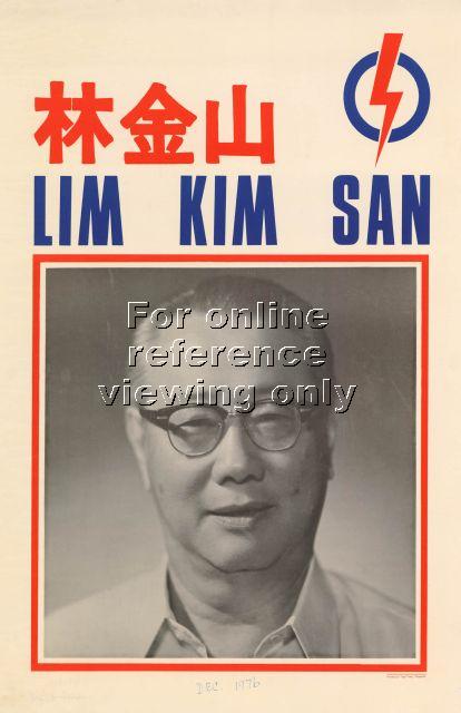
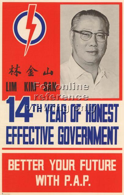
In the previous post, I talked about the manifesto posters that the various political parties put up during a General Elections. This time around, I’ll be looking at the posters that feature the candidates. Above are the various poster designs of the People’s Action Party (PAP) in 1972, 1976, 1988 and 1991 respectively. The lack of colour coincides with the period when colour printing wasn’t cheaply available yet. The choice of portraits was also conservative, or maybe even practical, since it is just as likely that these would have used for Identity Cards, or worse, funerals. It was only in the 1997 elections that the candidate photos came in colour, and by 2001, Photoshop also came into the picture.

1972 PAP Lim Kim San

1976 PAP Lim Kim San

1988 PAP LKY

1991 PAP Single

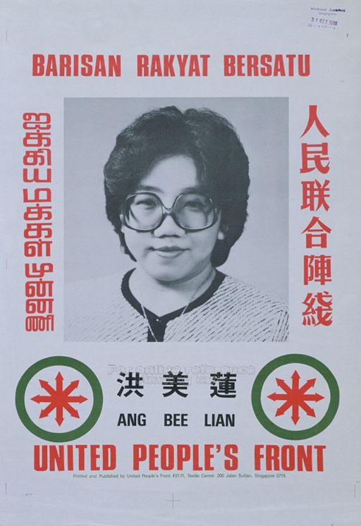
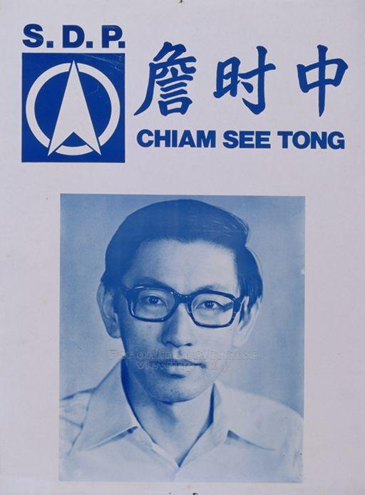
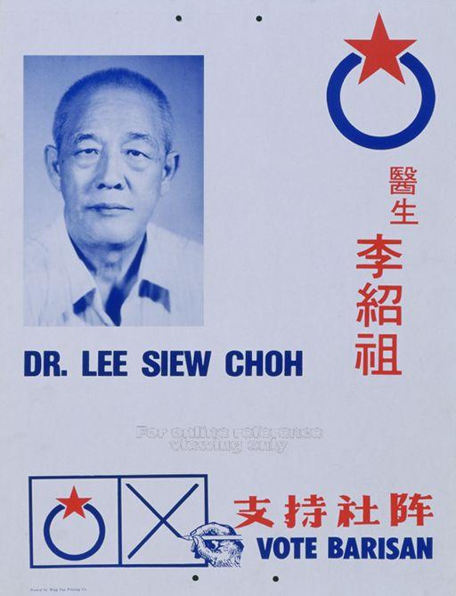
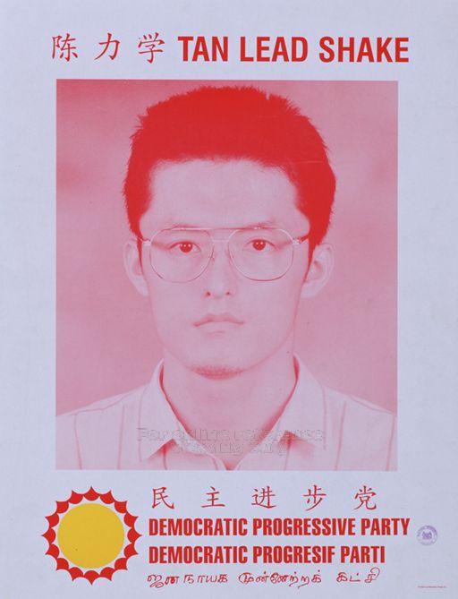
In contrast to these posters of the ruling PAP, the candidate posters of the opposition parties have generally been ‘less designed’, as evident in these posters of the Workers’ Party (WP) (1980), Barisan Sosialis (BS) (1984), Singapore Democratic Party (SDP) (1984), United People’s Front (1988), Democratic Progressive Party (1997) and National Solidarity Party (NSP) (1997). With the exception of NSP’s poster, the other opposition candidates don’t subscribe to the “less is more” attitude of the PAP posters. Instead, they try to squeeze the logo, slogan, party name (in all four languages!), candidate name, and in case you still don’t get it, icon or tagline reminding you to vote for him or her. One might attribute this desire to squeeze as much as they can to the lack of funding to print better posters, but one must also remember that by law, each candidate has a fixed budget for their elections campaign. For the last elections, one could only spend on average, $3 per voter.1980 WP Single

1984 SDP Chiam See Tong

1984 BS Lee Siew Choh

1988 UPF Single

1997 DPP Tan Lead Shake

1997 NSP Christopher Neo

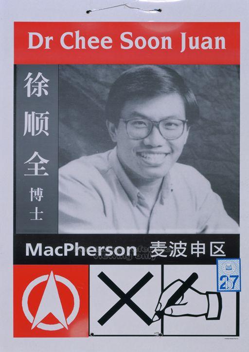
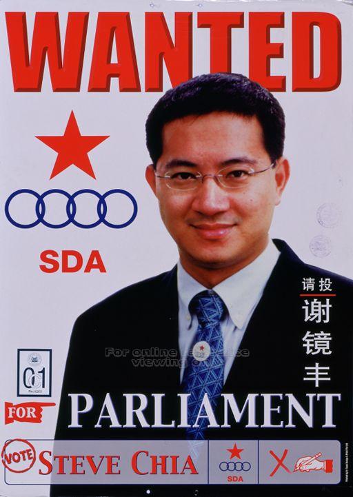
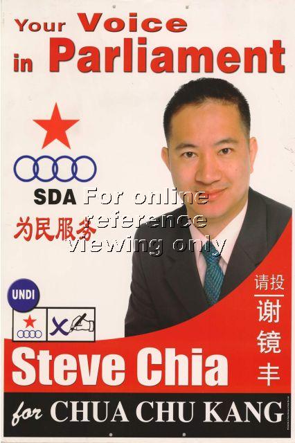
There few exceptions of distinctly designed posters of opposition candidates have come from two controversial ones: SDP’s Chee Soon Juan (1997) and Singapore Democratic Alliance’s Steve Chia (2006 and 2001). For some reason, the latter’s posters reminds me of real estate advertisements. I think it’s the man in a suit with the choice of colours.

1997 SDP Chee Soon Juan

2001 SDA Steve Chia

2006 SDA Steve Chia

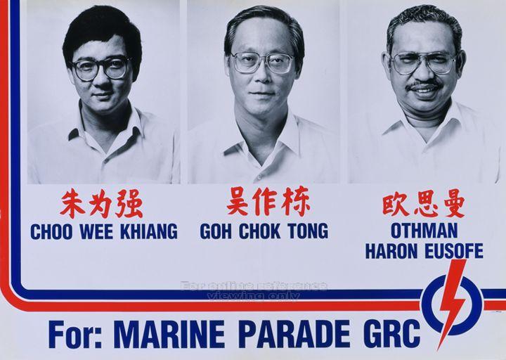
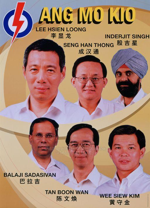
A new type of candidate posters had to be designed in 1988 when the Group Representation Constituency (GRC) came about. Suddenly, one candidate had to share the same space with two or more as seen in these posters of the PAP (1988), WP (1997), SDA (2006) and PAP (2001).

1988 PAP GRC


1997 WP GRC

2006 SDA GRC

2001 PAP GRC 1


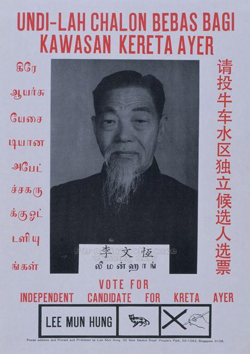
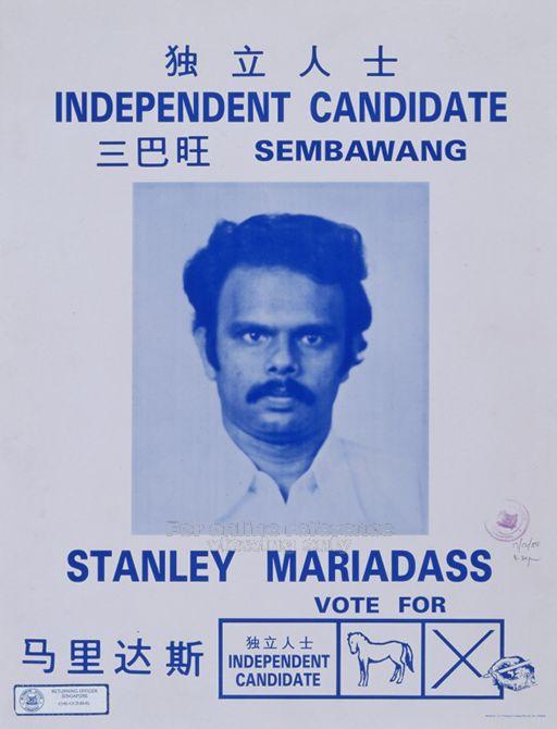
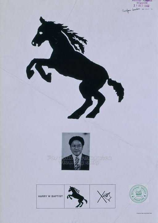
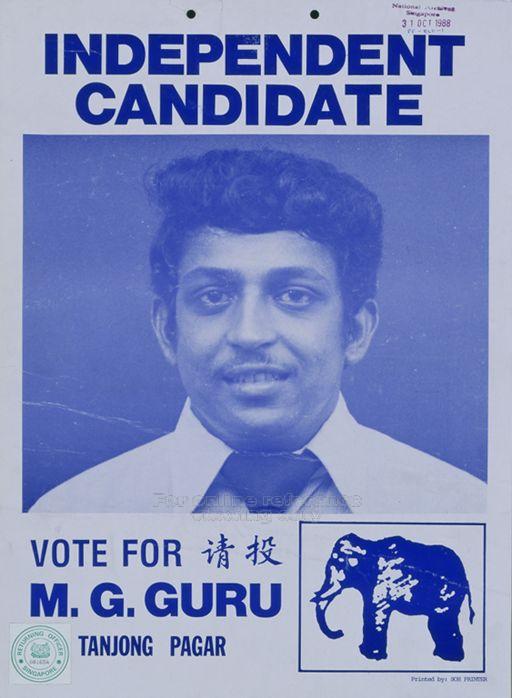
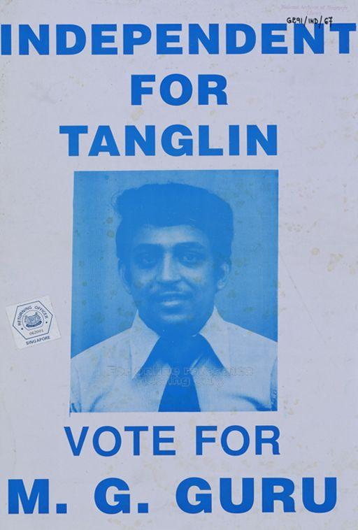
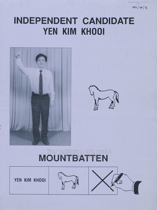
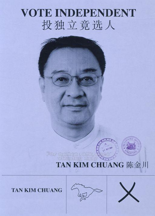
Finally, just a quick look at a quirky category of posters that belong to the independent candidate, a breed that has not existed since the 2001 elections. Their posters reflects how inadequate they are without the resources and machinery of a party.

1984 IND Lee Mun Hung

1984 IND Stanley

1988 IND Harry

1988 IND MG Guru

1991 IND M G Guru

1991 IND Yen 1

2001 IND Tan Kim Chuang