Category: Design

Singapore gets first locally-designed coins


SG-Coins-2013A new series of coins are being introduced in Singapore, some 28 years since a previous revamp was initiated in 1985. The new coins issued by the Monetary Authority of Singapore (MAS) are to gradually replace the existing ones, which have a 30-year tenure, according to The Straits Times.

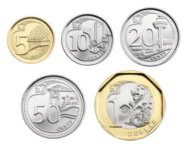
For the first time, the coins were designed by a local, Mr Fabian Lim. This third series of Singapore’s coins features national icons and landmarks — the Esplanade – Theatres on the Bay, public housing, Changi Airport, the port, and the Merlion —  marking the country’s progress over the decades.

$1 coins from the Flower series — SINGAPORE MINT

This departs from the current coins, known as the “Floral Series”, which were done by the late English painter and coin designer Christopher Ironside (1913-1992), who also created coins for countries such as Brunei and Kuwait. When introduced between 1985 and 1987, this series of coins were designed to be smaller, lighter, and more distinct from Malaysian ones as compared to Singapore’s first series of coins.

First series 10-cent coins — SINGAPORE MINT

Introduced in 1967,  the first coins in Singapore currency portrayed it as an exotic tropical island with marine animals. Designed by Stuart Devlin (1931-), a gold and silversmith who was born in Australia and is now based in the United Kingdom, these coins are apparently still legal tender today, although most have been phased out.

The changing visuals in Singapore’s coins over the decades, clearly mark its transformation from a tropical island to a Garden City, and today, a global city of landmarks. As Ravi Menon, Managing Director of MAS said in a press release, “Coins reflect the events, persons or symbols significant to a nation. The new series coins depict local icons and landmarks that are familiar to Singaporeans and reflect various aspects of Singapore’s progress as a nation.”

The latest coin designs also brings it in line with the nation’s current “Portrait Series” notes, which feature a portrait of our first President, the late Enchik Yusof bin Ishak, on one side, and on the other, scenes that depict themes of his life against the backdrop of the nation’s development. These notes were Singapore’s fourth series, and also the first designed locally when introduced on 9 September 1999 to welcome a new millennium. They were by artist Eng Siak Loy, who in 2007 was presented the President’s Design Award Designer of the Year.

To find out more about the evolution of Singapore’s money, check out this timeline by the Singapore Mint or information provided by MAS. There is also a very interesting blog about old currency in Singapore by here.

Singapore Design: We Are What We Eat

Where else should Singapore designers look for inspiration but in the nation’s favourite past time of eating? This is the theme of “Makan Time! Tuck into Good Design”, the latest exhibition put up by the Little Thoughts Group, a collective that explores local culture through design.

The group of 18 designers, many who work in multinational companies including Dell and Hewlett Packard, each spent their own time and money to create and exhibit a design prototype inspired by Singapore’s food culture and heritage. The resulting collection is a variety of cutlery that highlight local practices, products that appropriate the imagery of everyday food, and objects that re-interpret how and what Singaporeans eat.


One of the most thoughtful pieces was Chan Wai Lim’s set of cutlery that embody traditional Chinese eating practices (right). To get around the problem of flipping a fish to eat the other side, which is seen as symbolic of a boat being capsized or simply bad luck, Wai Lim created a stand that holds it such that one can eat it from both sides at the same time (background). Another design by the recent winner of the President’s Design Award 2012 for her work on a Dell computer, illustrates the myth that one must  finish every morsel of their food on their plate lest their future partner turns out ugly by putting a face at the bottom of a bowl.

“Makan Time” is the group’s third initiative to come up with Singapore design products since they first got together in 2009. While their first exhibition was inspired by their personal stories, they followed up in 2010 with a design collection based on their memories of Singapore. This current exhibition, after a two year hiatus, is on at the National Museum of Singapore until 27 January.

The marriage of Singapore’s rich food culture with its design scene has been one recurring trend in recent years. One of the earliest compilations was “Shiok! A Gastronomy of Singapore Design” in 2010, which put together the creations of several designers to present the country’s food culture at the inaugural Asia Design Conference organised by the centre of creative communication (CCC), in Shizuoka City, Japan. For years now, there have also been groups such as Triggerhappy, FARM and wheniwasfour that have designed various products related to Singapore’s food culture.

Like the work by the Little Thoughts Group over the years, “Makan Time” is distinct for a functional collection that probably reflects the industrial design backgrounds of its creators. This is unlike other existing food-inspired designs in Singapore that are generally more whimsical, such as re-approprating familiar food items to turn into objects of other uses.

However,  “Makan Time” does reflect the increasing use of narratives to define what is Singapore design, instead of searching for it in a unique form. As I have outlined in “Got Singapore Design?” in The Design Society Journal No. 05, many of such works in recent times look like they can be from anywhere in the world, but seen in the eyes of those familiar with Singapore culture, they take on a different meaning altogether.

Finally, if you are keen to hear from the designers themselves, do check out their forum this weekend, 19 January!

Campaign City – National Language Class

National campaigns —  against littering and breeding mosquitoes or encouraging the speaking of  good english and to have more babies — are part and parcel of everyday life in Singapore. A new exhibition, “Campaign City: Life In Posters”, celebrates this aspect of the country’s heritage by inviting 50 individuals from its creative community to design posters based on their personal memories of various campaigns. The works are currently being exhibited at the Lee Kong Chian Reference Library, on Level 11 of the National Library Building, until 3 July together with a historical survey from the library’s poster archives.

I was fortunate enough to have been invited to contribute a work for this event organised by The National Library of Singapore, in partnership with Salon Projects. Since I was a writer, I figured my best bet would to be create “word art”:

Print

Here’s what this “pledge”, made up of a mish-mash of campaign slogans over the years, meant to me:

As a writer, language is how I define my world. Growing up as a student under Singapore’s two language campaigns — first the Speak Mandarin Campaign, then the Speak Good English Movement — I always felt caught in-between.

The Chinese language was suppose to root me to my ethnic culture, but it was alien to my English-speaking family and my elders who spoke Cantonese, Teochew or Hainanese. When I discovered Singlish connected me with my family and friends in Singapore, I was told to speak English to plug in to the world outside.

Made to grow new roots and taught to cater to strangers outside of home, what have I become? A successful hybrid Singaporean or a failed translation of our bilingual policy?

As the campaign slogans over the years reveal, language for a Singaporean is so we can speak to everyone outside of this city, but never amongst, nor for, ourselves.