Category: History

A Scroll Through Century-Old Hokkien Temples

“Architectural Decoration: Negotiating Symbols Across Time and Place” examines the symbolic images of Hokkien architectural-style temples. | JESVIN YEO

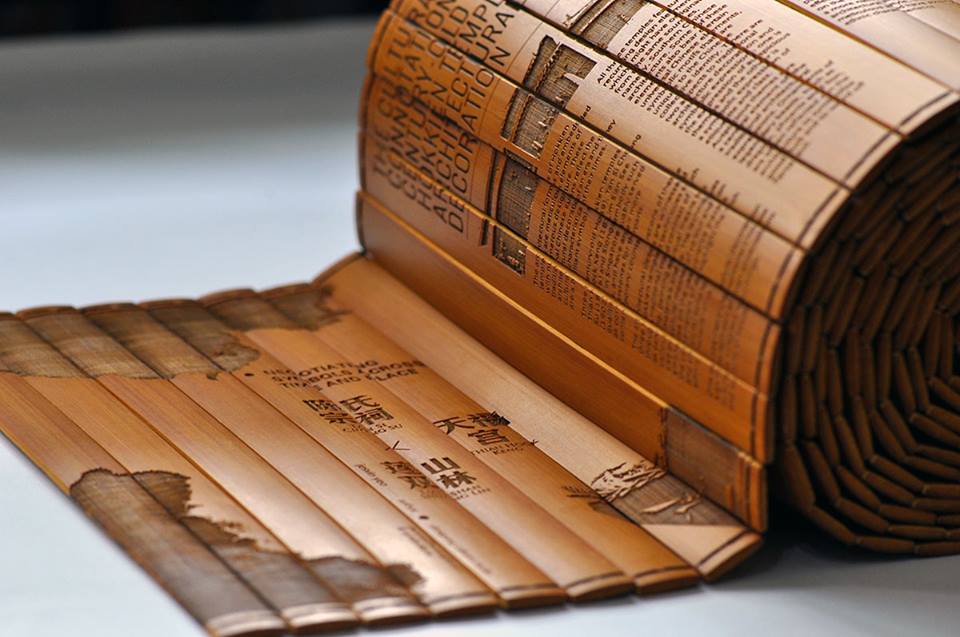
In the age of the e-book, this print publication offers a different take on “scrolling” through text. For her new book about the symbolic images of Hokkien architectural-style temples, designer Jesvin Yeo turned to ancient Chinese scrolls for design inspiration. Architectural Decoration: Negotiating Symbols Across Time and Place is a stunning 225 bamboo strips-long (4.35 meters) English publication examining the symbolic meaning of images found in three temples in Singapore built between the 18th and 19th century. Jesvin recently took us through her limited-edition publication (Only 40 were made and each selling at S$338) and her fascination with designing projects on Chinese culture.

How did this book project come about?
The idea for this book derived from my experience of collecting data for my other published book, Choi! Touchwood!, which was in 2010. Through many visits to the oldest Chinese temple in Singapore, Thian Hock Keng, I discovered many unique and interesting symbolic images. When I researched further, it remained a mystery, and no one, not even the people who take care of the temple, could provide answers to the meaning behind some of these symbolic images. I decided to research and understand the meaning of these images through the lens of visual communication. Moreover, I am a Hokkien, therefore it is important for me to understand my own culture and roots. Especially, how my ancestors designed these symbolic images more than 1,000 years ago.
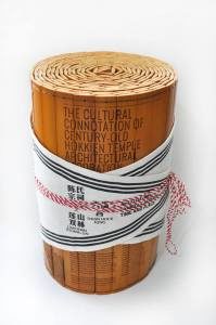
This book recently won a 2014 Red Dot Award in communication design. | JESVIN YEO

Why do a bamboo scroll book?
This book is deliberately made in the format of a traditional bamboo scroll to:

1) Indicate the importance of these cultural images as bamboo scrolls were used to record the chronicles of ancient China.

2) Enhance the value of these cultural images as they display our ancestor’s expectations and pursuits of beautiful things. As the bamboo scroll allows for the depiction of a continuous narrative, the viewing is a progression through time and space.

3) Let our younger generation have a chance to read a bamboo scroll book — how fascinating!

What were some of the challenges in designing this book?
I worked with a research team on this project with support from Nanyang Technological University and the Ministry of Education. The main members are Wong Wei Loong and Charissa Ho Jia En, with the help of others like Kent Neo and Kenneth Lim Zhi Wei. I start the project in February 2011 and we took over two years to take the photos, to archive and analyze, and to research on the meanings behind these symbols. The illustration, designing, and refinement took another year or so.

The main challenges in creating this book were:

1) Taking photos of the temples: some caretakers of the temples preferred us to send an email request before we shot and we were not allowed to set-up any equipment when photographing symbols on the roofs or ceilings. Of course, I totally understand this need for restrictions as these temples are Singapore monuments.

2) Researching on the meaning and mythology behind the symbolic images. I could not found any English books on the symbols of the temple then. Therefore I gathered information from Chinese references books and compared them with English articles written by scholars, especially on the name of the symbols and techniques used. At the end of 2011, I also went to Taiwan to interview caretakers of Hokkien-style temples too.

3) Illustrating the images: we hand-drew more than 150 illustrations of the symbols, and our eyes were seeing stars after a few images as they are very fine and detailed. Charissa started the first round and I continued from there and also refined all of them on computer later. It took us about eight months to finish.
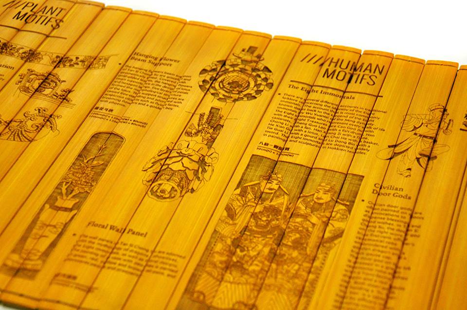
Many of the images in this book were hand-drawn by Jesvin and her team | JESVIN YEO

How did you convince the client to commission such an unconventional book?

This is not the first time I have proposed an unconventional book form toBasheer Graphic Books. They also commissioned my other book, Choi! Touchwood!, which is made up of four parts and costs a lot to produce. LuckilyChoi! Touchwood! was well liked by readers, so Basheer was confident in what I could produce.

Was it difficult to find someone to manufacture this book?
I checked with a couple of printers in Singapore and they were unable to produce the book as the bamboo material was a major issue. Moreover, their laser machines cannot achieve the details that I wanted. In the end, we had it produced in China by Neo Brands. But the Chinese printer did complain that the book was too time consuming as it involves hand work to tie the more than 200 bamboo strips to form one book and laser engraving is also done manually. They experimented with more than 10 different threads to find the right one to hold the weight of the scroll. Each book took about five days to complete.

You’ve designed several projects related to Chinese culture. Can you talk about your personal fascination with this subject?
As a Chinese Singaporean, I am always very interested in symbol, totems and the visual culture of Singapore. I remember those fascinating stamp designs on the back of my T-shirts printed by Taoist mediums during my childhood. Studying and working in London allowed me to further realise and understand the value of one’s cultures and heritage. After returning from London, I came across a statement by Singapore’s founding leader,  Mr Lee Kuan Yew, who said that the digital age was making it impossible to evolve a Singaporean culture even in a few hundred years. I decided to explore this statement through experiments in design and cultures.
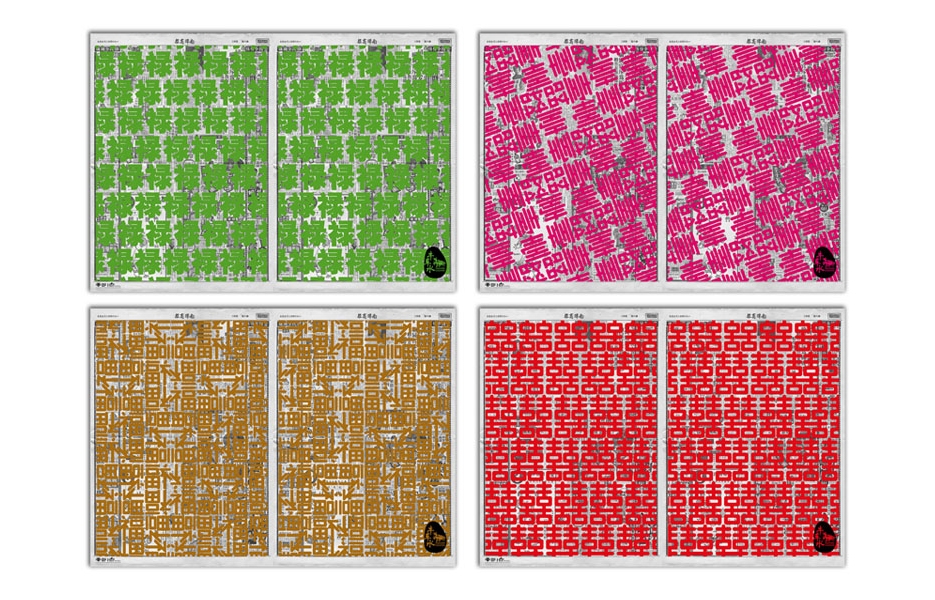
A set of wrapping paper designed by Jesvin which uses typographic elements from Singapore newspapers in the 1950s. | JESVIN YEO

It’s interesting that this book about Chinese culture is in English. Can you talk about navigating between two cultures as a designer?
As a Gen X, I understand both English and Chinese. Therefore, it is not too difficult to navigate between these two cultures.

The book is in English because one of my aims in doing cultural projects is to bring as much knowledge and value of our cultures to the younger generations. And we know that our younger generation prefers English and they are not really interested in print. Therefore, my projects have to be in English, easy to digest, unconventional and visually appealing to stimulate interest their interest.

A lot of your work is also about bridging modernity and tradition. How do you approach such work as a designer without falling into stereotypes and cliches?
A good and difficult question. I am not too sure whether my work are stereotypes and clichés. I just know that I am interested in the dialogue between tradition and contemporary, old and new. Although I work with tradition elements, I create my content with our younger generation in mind. I believe that tradition and culture are symbols of thought and it is important to pass them down. Hopefully our young people can continue to preserve it. Moreover, I feel that a product is made up by a combination of effort from many people, so it has to scream and not just sit subtly.
East and West: Graphic Design in Singapore Today

Since British advertising agencies brought modern graphic design into Singapore after the Second World War, a thriving community of independent studios has emerged in this former colony in Southeast Asia. Today, Singapore is a modern metropolis set to celebrate fifty years of independence in 2015, but the nation-state is still struggling to create a distinct local identity while earning global recognition— just like its contemporary graphic design scene.

Two separate exhibitions held by Singapore’s top graphic designers in the 1990s and 2000s show how the profession had changed within a decade in the city-state. In 1994, Su Yeang paid her own way to hold “Breaking Barriers” in The Design Centre, an exhibition of Su Yeang Design’s work to educate the public and businesses on the importance of good design. It reflected a time when graphic design was seen as a problem-solving tool for businesses. Fast forward to 2005, :phunk Studio held “A Decade of Decadence”, a retrospective exhibition of their “Greatest Hits”. Besides the influence of music, this exhibition held in the Singapore History Museum was supported by entertainment establishments Zouk and MTV, as well as Tiger Beer. As William Chan of :phunk then said: “When we started, people thought all graphic designers could do were design ‘Big Sale’ flyers and lay out text on posters. But these days, we are viewed as trend-setters.”

➜ Read the rest at Design Observer

Sannie Abdul (1935-2014): A Pioneer Promoter of Singapore Design

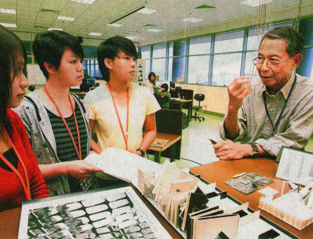
A 73-year-old Sannie Abdul talking to his students at Nanyang Polytechnic. | BERITA HARIAN

He barely completed primary school, but that did not stop Sannie Abdul from rising to become the government’s chief promoter of Singapore design.

For over two decades, Sannie spearheaded the state’s efforts to introduce design to businesses in Singapore, first as the head of the Industrial Design Centre in the Singapore Institute of Standards and Research (SISIR), and later, as the director of the Design Centre.

Too poor to afford education after primary school, a young Sannie began working as a clerk in a private company in 1950. According to a 1977 profile in Berita Harian, he left after a year to dabble in photography with the Singapore Photo Company before ending up as a technician for a civil engineer. During this period, he also began studying part-time in Singapore Polytechnic to be an architecture technician, and eventually joined the studio of Architects Team 3.

Sannie first got involved in the development of design in Singapore when he joined the industrial design department of the state’s Economic Development Board (EDB) in the 1960s. As part of Singapore’s industrialisation efforts, Sannie and his team helped local manufacturers design better Made-in-Singapore products and also promote good design to the public via the Product & Design Centre in the John Little Building. By the 1970s, Sannie rose to become head of the department, which by then came under SISIR, the state’s science and research  arm.

There was much work to be done, recalled Sannie during a 2010 interview.

“In the early days, when people look at design, they always say ‘modern design’. Modern is something new. They will say, ‘Oh, this is very modern.’ But I think people still far from understood what is good design,” he said.

While working to raise the state of design in Singapore, Sannie also continued upgrading his skills in design. He obtained a grant from the Asia Foundation to study industrial design and architecture in Chicago’s Illinois Institute of Technology, and in 1973,  he worked for six months in Italian design group, Olivetti, with the help of a United Nations scholarship.

This logo was designed by Sannie for the Singapore General Hospital to commemorate its 50th anniversary in 1976.

When he returned to SISIR, Sannie worked with a pioneering team of Singapore designers, many who went on to start their own design studios, to provide consultancy services to government agencies and local companies. Some of the group’s work included exhibition design for the Singapore Fairs, interior design of the Central Provident Fund building, and the logo of the Singapore General Hospital, which was credited to Sannie.

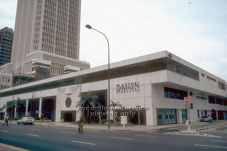
But what Sannie is most remembered for was his work in running Singapore’s short-lived Design Centre from 1992 to 1995. It was the culmination of the state’s renewed efforts to promote design after it privatized SISIR in 1981. Sannie had left briefly for private practice, but was called back in 1984 by the newly established Singapore Trade Development Board (now IE Singapore) to continue work on promoting design to local businesses. Working with the recently founded Designers Association Singapore (now the Design Business Chamber Singapore), many of its founders whom Sannie knew personally, he helped the government kickstart several initiatives that brought attention to Singapore design. In 1989, TDB launched the biannual International Design Forum which brought leading design nations such as Germany and the United Kingdom, as well as top designers including New York’s Vignelli Associates and Japan’s GK Industrial Design to showcase their work in Singapore. Three years later, the government opened a Design Centre along North Bridge Road with Sannie directing the creation of exhibitions and a design library, which was a rare source of books for local designers in the pre-Internet age. For his efforts, Sannie was elected to the executive board of the International Council of Societies of Industrial Design (ICSID) in 1993 for a term of two years.

The Design Centre opened along North Bridge Road in 1992 and closed only three years after. Over two decades later, the government would open a new National Design Centre along Middle Road.

After a decade of promoting Singapore design, Sannie left the Design Centre and soon joined local branding agency, Su Yeang Design to help it expand overseas. The Design Centre closed six months after he left, reportedly because of a shortage of funds. When asked about it a few years ago, Sannie said, “To me, it’s a pity, they built up a certain level, and it was recognised internationally, and it just went poof. It had become like a hub for young people to meet. You have activities, seminars, workshops…”

Even after leaving the government, Sannie’s desire to improve design in Singapore never died. After trying to retire in Melbourne, Australia in 2006, he found his way back to Singapore and started a second career as a lecturer at Nanyang Polytechnic’s School of Design at the age of 70. He taught full-time for several years before passing away last Wednesday on August 20.