The Straits Times (ST) unveiled a new look last week, the second time it has redesigned within a period of just four years. The 167-year old paper overhauled its look back in 2008, but unlike the previous change where it cited the need to stay attractive as it faced pressure from the Internet, this latest redesign seems to be at the orders of its new editor Warren Fernandez, who took over from Han Fook Kwang in February. Fernandez gave the in-house design team just six weeks to create a new look that was “more modern and contemporary”.
The result is a much cleaner-looking paper that does away with much of the fussy elements in its previous design such as special motifs for its bylines and coloured dividers. The section headers and liveries have also been reduced significant and simplified, probably to give more space for editorial and advertisements. Overall, the paper has adopted a more muted colour palette. The colour red, especially, has been dropped, and even when retained, is of a darker shade. This is probably to distinguish itself from its rival in the Singapore newspaper market TODAY, whose corporate colour is red. ST will instead be a pre-dominantly “blue” paper.
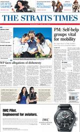
The 2012 front page.
Another significant change is the paper’s return to a six-column grid like in its 2004 redesign. It’s also a format that its weekend edition The Sunday Times has had, which probably simplifies life for the designers. Also marking a return is a new section “The News in 5 Minutes”. Such an attempt to provide a quick overview of the news came in the form of “In Summary” in the ’80s and “News Flash” in the ’90s.
Perhaps the biggest, but also the least inspiring change, is the paper’s masthead. It’s the third time it has changed its look since 2004, a frequency which some may see as a clear lack of an identity. The latest masthead design uses a typeface that looks like it is harking back to the 1970s when it was typeset in Bodoni. That design stayed for over three decades before this cyclical masthead revamp began.
![]() Masthead (2012)
Masthead (2012)
 Masthead (1973)
As a whole, there has been very little change in this redesign. If anything, the redesign seems more like an effort to shore up its brand colour and an opportunity for the new management to reach out to advertisers. After all, that’s what most redesigns are really about, an effort to stay attractive as an advertising platform. It’s why when there was a preview for the latest design, it was the advertising agencies and media professionals who were invited, and it was their positive views that were broadcasted when you read the new look ST the next morning.
For a more detailed examination of ST’s newspaper design since 1959, do check out this article I wrote for The Design Society Journal two years back.
CORRECTION: I had incorrectly said that the current masthead is typeset in Bodoni, so I’ve changed that bit. But I still don’t know what typeface it is.


