Tag: The New Paper

FOUND: A Short History of Newspaper Design

In this 1987 Asian Media Information and Communication paper that I found via GooglingPeter Ong, a former regional editor of the Society of Newspaper Design, provides a short history of newspaper design. A former editor in The Straits Times and The New Paper, he sees the birth of newspaper design as a necessary response to consumer’s changing expectations and needs, and looks to the American newspapers as the leaders in this area. The follow areas are covered in this 14-page PDF

  • The American Experience — why and how American newspapers focused on newspaper design
  • Design Trends — modular layout systems, how wide a column should be and what kind of font size to use
  • Why redesign a newspaper and how to go about doing it
  • Thoughts on the electronic newspaper and how it might change things

Though dated, this is still a very good read to be introduced to the fundamentals of newspaper design. The section on why to redesign and how to go about doing it is very useful for understanding the process of putting together a newspaper. Finally, it is quite interesting to see how his predictions of changes to the newsroom over 20 years ago panned out:

Just imagine this: A reporter leaves the office for an assignment with a photographer. All she has in her hands is a tiny tape recorder. No notebook. No pen or pencil.

The photographer, too, is seen with a strange-looking camera. Instead of the usual film, the camera has a computer-like disk.

At the end of the assignment, they return to the office. The reporter plugs her tape recorder into a computer system and the story appears on the screen in front of her. There is no typing to be done. Any corrections she wants is made through a voice-activated computer. When she is satisfied with her story, she transmits it to her editor at the click of a button.

In the photo department, the photographer slips the disk into a computer. He scans through the pictures he has shot, selects the best and then transmits it to the editor.

The editor calls up the story and photograph on a video display terminal, crops and sizes the picture the way he wants it and merges it with the story which he has edited.

Story and picture are sent to the sub-editors and designers who then lay out the various pages on a video display terminal. Once the page is completely filled, he sends the page off to the production room where a plate is made directly from the computer. The page is ready for printing any minute now.

Except for the part on “no typing”, much of what he imagined has actually come true!

Explaining the Budget 2009

Lots of of numbers and something for everyone, the Budget 2009 announcement yesterday was a great opportunity for the use of information graphics — so which local English paper did it best?

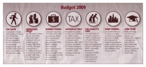
tnpbudget

Most engaging concept: The New Paper

You have to give it to the tabloid paper for always trying to make the news accessible and interesting for its readers. Conceptually, the umbrella, an everyday object, to protect you from bad weather is a great analogy of the Budget announcement and something anyone can relate to. And instead of going for the big numbers, it divides the details into neat packages depending on who you are, a businessman, a tax-payer, an adult Singaporean…

todaybudgetMost efficient concept: TODAY

This paper covered all the necessary details in a quarter of a page and with an interesting concept to boot! It clearly knows who its readers are as it divides the budget coverage into clear sections that are represented as “pills”. Not only are you able to get the information in a glance, the graphic also points you to the pages if you plan to read more on the given section.

stbudgetcover

Most grand concept: The Straits Times (ST)

A full cover and big numbers — when the Budget is discussed in terms of billions, it is hard to relate to it as a person on the street. The paper decided to go for the helicopter-view of things and emphasise on the massive figures as the news point. Unlike TODAY, the infographic does not serve to lead on to the other sections but in its special Budget section, it does divide it to relevant parts for different readers. The paper is definitely aiming to provide depth with an individual section just for the Budget and it clearly expects its readers to read everything on it. Whether this actually pans out in reality, I remain sceptical.

Most no-frills concept: Business Times (BT) & My Paper

btbudget

mypaperbudget

Both papers chose to keep things simple, limiting any graphic to just a box and relevant sections. My Paper (right) is clearly more people-oriented while BT’s (left) angle was more for the businessmen.

How do other newspapers cover the Budget? Here is the Spanish 2008 Budget as covered by a Spanish newspaper, Público

1205526392752gastos_estado

This is definitely not something that would work for a TNP reader, but I would hope to see out of ST, BT or TODAY.  It is a sophisicated infographic that shows the complexity and massive figures of the budget instead of telling it by using different colours and sizes for its “pipes”.

Since ST went for the helicopter-view of things, such a graphic would have been a great companion to its pages and pages of text. In fact, it would be something I want to pull out and keep just so I know the Budget 2009 inside out!

Graphics are for the less educated?

The New Paper (TNP), a tabloid paper, uses a lot more graphics in its stories than most of the other local papers. One reason I can think of is that graphics are seen as tools to present data in a simple manner and TNP’s target audience has traditionally been the blue-collared workers who are less comfortable with text either in quantity or quality. Besides, its focus on foreign soccer league news, means it has to offer more value than what it publishes from foreign news sources, thus presenting exciting moments of the games in graphic form has figured prominently in the paper.

But are graphics only meant for the simplification of data?

Not so, says Alberto Cairo, an infographic designer and author of Infografía 2.0. He argues that just as there are complex texts, some graphics need to be complex too. The book is in Spanish but according to a review by Infographic News, the key is in providing “layers” that allow a reader to get information at a glance but also delve deeper for the details.

This is an un-attributed infographic found in yesterday’s Straits Times about the Singapore Navy’s launch of its largest combat vessels the new stealth frigates, at 114.8m long.

stshipjan172009

Compare this with another infographic done by Juan Cholbi of a Spanish newspaper on the launch of an aircraft carrierportaaviones

To be fair, the ships are different in size and ST probably had space constraints. A graphic like the latter would have easily taken up half a page instead of the quarter page that ST gave. Still, if you get a chance to read the ST report, a lot of it focuses on rhetoric about how new frigates will improve maritime security (duh!). From a reader’s perspective, I think it would be more interesting to learn that this is the Navy’s largest combat frigate!

Juan Cholbi’s piece works as an example of having the main details like a sense of scale for the reader, at the left hand side, where the aircraft carrier’s size is compared to others and also the other details that might simply be more interesting for the military geek.