Category: Design

Planet Hillary: A great meme, not cover

Planet-Hillary

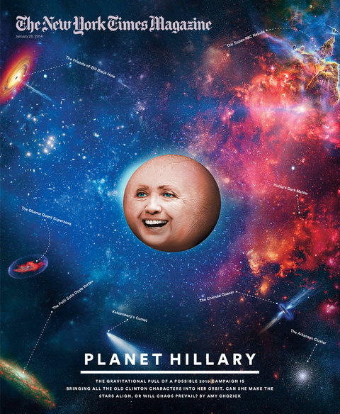
It looks like a head about to explode. Smack in the middle of a recent cover of The New York Times Magazine was the face of Hillary Clinton blown up into planetary proportions. This was for “Planet Hillary”, a story on the vast network of allies, friends and supporters that Hillary must manage if she was to successfully run for president in 2016.

Using the analogy of the universe, the cover turned Hillary into a planet surrounded by other cosmic elements such as “The Super-PAC Nebula” and “The Friends-of-Bill Black Hole”. While this concept sounds decent in theory, the cover looks less than stellar in reality.

Instead of resembling a celestial object, “Planet Hillary” looks more like a bloated orange juxtaposed against an image of the galaxy. The background is what defines the context and cover. It is also not immediately obvious whose face this is as we are only given a pair of eyes, a nose and a mouth to identify the subject. Even though the planet is the anchor element of this cover, it is the title, “Planet Hillary”, that tell us what we’re looking at.

Although some may take issue with this unflattering portrayal of the politician — and one wonders if there is an intention to poke fun at Hillary — the bigger problem is the cover is not very pretty. Not that all design has to be beautiful, but this looks like a crude rendering of the very first concept that came to the designer’s mind. Perhaps it was also a poor choice to use photography to execute this. It sets up an expectation of realism that is let down by how unreal this image looks. An illustrator might have been better in bringing out the fantasy universe this cover is trying to take us to.

The overall direction of this image also looks out of place with the style of Times Magazine covers. A glance through past issues show an intelligent use of photography and typography, as well as covers that have more depth and are open to interpretations. In contrast, the “Planet Hillary” cover is literal and one-dimensional, offering nothing more after the first look.

The one redeeming factor of this image is how absurd it looks — Hillary as a planet? While it fails to impress as a cover for the Times Magazine, its gimmicky visual messaging makes it prime for a few rounds of sharing and retweeting as just another slick Internet meme.

———–
Written for Steven Heller’s Researching Design class at D-Crit.

HHH: Vote for Hubert Horatio Humphrey!

HHH-Final

Just three letters said it all. In 1968, “HHH” could mean only one thing in the United States: Hubert Horatio Humphrey. He was the vice-president of the country, and more importantly, the Democratic Party candidate for the upcoming presidential elections.

503px-H_Humphrey

Like countless candidates before him, Humphrey’s face and name became integral visual elements of an election campaign. From picture posters to matchbooks, ceramic plates to calendars, and even cushions—Humphrey appeared everywhere and anywhere that year.

One of the cheapest and most widely available platform for advertising then was the button. Candidates gave out this small fashion accessory for free, and supporters who wore them became personal billboards for their campaign. The button is usually circular, although it has also been produced as tabs, lapels and other forms. Regardless of shape, the size of a button is always limited—typically ranging between 1 to 4 inches—so the message it carries has to be effective and economical.

LBJ

Recognizing what a mouthful his name was, Humphrey condensed it to “HHH” for the ‘68 campaign. He must have learnt from President Lyndon Baines Johnson, better known as LBJ, whom he had successfully run for office with just four years before. While the portrait of a candidate or his name was commonly used on a button since this marketing device was first introduced in the 1896 elections, the times were a’changing. As television took over the role of giving a face to the candidate from the 1950s, buttons could look more abstract. “HHH” not only fitted easily into a button, it combined to create a distinct logotype that was paired with different designs in various styles

This particular set of buttons have nothing else on them except “HHH” set in what looks like an extra condensed version of typeface News Gothic Bold. While the buttons of his competitor, Richard Nixon, came in the traditional patriotic colors of red, blue, and white, this set of Humphrey pins were unusual with their colorful mustard yellow and aqua green background. Perhaps it was a reminder of how Humphrey stood  up for the colored and was the main author of the Civil Rights Act. Or had the psychedelic ‘60s crept into the politics of this liberal candidate?

Additionally, these buttons do not match the official ones given out by the Democrats’ national committees. They could have been issued by local offices or commercial companies eager to cash in on the growing popularity of collecting campaign buttons. Just as how money and politics are so intertwined in the US, campaign buttons were commoditized. By 1973, a Hobby Protection Act was even enacted to protect collectors from imitation items that had flooded the market.

Several clues on these buttons suggest they are legitimate. Instead of having a separate safety pin on their backs, these buttons have bent pins integrated in them just like early designs. The edges of the buttons also have printed labels that read “Allied Printing”, presumably a historical union printer.

Pin+Allied

One thing is for sure: Humphrey’s campaign was unlike the orderly arrangement of the buttons’ design and their celebratory colors. In 1968, he not only struggled to overcome a Democratic party divided by the Vietnam War, the nominee kept coming up against angry anti-war protestors, which even led to police violence. Humphrey narrowly lost to Nixon, rendering “HHH” just another slogan of a failed presidential campaign.

———–
Written for Steven Heller’s Researching Design class at D-Crit.

Rem Koolhaas’ Spectacularly Generic Fashion

His buildings are instantly recognizable design icons. From the “twisted pretzel” CCTV headquarters in Beijing to the “melting iceberg” Casa da Música theatre in Porto, the Dutch architect Rem Koolhaas is synonymous with his out of the box buildings around the world.

But this man stands out differently in the streets of a city.

Tung Walsh | SMITHSONIAN MAGAZINE

His architecture is complex. His fashion is simple. His designs are asymmetrical. His self-styling is typical. His buildings are unconventional in shape and form. His clothing is uniform and austere.

A long-sleeve round-collared shirt and dress pants — only available in monochromatic black, gray, white, green or blue. Accessorize with jet black leather shoes and a classic white-faced watch with black straps. There you have it: the formula to dress up any lanky bald man as avant-garde Koolhaas.

It’s a shockingly basic fashion construction — a way for one of the world’s most famous architect to deflect attention? Koolhaas once lamented that celebrity architects like him are taken less seriously, and journalists seem mostly interested in what brand of shoes he wears.

While it’s unclear if he ever revealed his footwear choice, they are certainly not just any pair. This former journalist is not anti-fashion. He has designed runways and showrooms for high-end fashion brands including Prada and Coach. A typical Koolhaas architecture is derived from rethinking how a building is used, and that includes its function as a symbol too.

The twist and turns of his CCTV headquarters not only aid television production for the Chinese state broadcaster, they also defy the stereotypical skyscraper. While it was groundbreaking to restructure the Seattle Central Library after the Dewey Decimal System, which is used to organize books, it was equally radical to shrink-wrap this public institution with the gloss of a commercial building.

CCTV Headquarters and Seattle Central Library

Koolhaas is keenly aware of how architecture has turned into a spectacle in today’s market-driven society. At the same time, he has also astutely observed how globalization has led to generic cities around the world.

Such contradictions abound in the Koolhaas universe. Don’t be fooled by the seemingly plain dressing of this man who once told Spiegel magazine, “I like fashion, whether or not it’s overpriced, because it creates a sense of the sublime with relatively few means.”

The effortless and minimalism of Koolhaas’ fashion is a foil to inspire awe too. Think of the creative uniforms — black, bland, and brand — of other modern design monks such as Steve Jobs and Massimo Vignelli. Like them, Koolhaas wears his body of clothes less as form but as a frame for his intellect, that white Zen-like genius of a head that sits above it all.

When all dressed up, Koolhaas evokes a mash-up between Auguste Rodin’s nude “Thinking Man” and Captain Jean-Luc Picard in his Star Trek uniform. His attire is at once nothing and the futuristic everything. In true Koolhaas’ fashion, the architect becomes a contradiction of the generic and spectacle all rolled into one.


Rodin+StarTrek
lecture3_14

———–
Written for Andrea Codrington Lippke’s Criticism Lab at D-Crit on the fashion construction of a designer.