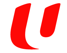
 Labour unions have always been the symbol for grassroots activity so it was no surprise that when NTUC re-branded itself last year, it rallied around a new logo and tagline, “NTUC for U”.
From a visual perspective, the logo is very intriguing because it literally contains more than one “U” depending on how you look at it. And this is a deliberately done to encompass what the union stands for:
- The small U that stands for working people of all collars, ages and nationalities in Singapore, and their families.
- The big U that stands for the Labour Movement, made up of our affiliated unions and associations, social enterprises, staff, members and partners.
- The invisible U that stands beside working people and their families at work, live and play, to help them earn a better living and live a better life.
Moreover, as compared to the old logo designed by architect William Lim in 1971, it is much more versatile to accommodate the wide range of services that NTUC provides as seen here:

In fact, the best testimony of this can be seen at NTUC Centre building at Marina Boulevard at night where the logo on the side of the building is lighted up and constantly changes like a chameleon.
The new logo definitely reflects a sign of the times and is very much part of the Singapore ideology as it wants to be “progressive”, “dynamic” and “forward-looking”. Contrast this to what Lim was attempting to symbolise in 1971:
- Eight cogs of a wheel, representing:

- national solidarity and well-being
- dignity of labour
- brotherhood of workers
- industrial peace with justice
- modernisation of the Labour Movement
- progress of labour
- cooperation of labour
- co-equal in the tripartite partnership of labour, government and management in the social, economic and political advancement of Singapore.
- A spanner, portraying hopes and aspirations of the working class.
- Octagon shape, portraying multi-racialism in Singapore.
What use to dominate the old logo was the the “hopes and aspirations of the working class”, but in today’s logo the worker has been relegated to a “small U”. And just like how the “U” in the logo has smoothened out from the old to the new, the values the logo symbolise have also blunted and, in a way, fallen more in line with the government. There is almost a deliberate attempt to sound broad and vague so that it can be everything and nothing all at the same time and the chameleon-traits of the new logo serves this purpose very well.
Symbolism aside, I think this logo was very well-designed to suit the current values of NTUC, it’s core message stands out strong and it is flexible enough to suit a wide-range of purposes, but I can’t seem to say the same about the union that it represents.
the old ntu logo frightens me. like something out of 1984.
WISHBY (What It Should Have Been)
I’ve just learnt that the NTUC logo was not designed by the architect William S W Lim, but the industrial designer William Wan Lim. Sorry for the error!