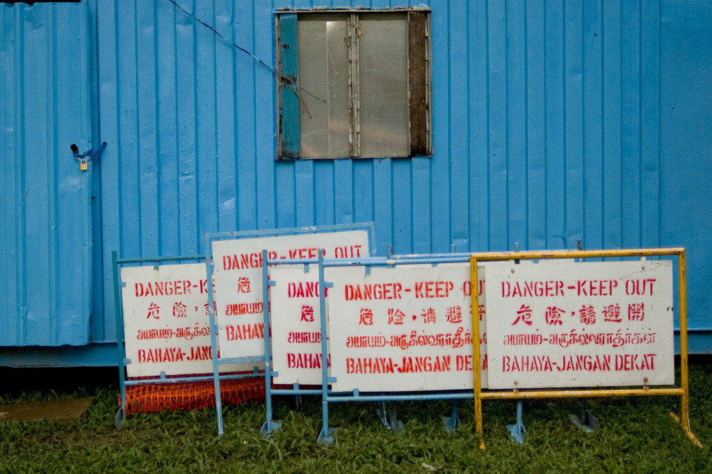
There’s red, there’s white, and it even comes in English, Chinese, Malay and Tamil. All this in a rectangular board about the size of a flag. The “Danger-Keep Out!” sign is how I remember my Singapore, a ‘flag’ representing the visual culture that surrounds us in this city.
You can find it all around in this city, which is perpetually in construction or undergoing some makeover. As long as something is being built, serviced, or torn down, this simply designed sign helps to keep Singaporeans safe by communicating to us that there’s dangerous work going on behind it, and we should keep our distance.
To make sure everyone in Singapore gets this message, it is repeated in the country’s four official languages. This equality extends to even how each line is spaced out so that they look equally long, regardless of language. And even if you don’t understand any of the languages, seeing four exclamation marks on a single board should surely tell you something is amiss.
This sign is functional and without frills, just text on a blank board in a single colour. But it isn’t just the design that reminds me of Singapore, how it is created bears the hallmarks of this city’s love for efficiency and its approach towards many things. The look of the letters suggest a pre-designed template is used to manually produce identical copies of this sign quickly without compromising quality.
Ironically, as Singapore continues to develop and re-construct itself, even this “Danger-Keep Out!” sign has not been spared. Nowadays, with technology, these signs are produced by digital printers that replace craftsmanship with machine precision. Sometimes, this is taken to its extremes, such as construction sites with ‘Danger-Keep Out’ signs printed in A4-size and kept in plastic sleeves!
Slowly, but surely, such signs are also being replaced. Instead of construction sites fenced with empty walls plastered with “Danger-Keep Out!”, carefully designed walls displaying what is being constructed are increasingly common. It’s a reflection of a more “designed” Singapore, but also how open we have become. We don’t just care about function and safety, but also spend a little more thought and money to be inviting and informative. Instead of keeping people out from a future that is being built because of the overriding concern for safety, the new signs promise and invite them to be a part of it, visually at least.
But what will happen to the “Danger-Keep Out” sign that I remember? Here’s an interesting take by Singapore graphic design studio Bravo Company. They re-appropriated this sign that they thought was being ignored by Singaporeans, who had become so used to seeing construction sites. After the General Elections in May, they used these warning signs to spread words of encouragement instead.
“I think the sign is an understated symbol of Singapore. We are the only country in the world that has the need to display all important messages in four different languages,” said its co-founder Edwin Tan.
How an everyday visual symbol, originally intended to be functional, becomes an icon, is an example of how inspiring our own heritage can be. It also shows how what we see around the city — all that is designed and built — can also become markers of memories. And that these collective memories are constantly re-interpreted and used in the present reminds us of how much we’ve constructed as a nation, and that this journey of remembering never ends, but only evolves with each generation.
———–
Written for Singapore Memory Project’s iremembersg.