Tag: Singapore Design

Design50: Space For A Nation to Play (1980s)

Mr Khor Ean Ghee standing atop the Dragon Playground he designed. | PIX: ZAKARIA ZAINAL

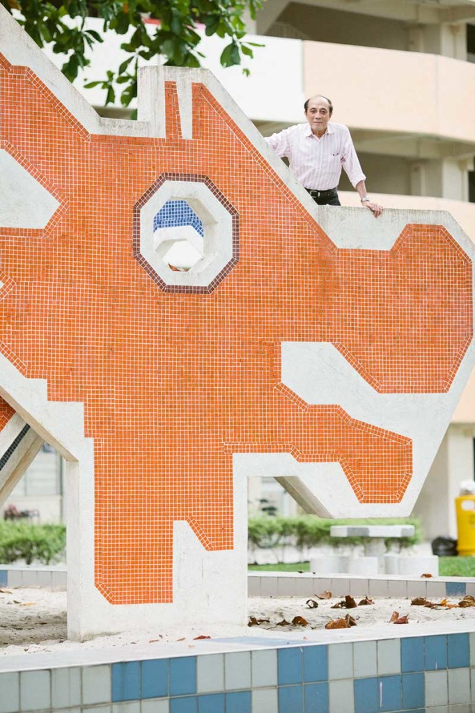
Dragons are everywhere in Singapore these days. As a pin, a door stopper and a toy rocker. On music album cover, a fashion spread and even an elections manifesto. This mythical animal has become a part of the Singapore story—and it all started with Mr Khor Ean Ghee.

Close to four decades ago, he dreamt up a playground shaped as this Asian symbol while working as an interior designer in the Housing and Development Board (HDB). Mr Khor had been tasked by the agency’s then head honcho Liu Thai Ker to design play spaces for a new generation of public housing that would go beyond providing just a roof over Singaporeans heads.

“The thinking then was to have more local identity and themes. We wanted something different, designs that reflect what we see in Singapore,” recalls the designer who joined HDB in 1969.

Read the rest in SG50 Pulse

One Graphic Designer Challenges Viewers By Not Showing Any Work at His Retrospective

At the mid-career retrospective of graphic designer Hanson Ho last month, visitors might have been surprised to see not a single piece of work he created in the past 16 years.

Instead, the gallery walls were adorned with a salmon-colored semi-circle, a grey square, and framed black rectangles, amongst other simple shapes. These are the building blocks of the elemental and modernist creations by the Singaporean designer, better known as the founder of H55 studio. When Ho thought about looking back at the output of the studio he founded in 1999, he decided to pay homage to the aesthetic fundamentals of his practice instead of staging a “meaningless” show-and-tell exhibition.

Read the rest at AIGA’s Eye on Design

Here’s What Happens When a Punk Designer + Classic Master Printer Collaborate

What happens when a classical musician meets a punk rock star? The result, in graphic design terms, is the latest release of WERK magazine.

Bundled inside a handmade wrapper resembling a courier package plastered with stamps, customs forms, and white shipping tape, is a pristine hardcover book—a surprisingly conventional design for a cult publication better known for its experimental printing and production. Previous issues came in spray-painted covers, cloth pages, and frayed edges, but for its 23rd edition magazine founder Theseus Chan made the unusual move of making a book as German master printer Gerhard Steidl would.

Read the rest at AIGA’s Eye on Design