Creating an active community for all

Singaporeans today are being engaged on many fronts to participate in society. Recently, the Feedback Unit was revamped and renamed as REACH (Reaching Everyone for Active Citizenry @ Home) to give the public a bigger way in issues pertaining to them.

The media has also opened itself to gathering news direct from the ground. The Straits Times just launched a new section in STOMP known as “Singapore Seen”, where it gives its readers a platform to turn journalist and create media to share with fellow readers.

These two pillars of society have traditionally treated the public as passive members and these changes recognise the public as more equal and active members.

And it is important that the public make use of these “direct” channels, not only as a sign of support for the right step taken, but more importantly, to help shape a Singapore that they can truly feel attached to.

Here in NTU, there exist active members too. Recently, students have formed groups to initiate changes in NTU, for instance the Small Dwarf Alliance. It claims to publish issues of concerns, on the NTU Students’ Union Expression Board in the hope of directing these concerns to those whom it may concern.

To better facilitate feedback collection and management, NTU should create a department for this.

Not only will it point students to an avenue to air their suggestions and grievances, this department can also play a part in educating students on how the administration works, so as to debunk myths about it too.

The aim is to create in NTU an environment where students feel and can be equal partners in their chase for education excellence and to give them a stake in the school so that they will be proud of being a student in the school.

The Nanyang Chronicle, 30th Oct 2006
The hegemony of words

Words — we use them all the time to communicate to one another, thus it is the default tool for many of us to understand the world. From a young age, we are taught a language that is based on words, so much so, that we forget there are other languages to understand our world. I do not mean a foreign language — Japanese or German — but visual, musical or even film language.

The hegemony of the written word has meant that these other languages are usually fully appreciated or understood through the mediation of words. Thus, we have write-ups in photo exhibitions, reviews and studies of films and music scores, even dialogue in films is an instance of such a mediation. All this points to a lack of common understanding and education in these other languages. More often than not, these are learned only by critics of those in the specific industries.

Yet, as we increasingly become a visual culture, I’m wondering if the visual language should be taught more extensively, but the question is how? Can there be a dictionary of visuals just as there is a dictionary for words?

Review: Singapore Architect #245

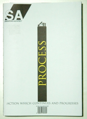
sacoverIt was by pure coincidence that I chanced upon the newly-revamped Singapore Architect,and despite being only remotely interested in architecture, I forked out S$13.90 for the magazine that claims to be “the only magazine, produced and written by architects, for architects, in South East Asia”. Even though the magazine was all wrapped up, I was sold simply by its cover, the binding and the theme of this issue.
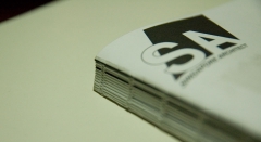
The theme of “process” comes out very strongly in its cover. Using a graphic, an intriguing choice for an architecture magazine, the building process is deconstructed to its individual components: the land, the crane and the pillars that  communicates the message in a clear and simple form. This deconstructive approach is also applied to the choice of binding: a stripped-down look — I think it’s called book spine stitching —that alludes to the process of making a magazine.

The coherence of the theme continues beyond its cover and into its layout beginning with a page, “Processing The New SA”, that is devoted to explaining the rationale and inner workings of the re-design. One detail I liked a lot was how I got to see covers that did not make it as it shows me the designer’s thought process. To top it off, even the magazine’s colour scheme follows the conceptual theme of “process” as it stuck to Cyan, Magenta, Yellow and Black — the four process colours of printing.

sabind1The theme aside, I liked the new logo and how a third dimension as compared to the previous logo was added with the parallelogram. In a sense, architecture is about creating the 3-D form and the new logo communicates this very well. Moreover, the parallelogram behind “SA” acts as a very strong identifying symbol and is used at the end of all its articles.
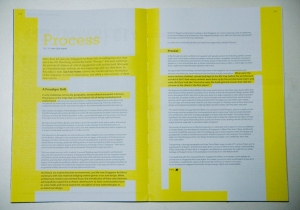
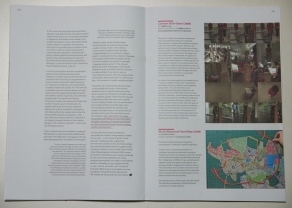
Here are just two peeks at the inside, I especially love the left one where the page and text are unified  by the yellow colour because it is applied in a manner that serves as a hierarchy for the text too. While we would conventionally bold the sub-heads and separate the pull-out quotes, throughout this magazine, there seems to be a concious design choice of seamlessly highlighting them out instead with underlines, circles and in this instance, highlights. This is one trend that I’m increasingly seeing in publishing design, perhaps it just seems more poetic?

Published by Singapore Institute of Architects, the magazine’s redesign was done by Night and Day and its Creative Director is Kelley Cheng. Based on some Google searches, I believe Kelley is also the editorial director of another design/architecture magazine, iSH, and Page One. I am now wondering if Night and Day is actually the same  bar and gallery opened by her and fellow architect, Randy Chan.

sainsidesainside2