Category: History

Less Structure, 
More Substance

FROM UNIT EDITIONS
FROM UNIT EDITIONS

Best known for having created the First Things First manifesto, one of the earliest documents that outlined the existential problem of a graphic designer in the modern commercial world during the 1960s, Ken Garland is undoubtedly one of Britain’s most significant graphic design thinker.

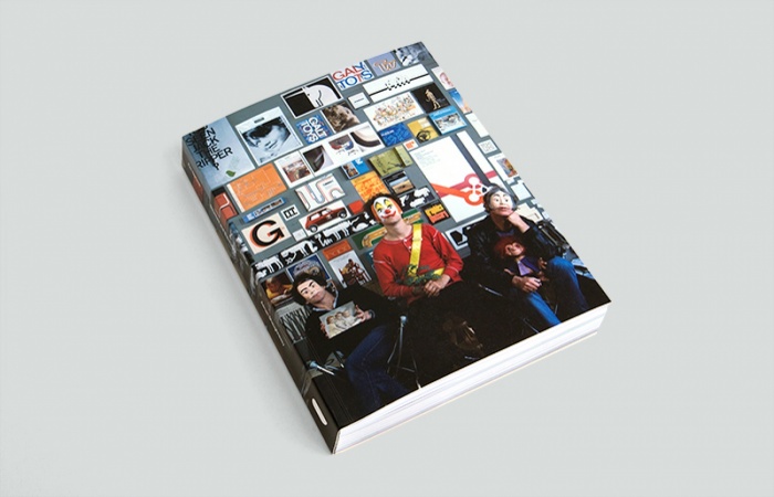
But lesser known is Garland the graphic designer, which is what Shaughnessy attempts to address in Unit Editions’ recent book Ken Garland: Structure and Substance. This 323-page monograph showcases Garland’s work over the last five decades, from 1952, when he was a student at the Central School of Arts & Crafts till the year 2009, when his independent studio Ken Garland and Associates was over forty years old.

The bulk of the book is a visual compendium of Garland’s significant works, but it is also accompanied by his photo works as well as indexes of the designer’s extensive published writings and lectures. While many of these are also available in Garland’s personal website, what makes the monograph truly comprehensive is a 65-page biography of the man who wears many hats (literally, as Garland is never seen without one of his iconic embroidered hats).

Shaughnessy’s straightforward approach to the multi-faceted Garland is to separately present each of his roles — as a graphic designer, studio owner, ethical advocate, political activist, writer, teacher and photographer. Each section details the historical context, an introduction to Garland’s significant contributions in the field, the man’s retrospective recollections, as well as the opinions of peers and associates. Read together, the biography paints the picture of Garland as a “man of substance”, a designer who is much more than about the work he produced, but a human being whose values deserve respect.

The book does a good job of tracing Garland’s roots and early life, giving readers a glimpse of what shaped the man we know. From leading a sit-in at art school to fight for life drawing classes and his conscription into the Parachute Regiment as military service, one begins to understand why Garland has a strong sense of mission and militaristic character.

The highlight of the book comes in the sections about Garland’s graphic style and philosophy, as well as features of his early works for the British trade journal Design and the children’s toys company Galt Toys. Readers are introduced to Garland’s belief in integrating image and text in his covers for Design, and they can see the depth of thinking in his approach for Galt Toys, a two decades long association best exemplified by the logo he designed, which was unconstrained by the popular rigid rules defined by corporate design manuals in the 1960s.

Beyond these pages, however, the essay begins to suffer from the structure of Shaughnessy’s approach. In comparison to what has come before, the sections on Garland’s different roles are summary, often lacking in details and purpose, which either speaks about the author’s lack of interest in these areas or his interviewee’s lack of substance in them. By sticking too closely to the structure of examining Garland’s different roles, the opportunity is also a missed in exploring how the different roles informed one another. How did Garland as a photographer or writer inform his design approach? The connections are mentioned in brief, but it seems Garland was not questioned about these relationships.

Another missing point of interest in the biography would be Garland’s writings on design that were compiled in a word in your eye, a book published in conjunction with an earlier retrospective exhibition of his work put up by The University of Reading in 1996. How has Garland’s views on design changed over the years and why so?

As with many monographs, this book is of a celebratory nature and does not take on some of the more thorny topics of the subject. It is clear from the output compiled in this book that after two decades of being in business, the designer started to lose his relevance from the ‘80s. Shaughnessy does highlight this point as well, attributing it to the changing times and tastes. But what did the man think of his work in relation to that period? Why did he stick to his core principles instead of adapting his studio?

By asking Garland more of such critical and challenging questions, the designer would have the opportunity to hit back, and truly establish himself as someone of substance — even in contemporary times.

——————

This review was originally written for a graduate programme application. 
Singapore gets first locally-designed coins


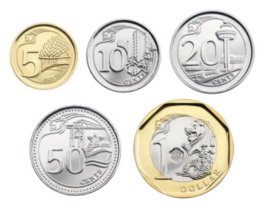
SG-Coins-2013A new series of coins are being introduced in Singapore, some 28 years since a previous revamp was initiated in 1985. The new coins issued by the Monetary Authority of Singapore (MAS) are to gradually replace the existing ones, which have a 30-year tenure, according to The Straits Times.

For the first time, the coins were designed by a local, Mr Fabian Lim. This third series of Singapore’s coins features national icons and landmarks — the Esplanade – Theatres on the Bay, public housing, Changi Airport, the port, and the Merlion —  marking the country’s progress over the decades.

$1 coins from the Flower series — SINGAPORE MINT

This departs from the current coins, known as the “Floral Series”, which were done by the late English painter and coin designer Christopher Ironside (1913-1992), who also created coins for countries such as Brunei and Kuwait. When introduced between 1985 and 1987, this series of coins were designed to be smaller, lighter, and more distinct from Malaysian ones as compared to Singapore’s first series of coins.

First series 10-cent coins — SINGAPORE MINT

Introduced in 1967,  the first coins in Singapore currency portrayed it as an exotic tropical island with marine animals. Designed by Stuart Devlin (1931-), a gold and silversmith who was born in Australia and is now based in the United Kingdom, these coins are apparently still legal tender today, although most have been phased out.

The changing visuals in Singapore’s coins over the decades, clearly mark its transformation from a tropical island to a Garden City, and today, a global city of landmarks. As Ravi Menon, Managing Director of MAS said in a press release, “Coins reflect the events, persons or symbols significant to a nation. The new series coins depict local icons and landmarks that are familiar to Singaporeans and reflect various aspects of Singapore’s progress as a nation.”

The latest coin designs also brings it in line with the nation’s current “Portrait Series” notes, which feature a portrait of our first President, the late Enchik Yusof bin Ishak, on one side, and on the other, scenes that depict themes of his life against the backdrop of the nation’s development. These notes were Singapore’s fourth series, and also the first designed locally when introduced on 9 September 1999 to welcome a new millennium. They were by artist Eng Siak Loy, who in 2007 was presented the President’s Design Award Designer of the Year.

To find out more about the evolution of Singapore’s money, check out this timeline by the Singapore Mint or information provided by MAS. There is also a very interesting blog about old currency in Singapore by here.

Campaign City – National Language Class

National campaigns —  against littering and breeding mosquitoes or encouraging the speaking of  good english and to have more babies — are part and parcel of everyday life in Singapore. A new exhibition, “Campaign City: Life In Posters”, celebrates this aspect of the country’s heritage by inviting 50 individuals from its creative community to design posters based on their personal memories of various campaigns. The works are currently being exhibited at the Lee Kong Chian Reference Library, on Level 11 of the National Library Building, until 3 July together with a historical survey from the library’s poster archives.

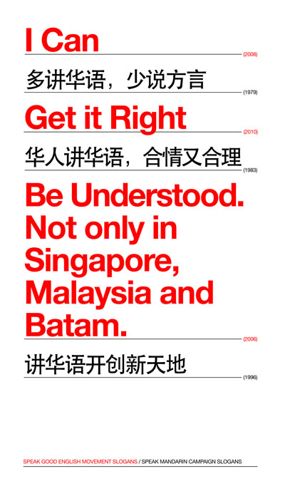
I was fortunate enough to have been invited to contribute a work for this event organised by The National Library of Singapore, in partnership with Salon Projects. Since I was a writer, I figured my best bet would to be create “word art”:

Print

Here’s what this “pledge”, made up of a mish-mash of campaign slogans over the years, meant to me:

As a writer, language is how I define my world. Growing up as a student under Singapore’s two language campaigns — first the Speak Mandarin Campaign, then the Speak Good English Movement — I always felt caught in-between.

The Chinese language was suppose to root me to my ethnic culture, but it was alien to my English-speaking family and my elders who spoke Cantonese, Teochew or Hainanese. When I discovered Singlish connected me with my family and friends in Singapore, I was told to speak English to plug in to the world outside.

Made to grow new roots and taught to cater to strangers outside of home, what have I become? A successful hybrid Singaporean or a failed translation of our bilingual policy?

As the campaign slogans over the years reveal, language for a Singaporean is so we can speak to everyone outside of this city, but never amongst, nor for, ourselves.