Category: History

445 Park Avenue: Architecture from the Inside-Out

445 Park AveAt just 22-stories tall, nondescript, and boxy, 445 Park Avenue is easily passed over when talking about architecture along its avenue. It neither has the intricate classical ornamentation of its next door Ritz Tower or the spectacular transparency of the glass-walled 450 Park Avenue across it. And built right up to the street, this office building offers pedestrians nothing more than a shadow of its presence.

But it would be wrong to equate 445 Park Avenue’s lack of distinction to a building that writer Ada Louise Huxtable might regard as “economically styled” rather than “architecturally designed” . Far from a result of “accident, expediency, economics and the inevitable march of industrial advance”, this building designed by Kahn & Jacobs for developer Paul Tishman is a highly functional product that demonstrated how modern office buildings could work in Park Avenue.

As one of its architects Ely Jacques Kahn once said, a building must first and foremost work for its inhabitants. “The architect’s first objective should be the study of the use of materials and the designing of a building that works — something that works from the inside out. What we should do is to consider function and let style follow as a corollary,” he said. Similarly, 445 Park Avenue has an interior substance deserving of more attention than what its undistinguished exterior presents.

That this office could be built so soon after the second World War — it was the first such development — and was completely filled in just over a year , is in a part, due to Kahn & Jacobs’ design. Their modernist approach of using standardized modules allowed for faster and easier construction compared to traditional methods, and would have helped convince the government to approve its building in 1946, even though construction was then heavily regulated as New York City transited to a peace-time economy after the war . The building design was also attractive to businesses because of its large spaces that could be easily partitioned, a feature made possible by the elimination of heavy columns on the exterior of its design. In addition, the standardized windows were of a ratio convenient for office layouts , and its horizontal system of arrangement lit up the building’s interiors such that workers did not feel trapped like in pre-war buildings with heavy masonry . Such a highly functional interior was enhanced by being fully air-conditioned, a first in New York City, and the combination was then regarded by architecture critic Lewis Mumford as “the best answer to the year-round problem of lighting and heating” . It is no wonder Tishman regarded his building as the office space of tomorrow, and 445 Park Avenue played a significant role in ushering the modern offices that followed after it.

But instead of taking the building’s modernist interior to its logical conclusion, as in the entirely glass International Style buildings that followed after 445 Park Avenue, Kahn & Jacobs designed an architecture sensible to its context. It is harder to appreciate now, but the building’s alternating masonry bands, would have fit into a street lined with ornamented masonry-clad buildings then. Its ziggurat top — Kahn’s signature response to the setback requirements of the 1916 Zoning Resolution — also echoed an evolution, rather than a disruption of the avenue’s architecture. These features gave 445 Park Avenue a sense of place, or what Kahn once called a “New York Style” of architecture. By “localizing” the International Style, 445 Park Avenue was unique to the city, familiar to the public, yet still took half a step towards the impending modernist future.

Perhaps, it is also this conservative stance that prevented 445 Park Avenue from looking beyond itself. While the pragmatic building achieves the maximum function for its developer and inhabitants, and fits into its urban context, it does not go beyond, unlike the nearby Lever House and Seagram buildings which sacrificed functional space to build public plazas. Even so, it should not diminish too much from 445 Park Avenue’s commitment as an office building that simply functions, which was much more vital during the period of economic and political uncertainty when it was built. Instead of grand public gestures and seeking an iconic exterior, Kahn and Jacobs created a building that became a backdrop for life in the city . Given how architecture today has become so much about the surface rather than function, 445 Park Avenue is a a reminder of why we build architecture: as a space that works “inside out” rather than “outside in”.

Bibliography

  • “Architects’ Rows ‘Silly,’ Kahn Says.” New York Times, 23 February 1932.
  • “Big Tishman Building on Park Ave. Filled.” New York Times, 8 Dec 1947, 45.
  • Huxtable, Ada Louise. “Park Avenue School of Architecture.” New York Times, 15 December 1957.
  • Mumford, Lewis. “The Sky Line.” The New Yorker, 13 December 1947, 85-92.
  • Stern, Jewel, and John A. Stuart. Ely Jacques Kahn, Architect: Beaux-Arts to Modernism in New York. New York: W.W. Norton & Company, 2006.
  • “Tishman Building Gets CPA Sanction.” New York Times, 17 July 1946, 37.


———–
Written for Karrie Jacobs’ 
Urban Curation class at D-Crit on a building in Park Avenue.
1980s: Sowing the seeds of SG graphic design today

These messages of a graphic design educator to his graduates suggest how Singapore design has developed since the 1980s.

Working outside of advertising agencies, producing conceptually-driven work and packaging local products to sell overseas — these are what many Singapore graphic designers do today.

They are also what one Singapore graphic design lecturer urged his students to do some three decades ago at the Nanyang Academy of Fine Arts, one of only three design schools that existed in the city during this time.

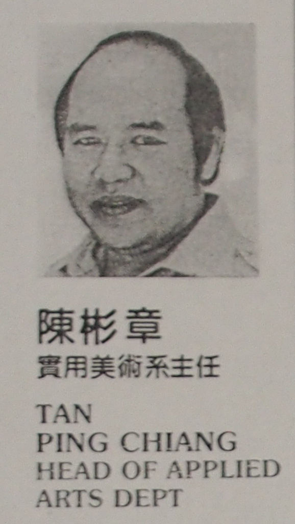
Tan Ping Chiang (1984/85)
A photo of Tan in the 1984/85 annual.

As head of the academy’s applied arts department, Mr Tan Ping Chiang (陳彬章), penned messages in its graduation annuals that outlined the role of Singapore graphic designers in the ’80s. In the midst of Singapore’s second industrial revolution in 1980, the former NAFA fine arts graduate urged the academy’s students to look for work beyond the narrow confines of advertising as “agencies were not the only way out” (“廣告公司並非唯一的出路”). Like how he worked as an in-house designer for the government, graphic designers could apply their skills in other sectors of the economy, and mirror the nation’s shift then from labour-intensive industries to those that of high value-added and wages.

To the graduates of 1984, he further elaborated on how this economical shift was changing what employers and clients expected of designers. Summing it up as “We Pay For Your Idea”, the designer who had worked and obtained his diploma in graphic design in England for six years from 1966, stressed the importance of “ideas” and “creativity” and not just craft and skills for the contemporary designer.

Dress-Up-Our-Local-Food-Products
Tan’s message for graduates in the 1981 annual.
We-Pay-For-Your-Idea
In 1984, Tan outlined the importance of “creativity” and “ideas” in contemporary design.


Tan had a particular interest in food packaging, and once urged the academy’s graduates to “Dress up our local food products”. Design could help such products sell better in Singapore and overseas, although he cautioned against creating packaging that simply imitated either the west or Japan. Later in life, he wrote a thesis on the value of food packaging in Singapore for his Master of Design from the University of Western Sydney and also illustrated Singapore Delicious and Delirious, a visual tour of the city’s food culture.

This love for food and design has spread to his industrial designer son, Tan Lun Cheak. As one of the founders of design collective Little Thoughts Group, Lun Cheak has created several products that reflect Singapore’s food culture including a steamboat that is also a lamp, and a plate that aids the tossing and turning of the traditional Lunar New Year dish of Yusheng, an act which symbolises good luck and prosperity.

The elder Tan, who turns 73 this year, is now working on his art works and blogs regularly about his travels.

How People and Time Can Save Bad Design

national_library1n

Try calling the old National Library a “monstrous monument” and “a picture of total failure” today, and one can only imagine the uproar it will cause amongst nostalgic Singaporeans. But that’s exactly what architect William Lim and others of his generation had to say about this now extinct building after it was unveiled in 1960.

“A visit to the inside confirms without any doubt the complete and absolute failure of the architect to create the necessary atmosphere and delight for both the readers and the library staff.” — William Lim (1960)

“Aesthetically, the design and exterior materials used, which are in juxtaposition to the soothing, pleasing National Museum, constitute what might be harshly termed a major architectural abortion.” — Cecil K Byrd (1971)

Similar sentiments were shared when the government announced in 1999 that the library would be demolished  to make way for the development of the Fort Canning Tunnel. The Urban Redevelopment Authority felt the library did not deserved to be conserved because “it was not of great architectural merit”.

But the outpouring against the library’s demolishment and declarations that it was a national icon shows how insignificant design is when compared against how it was used by people and remembered over time. While the criticisms of its architecture are fair and justified, but in this instance, those who supported the library’s conservation  saw its value beyond architecture.

WIKIMEDIA / SENGKANG

This also explains the struggle with buildings like Golden Mile Complex → ,in which sentiments are reversed —  the architecture community thinks it is a gem, but the public find it an eyesore because it is seen as a home for a foreign community.

Granted that the quarrel is not about the criteria to assess design, but rather what is the value of a building. However, should our critiques of design be purely based on its design? Or should it be broadened to include non-design factors, in this case its value as a piece of Singapore’s social memory? Even so, there is also the question if such feedback be meaningfully incorporated into a design process or practice.

One recent project that addresses some of these issues is FARM’s effort to remember the National Stadium through “bench“. Designers were given old planks of the stadium seats to “recapture and rethink this piece of memory” of the stadium. The result are 30 benches inspired by the stadium’s architecture, its role as a sports centre, and also a community space. Most of the pieces are visual translations of these messages, and often at the expense of the seating experience. The designs also turned out looking rather similar, which could either hint at how narrow the brief was or how unifying the National Stadium was as a memory.

A side project of bench, WOOD, was much more interesting. Hans Tan led a design studio where 18 students from the Division of Industrial Design explored the materiality of the planks and essence of the stadium to greater detail. Freed from the need to create piece of furniture, the students pushed the experience of memory beyond visual objects and instead engage other senses such as smell and interaction. Do check out the exhibition of their works  in The URA Centre till 31 May 2013.