
A photo essay I had to do for Advanced Writing Workshop class.
Pouring rain, fruitless search and a class assignment sometimes produces strange results.
A photo essay I had to do for Advanced Writing Workshop class.
Pouring rain, fruitless search and a class assignment sometimes produces strange results.
A few posts ago, I introduced the typefaces of Singapore’s English newspaper nameplates and who else uses them. This time, I’ll interpret them and see if they might mean anything at all!
 Barnhurst’s Seeing The Newspaper is a great book on visual journalism and in one chapter, he looks at typography and meaning through a typeface’s origins in history and its use in that society.
The meanings assigned to type by readers and typographers seem to spring not form some objective code but from the cultural experience common to both groups.
Barnhurst, Seeing The Newspaper, p.155
With his words in mind, here is my take on the nameplates!

Typeface: Big Caslon (Straits Times)
Based on a humanistic handwriting by printers in Italy before 1500, Big Caslon is a modern day recreation of the original typeface by William Caslon of England in 1725. Back then, Caslon was very popular and even used in the US Declaration of Independence. The saying went, “when in doubt, use Caslon”. It seems appropriate for ST to use such a historic and serious typeface as “the paper of record” but it is also a safe and un-imaginative choice.

Typeface: Times New Roman
The default typeface in Microsoft Word for several years, Times New Roman was created by Stanely Morison and Victor Lardent for London’s The Times newspaper in 1931. It’s hard to go wrong with a typeface designed for newspapers but its ubiquity also suggests that TODAY was not really thinking out of the box. And for some reason, to be a serious newspaper here, you have to use a British typeface.

Typeface: Helvetica Neue (The New Paper)
Perhaps the most well-known popular typeface today, Helvetica was created as a neutral sans serif typeface that had great clarity and no intrinsic meaning. Indeed, TNP’s choice of this Swiss typeface reflects its readership and news — simple and familiar to the masses. There is no need for frills when this tabloid’s content is already full of sex, violence, gossip, soccer…

Typeface: Frutiger
Sans serif typefaces, like this one, came about in the 19th century and was first used in advertising displays. This particular one is another Swiss typeface and designed by Adrian Frutiger for directional signs for an international airport in France.
What better way to report about business by using a typeface they made their own? This one has an international appeal to boot too.
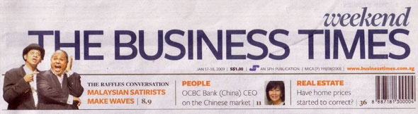
Typeface: Freight Sans
Being part of The Business Times, this nameplate cannot deviate a lot from its main paper. The choice of this pretty new typeface seems like a update with the times plus a touch of lightness for the weekend crowd. The typeface’s creator Joshua Darden says Freight Sans is “designed for warm formality in text and an authoritative, helpful tone in display” — indeed.

Typeface: Myriad
Used by Apple Computer since 2002, this paper probably wants to identify itself with the younger generation, so speak the language of one of the most popular brands amongst the youth today?

Typeface: TheSans
It’s Sunday and the last thing you want is to be greeted by a serious paper the first thing in the morning. Thus, the choice of this typeface by Dutch designer Luc(as) de Groot seems appropriate since it is marketed as a “useful-yet-friendly, all-purpose contemporary sans-serif”. Until you realise it is also “the face of thousands of organisations, publications and web sites”, but then it has to stay safe like its main paper, The Straits Times, too.
Here’s a list of the nameplates of Singapore’s english newspapers and what typefaces they use. I’ve also included popular contemporary references that also use the same typeface, maybe the choice of usage says something about the paper?
Typeface: Big Caslon (Straits Times)
You might have seen it: Foreign Affairs (headline) and The New Yorker (body text)
Typeface: Helvetica Neue (The New Paper)
You might have seen it: Everywhere (even a film made about it)
Typeface: Frutiger
You might have seen it: National University of Singapore
Typeface: Freight Sans (The Business Times)
You might have seen it: Reader’s Digest (logo)
Typeface: Myriad (my paper)
Also used by: Apple Inc
Typeface: TheSans
You might have seen it: Sprint

Typeface: Times New Roman
You might have seen it: Default font for Microsoft Word prior to Microsoft Office 2007