Looking back to see the future of Singapore design
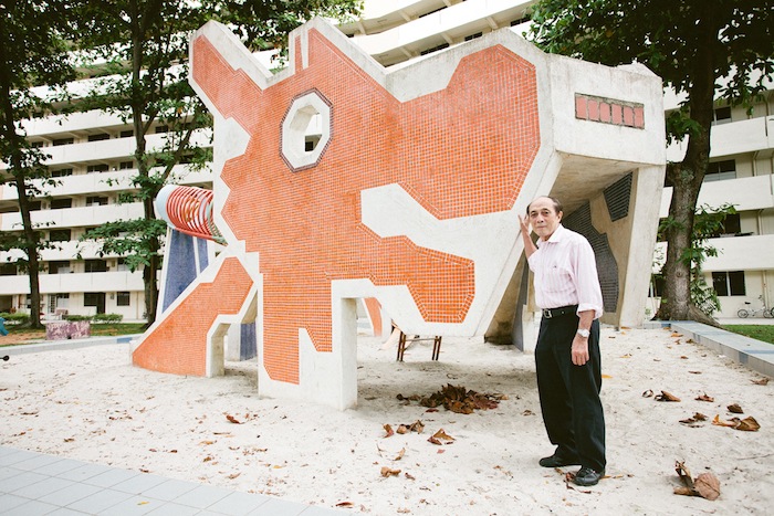
Dragons, those harbingers of growth and vitality, are twisting through Singapore once again. A design icon once ubiquitous in this city, the “Singapore dragon” is an angular, pixelated head with one octagonal eye. The rudimentary logo was conceived in the late 1970s, when the former British colony, having gained independence in 1965, was still conjuring an identity.
The dragon was designer Ean Ghee Khor’s response. Tasked to create “Singapore playgrounds” for the government’s massive public housing program, Khor sought to imbue them with the nation’s personality by employing representations of local fruits and animals throughout them. Over the next two decades, across Singapore, it was the lively dragon of Chinese origin that became the playground model of choice. Since the 1990s, however, all but two of Khor’s playgrounds have been replaced by uninspiring, modular plastic units made by multinational playground companies. But of late his serpent is reappearing in a variety of forms.
Ean Ghee Khor in front of one of his playground dragons. | ZAKARIA ZAINAL
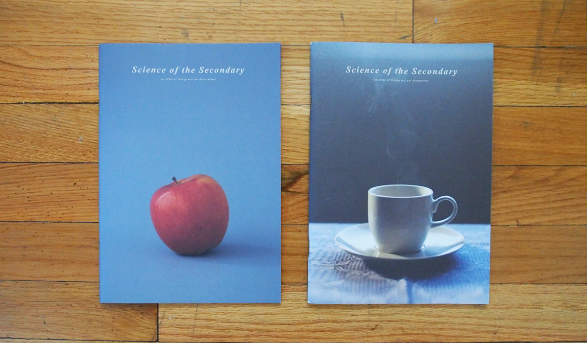
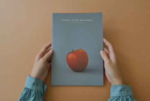
Launched in October 2013, “Science of the Secondary” promises to map an “atlas of things not yet discovered.” | ATELIER HOKO
Many of us experience the world primarily through our eyes. We are quick to make judgements based on how things look, while considering how they work is of secondary importance. It’s as if we can only see when we actually have four other senses: smell, hearing, taste, and touch.
“Science of the Secondary” is an on-going series of bi-annual booklets by design studio Atelier HOKO. The series aims to expand our narrow view of the world through a close examination of the everyday things that surround us. As if by teaching us how to read a new language, the first issue begins with the apple, taking the reader step-by-step through the seemingly mundane experience of eating this fruit. The Singapore-based studio (led by Alvin Ho and Clara Koh) draws out a series of unexpected insights that makes you chomp through the 44-page booklet in one sitting.
What is the role of each finger when holding an apple? Does the sound of crunching into an apple affect its taste? Why do we unconsciously bite into an apple in sequence? HOKO considers these questions and gives its answers by way of beautiful photography, illustrations, and short captions bound together in a handy comics-sized publication.
In May of this year, the duo released the second issue that looked at the cup and questioned the act of drinking. Alvin sums it up nicely in the introductory page:
“…but what does it mean to drink? Do we drink with our skin when the hands are hugging the cup? Are we drinking with our body posture while sipping earl grey in a team room? Are the ears drinking as we take each sip of the coffee? Can we consider the act of licking one’s lips drinking? Does the nose know that it is drinking as it hovers above the caramelised milk froth sitting atop a very large cup of coffee…?”
Although it may sound esoteric, Science of the Secondary’s content is meant to keep the general reader intrigued with plain, short captions, and by borrowing the visual language of science publications. Informative diagrams and photographic sequences give the duo’s observations and thoughts the weight of scientific objectivity.
More than just lessons about objects, one comes out of reading this series with a more mindful view of the world. Try closing your eyes for a moment to “see” — that’s how much more there is to the world than what lies in front of our eyes.
———– Written for Elizabeth Spiers and Chappell Elison’s Online Publishing class at D-Crit.
Self-publishing seems to be on the rise in Singapore of late. The secondSingapore Art Book Fair will be held this November, there are now two local Risograph presses — Push—Press and Knuckles & Notch — offering economical means of producing zines and publications, and more artists putting out books as works via events (Print Lab and The Yum and Dangerous) and through organizations like La Libreria. I’m curious as to what’s driving this trend of “art books”, which encompasses publications from artist books to catalogues and zines. For a start, here’s a list of some recent works, and who’s behind them…
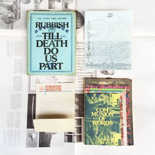
Rubbish Famzine 02 (2014) BY:HOLYCRAP DESIGN: HOLYCRAP NOTES: A magazine by this family art collective made up of Claire, Renn, Aira and Pann.
Being Together (2013) BY:John Clang DESIGN:DO NOT DESIGN NOTES: A catalogue created for photographer John Clang’s exhibition of the same name in the National Museum of Singapore.
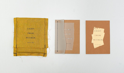
Light From Within (2012) BY:Melisa Teo DESIGN:Asylum NOTES: A book of photographer Melisa Teo’s four-year journey through the spiritual worlds of Buddhism, Hinduism and Shamanism.
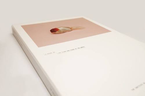
Science of the Secondary (2013) BY:HOKO DESIGN:HOKO NOTES: In this on-going series by design duo HOKO, each booklet dives deep into one object to look at how humans interact with it so as to uncover the science behind its “design”.
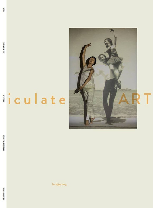
ARTiculate (2013) (Part of the TwentyFifteen.SG; Since 2013) BY:Tan Ngiap Heng DESIGN: Roots NOTES: TwentyFifteen.SG is an initiative by photography group PLATFORM to publish 20 photo folios by Singapore photographers to commemorate Singapore’s 50th anniversary in 2015. They will all be designed by Roots.
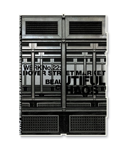
WERK No. 22: Dover Street Market Beautiful Chaos (2014) (Since 2000) BY:WORK DESIGN: WORK NOTES: WERK magazine has attained a cult following for how it takes fashion into the plane of art through the print and production experiments of founder Theseus Chan. The magazine regularly works with fashion brands such as COMME des GARÇONS and artists like Joe Magee and John Clang.
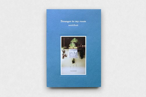
Stranger to my room (2013) BY:Sonicbrat DESIGN:Kitchen. NOTES: A music CD and art book package published by Kitchen Label. Founders April Lee and Ricks Ang have built a music label well-known for its “quiet music” and well-designed packaging. Each of the labels’ albums come with a photo art book that complements the listening experience.
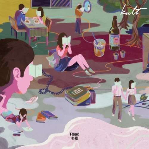
Kult Magazine: Read (2014) (Since 2009) BY:Kult DESIGN:Kult NOTES: A quarterly showcasing illustrations and visuals from around the world that respond to each issue’s theme.