My personal ode to the National Radiator’s Company AERO model.
———–
Written and recorded for Leital Molad’s Radio and Podcast class at D-Crit.
My personal ode to the National Radiator’s Company AERO model.
———–
Written and recorded for Leital Molad’s Radio and Podcast class at D-Crit.
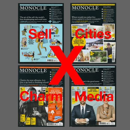
A monocle is a single eyeglass kept in position by the muscles around the eye. The same can be said of Monocle magazine, a publication fixated on how cities should all be built in style and for conspicuous consumption.
Since launching in 2007, this publication by journalist-turned-media entrepreneur Tyler Brûlé has become a celebrated design bible for urban planners and the elite. Before Monocle, creating an attractive city worth living in never seemed so simple and stylish.
From its format down to design and content, Monocle smoothens over the complex subject of urbanism in a smart and attractive-looking publication. It’s Brûlé’s vision of a cross between the The Economist and GQ, a perfect status accessory for the modern executive—best displayed when one is dressed in tailored suits and leather shoes.
Monocle calls itself “A briefing on global affairs, business, culture & design”, but each issue reads more like Brûlé’s personal travel blog (he is known to travel more than 250 days in a year) printed on uncoated stock — all 300 pages of it, including booklet inserts and advertisements. A glossy spirit of optimism pervades throughout this magazine stuffed with informative blurbs, clever lists, one-page profiles, as well as question-and-answer interviews. Whether it is a survey on the world’s most livable cities, an interview with a politician or a shopkeeper, or an advertorial on Samsung’s latest phone, there is little difference. Everyone and everything on Monocle is selling their suggestions in creating a better city. Nothing seems problematic, not even the fact that almost everything Monocle features as good examples of city living are unaffordable to the rest of the 99%.
Despite its marketing stance, Monocle tries to look like it is delivering on its promise of “quality journalism” through design and art direction. Its commissioned photography borrow the visual language of objectivity, while its illustrations project a sense of simplicity. Documentary style photos of places run alongside straight-up style portraits of business owners, shops and products, creating a veneer of honesty over the fact that Monocle is promoting them to readers. Many of the magazine’s illustrations of city life display a charming LEGO-like simplicity, rendered in a uncomplicated style of elemental forms reminiscent of Isotype. Like this international picture language, Monocle’s illustrations smoothen out differences and diversity within and across cities, falling back on outmoded national costumes and stereotypes to fit a trans-national universe the magazine is building. From page to page, the images and short texts are packed into a three-column grid creating a sense of sameness regardless of who, what or where, which only encourages reader to skim rather than read seriously.
Most telling of Monocle’s journalistic aspirations is the typeface the magazine and brand has chosen to be set in: Plantin. The magazine’s creative director Richard Spencer Powell wanted a nod to “old journalistic values”, and this early 20th century typeface also gives the brand instant tradition, reinforcing why Brûlé had picked the archaic object of the monocle as its name. Despite establishing such origins, Monocle is uninterested in practicing journalism the old school way. The profession’s cardinal rule of separating editorial from advertising is discarded because Brûlé once said that “all good journalists are good salespeople too”, and Monocle’s editors often accompany ad directors to sales calls. It shows. This magazine’s advertorials are difficult to distinguish from editorial content. The only indication is a “(Brand name) X MONOCLE” tag at the bottom of the page, an ambiguous line that could also read as endorsed by Monocle.
But this magazine has no qualms about mixing the two. It is good business for Brûlé, who is also chairman of the branding and design agency, Winkreative. Monocle is a great advertising platform for the agency, as editorial subjects such as the government of Thailand have become clients too. In Monocle, Brûlé has created a marketing darling that has been recognized by Advertising Age which awarded him “Editor of the Year” in 2011, as well as, Adweek which named Monocle the “Best brand for living the good life” in 2012.
This commercial success is undoubtedly Monocle’s great achievement in a print media industry puzzling over how to survive in the digital age and has made it a model for many publications to follow since. But it comes at a cost: real quality journalism that helps us understand cities as citizens and not just consumers. Unlike those who live in Monocle city, these are ideals most of us cannot afford to buy nor lose.
———–
Written for Rick Poynor’s Critical Takedown workshop at D-Crit. This essay was later published on Design Observer.
Exhibition Review: All Possible Futures
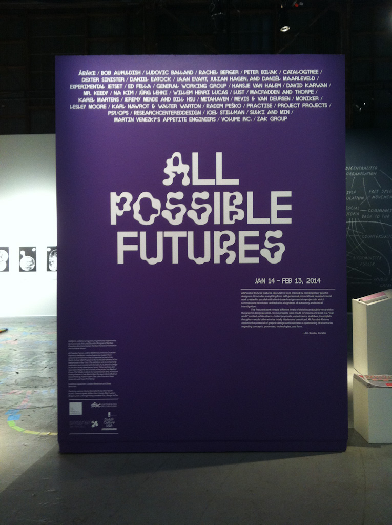
What if graphic designers could create whatever they wanted? Instead of having to design yet another cool brochure or please a client, how would they do things differently? “All Possible Futures”, a recent exhibition showcasing a collection of “speculative work” by contemporary graphic designers gives some answers.
While “speculative work” in graphic design traditionally refers to hypothetical creations for clients that offer little or no fees, curator Jon Sueda has redefined it as projects that question the boundaries of the profession. He compares it to “paper architecture”, which are small-scale prototypes built by architects to test and present new ideas. Similarly, through mostly prints, as well as some videos, publications and installations, this exhibition at the SOMArts Cultural Center featured the experimental ideas of 37 graphic designers and studios across the US, UK, Holland and South Korea.
A highlight of the exhibition was an “Unrealised Archive” by Sueda to document failed design proposals from different studios. This display of conceptually fascinating work accompanied by interviews with the designers on why their proposals were rejected frames Sueda’s observation that edgy and experimental graphic design work often dies in the hands of clients. In one instance, designer Mr. Keedy created an identity as a typeface made up of logos and text for furniture retailer OK so that its staff could assemble an unlimited combination of images to express its brand. However, this 1999 design was never implemented because the client only wanted a “simple logo” and “not everyone wants to be a graphic designer”.
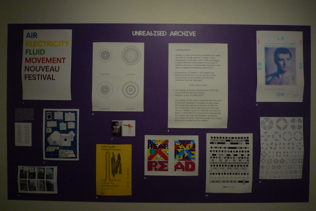
The works in the archive were telling of how clients (and most users) do not engage graphic design on this level, and why a lot of such work is bound for exhibitions like this. But it also shows that they are not always right. The idea of an identity as a system and typeface instead of a static image is now common place—as seen in the likes of the Walker Art Centre branding—and the profession is losing many intriguing ideas by depending solely on traditional forms of commission where clients and the market dictate what they want. It was this conclusion that led Sueda from just exhibiting an archive of rejects to include experimental projects by graphic designers in “All Possible Futures” too.
The expansion unfortunately relegated the archive to the back of the gallery, and the need to take an extra step to read the interviews from a single book meant most visitors probably missed the opportunity to rethink failed design proposals. However, there were plenty of other opportunities to look at graphic design beyond the surface, and consider how else it can be practiced. The rest of the works were spread across the open plan gallery and seem loosely arranged into four categories of experimentation: visual form, production methods, user participation as well as identity and representation.
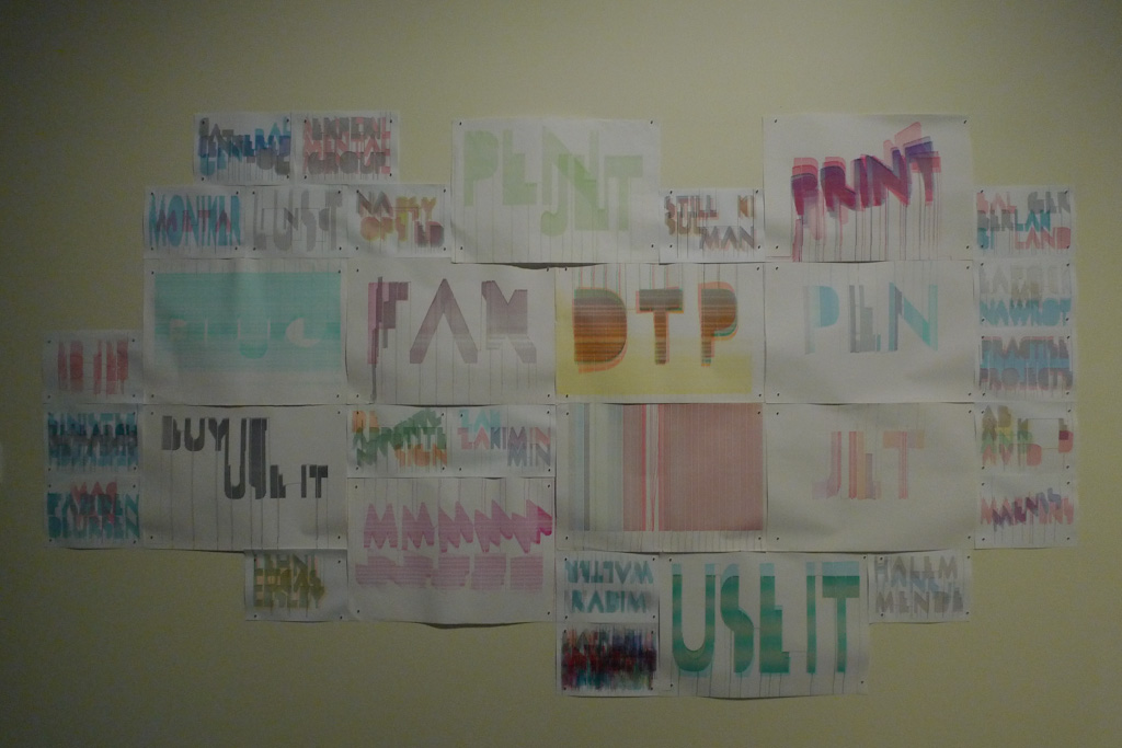
The largest collection, which filled up a length of the rectangular space, showcased the results of designers rethinking how to produce a work. Many of them involve making by hand, which may be a reaction to how graphic design production has largely migrated to digital screens nowadays. Dutch trio Jaan Evart, Julian Hagen and Daniël Maarleveld turn this issue on its head by combining the personal writing tool of a pen with a mechanical print head, and the resulting “PenJet” machine outputs 31 prints of crudely scrawled words from its Frankenstein-like creation. The interplay of traditional and modern design tools also appears across two separate projects by CatalogTree. The Dutch studio silkscreened a set of X-ray like posters and created another series of portraits resembling contour maps with 3-D scanning. Despite the different mediums, the uncannily similar prints of line movements in both demonstrate how two technologies separated by decades shared a common element of light.
")
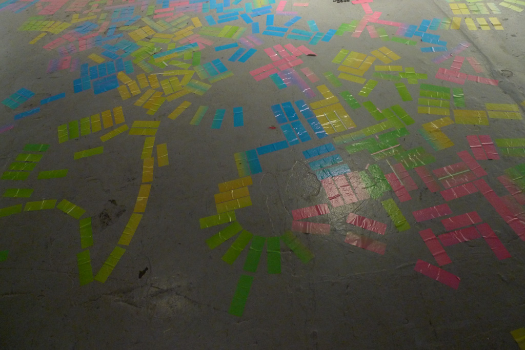
This “hacking” of closed modes of design production goes a step further in another set of projects in the middle of the gallery which look at how users can participate in the creation of graphic design. Demonstrating this on-site was Moniker’s “Polychrome Fungus”, a snaking trail of rectangular stickers pasted on the floor by visitors that together formed some kind of exploded rainbow. The resulting visual chaos mirrored how the democratization of graphic design with desktop publishing has made the scene more colorful, but not necessarily legible. Another project that suggested an active, but more meaningful role, for users was in Peter Bil’ak’s Works That Work magazine. Readers of this publication on unexpected creativity are offered discounts to help sell it wherever they live, helping the magazine bypass traditional distributors who are expensive for small-run publishers.
While projects that commented on the process of creating graphic design were fresh and mostly made in the last three years, the remaining two types of projects investigating the meaning of graphic design and its practice seemed a little dated in comparison. The set of experimental works on visual form contained abstract prints by Karel Martens done between 1990 to 2004 and also a poster as a roller ball that ResearchCenteredDesign came up with a decade ago. Similarly, the experimental work on identity and representation included projects such as Lesley Moore’s 2004 “LM Logo Machine”, where users can play with a palette of graphic elements to create this studio’s identity, and Daniel Eatock’s “An Idea for…”, a collection of text descriptions as design works done in 2007. Looking at these projects that date further back in time, one wonders about the omissions of other historically significant projects such as Rudy VanderLans’ Emigre magazine, which was pushing the profession’s boundaries when it was published between 1984 to 2005. Most of the exhibition featured the newest experimental projects of the studios rather than the most impactful, so the inclusion of work from further back seemed odd.
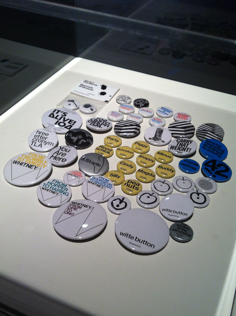
“All Possible Futures” sheds light on a small but thriving community of the graphic design profession today using the banner of “speculative work”. Many of the same projects featured have also been classified elsewhere as “critical design”. What is the difference? The exhibition does not tackle this question. Exhibition participant Experimental Jetset even calls this out with a Guy Debord-inspired piece, “The Society of the Speculative” button which sits amongst a collection from its other works, suggesting that anything can fall into Sueda’s categorization, so why single out these set of projects? Every studio produces its share of ideas, proposals, experiments and failed work—and many of the work in this exhibition were a part of this output rather than serious suggestions on how else to produce and practice graphic design in the future. But that is perhaps the true value of this exhibition, making visible a process usually invisible to the public, and demonstrating that design is very much an exploration of possibilities—a future arrived at rather than received.