Category: Design

Seeing Asian Design through Books

One of the biggest issues I’ve always felt about my understanding of design (and even the world) is it has been largely from the view of the West. Living in Singapore where English is our first language, I’ve easily gained accessed to the tomes (and tonnes) of writing about design from Europe and North America. Most of these are not only from the West, but are also about the West, as English-language writers and publishers are only just starting to take notice of the Asian design scene.

A hint that designers from my neighbouring countries might have something else to offer first came when I attended “The Way of Asian Design” forum in Singapore a few years ago, featuring Kirti Trivedi, Ahn Sang-Soo, Lu Jingren and Kohei Sugiura. Then, I chanced upon Kenya Hara’s Designing Design, one of a select few English-language publications from an Asian designer. At the beginning of this year, I discovered Chinese translations of Japanese design books on a trip to Taiwan, and I immediately bought them—assuring myself that my rusty Chinese language I picked up in school would hold me in good stead.

It barely did, especially since the books were in Traditional Chinese script, and I learnt the language in Simplified Chinese. Nevertheless, I’ve trudged through a few volumes of these Chinese-language design books along with other Asian design books over the year and here are some things I’ve picked up, accompanied by interesting related links:


Asian-Design-Books
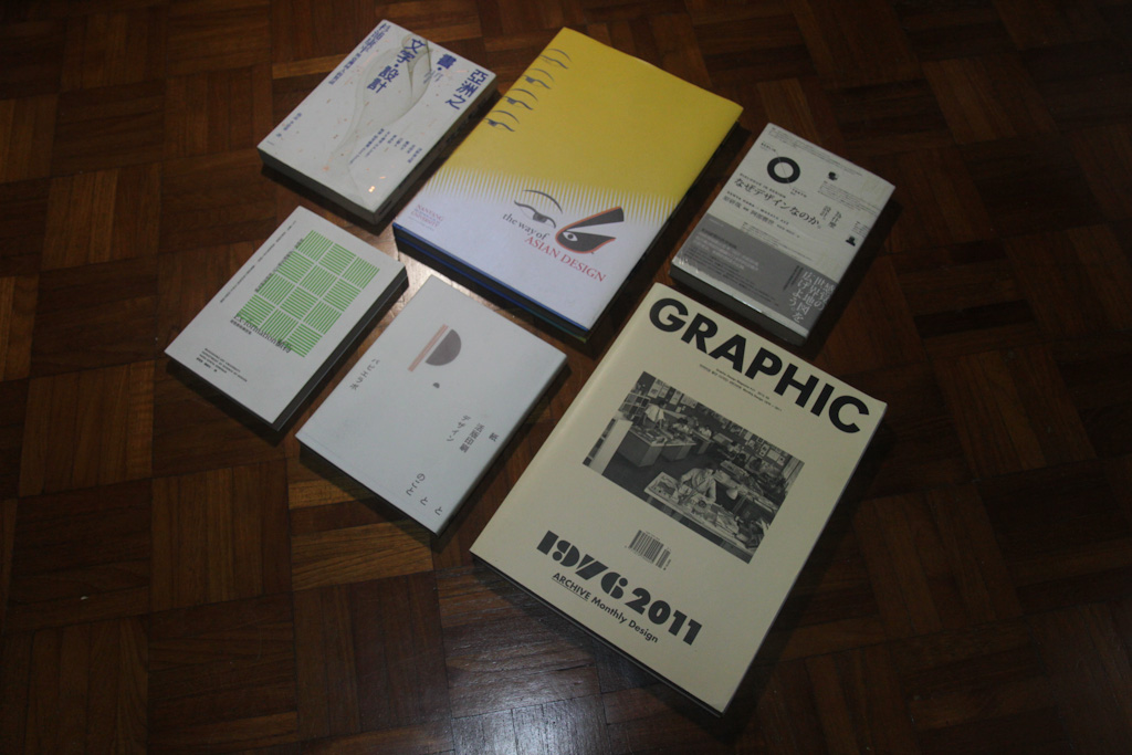
Clockwise from top left: Books, Text, and Design in Asia (2006), The Way of Asian Design (2010), Dialogue in  Design: Kenya Hara x Masayo Ave (2009), Graphic Design Magazine #21 (2011), Papier Labo (2010), and Ex-formation: Plants (2008).

Books, Text, and Design in Asia (2006) (亚洲之书。设计。文字)
This volume contains the conversations between Japanese designer Kohei Sugiura (杉浦康平) with his contemporaries from Japan (Tsuno Kaitaro 津野海太郎), India (Kirti Trivedi, and the late R.K. Joshi), South Korea (Ahn Sang-Soo 安尚秀 and Chung Byoung-kyoo 郑丙圭), Taiwan (Huang Young-sung 黄永松), and China (Lu Jing-ren 吕敬人).  Each of them have been picked by Kohei because he feels they dig deep into their cultural roots to design, particularly in their typography work and books.

The conversations mostly revolve around the history of craft and culture in the respective countries and how each designer has tapped into that for their design work. One becomes aware of the possibilities when designing in the language of a particular culture; and it struck me that the traditional Chinese character is both a graphic and word that represents what it means, which is unlike the Roman alphabet that makes up most of our modern-day languages.

The Way of Asian Design (2010)
This is the printed volume of the proceedings that went on during a forum held in Singapore in November 2007. Four Asian designers—Kohei Sugiura, Ahn Sang-Soo, Lu Jingren and Kirti Trivedi— shared their design philosophies and showed how their work were underpinned by the region’s cultures and beliefs. Like during the forum, the speeches have been  translated into English, which makes it very useful for those who can only understand Asia through this language.

A standout speech was Kohei’s design philosophy of “one in two, two in one” and “one in many, many in one”, which he attributes to how ancient sages in China and India thought how the universe works, thus the concepts such as  Yin and Yang. In Kohei’s case, he compares a book to a universe, which hosts a multitude of characters, stories and elements in a single form, thus  “one in many, many in one”. The structure of a book can also been seen as many pairs of pages that extend left and right to top and bottom; and this he says represents sky and earth, beginning and end, past and future. Yet, when the book is closed, this duality becomes one, thus “one in two, two in one”.

Summa Cosmographia (1979). Click on the image to see how Kohei has designed, literally, the entire book.

Kohei then extends this design philosophy to the reader too. He says, “…We readers of books have bodies that reflect this same duality, with the left half and right half. When we pray we join our hands together. In doing so, we unite the right and left sides of our bodies into one. Our body hosts one heart, and this one heart is what we offer together with our prayers.”

It is in this view that guides how he designs his books, which unlike contemporary zen-like Japanese designs are full of colour, details and possibilities—and got me re-thinking what I thought I knew as Japanese design.

Dialogue in  Design: Kenya Hara x Masayo Ave (2009) (为什么设计:原研哉 对谈阿部雅世)

Moving from an older Japanese designer to two contemporary ones, this is another conversation-drive book that revolves around Kenya Hara and Masayo Ave, who travelled between their bases of Berlin and Japan to chat about design in the two countries, society and their personal lives. There is certainly a thread here amongst these Japanese designers regardless of generations: how they see design as integral to the way they live. They don’t see it in terms of its “value-add” or how well it sells, or whether it is aesthetically beautiful. To them, design is an expression of values, which makes it such a personal and powerful endeavor.

Reading the conversations between the duo, I found it curious that the Japanese feel design in their country is too insular and needs to make itself understandable to the global arena to survive. Ironically, this is the reverse of what I have been thinking about Singapore, where design is so attuned to globalisation that it has no voice of its own.

GRAPHIC #21 (2011)
Papier Labo (2010)

These two books are really photo books for me because both are in languages I do not understand.

GRAPHIC is an independent South Korean design magazine started in 2007, and is now trying to reach out to the world by publishing both in Korean and English. The issue I got was Korean-only because it is an “archive” of another Korean magazine, DESIGN, which it regards as a pioneer of the community, having been publishing since 1976. It’s a fantastic flip through 400 of DESIGN’s covers and a selection of Korean works that together paint how the scene has evolved. Unfortunately, I ‘m not able to read the essays, which I can only imagine help to make this issue of GRAPHIC, a significant one in understanding its country’s design history.

As for the Japanese-only Papier Labo book, I gathered from online that it is a custom printing press formed in 2007 in the Sendagaya area of Tokyo, and this is a book that documents the work that goes into this studio. I was simply struck by how beautiful the book is as an object, as well as the photography of the works they have created and studio life.

Ex-formation: Plants (2008) (Ex-formation 植物)

This is essentially a report of the 2007 edition of Kenya Hara’s Ex-formation project, an annual research he conducts with students at the Musashino Art University in Tokyo to understand how little we know, to question what we think we know and understand. For this edition, the group explores the theme of “plants” and they design a series of projects that present us new ways of looking at them as silhouettes, food, products, and colours—which makes the book a delightfully unexpected page-turner.

———–

If you know of other Asian design books worth checking out, do drop me a comment. I understand Jamie Winder and Iain Hector from Where You Going? are already working on a book about Southeast Asian design after traveling through this area, so that should be something to look out for.

A Pioneer of Singapore Graphic Design

Two years back, I wrote about Mr William Lee (李秀镌), a graphic designer who has created corporate identities and logos for many Singapore companies and organisations. Since then, I’ve chanced upon more material that gives a fuller picture of his contributions to Singapore’s design scene.

Before William set up Central Design, an independent advertising and design agency in Singapore,  in 1969, he is said to have attended a Chinese-language school here before heading to Australia to be an architect. However, he dropped out of it to study graphic design, spending 12 years learning the profession via work-cum-study in Australia, Amsterdam and London. He began by obtaining a Certificate of Art in Australia before heading to Holland where he got a Diploma of Advertising and Typographical Design. William then left for London to study in St Martin’s College of Art, eventually receiving a National Diploma in Design. For the next seven years, he worked in a leading advertising agency in London as an art director before finally returning to Singapore to set up shop.

He seems to have started out by designing stamps for Singapore. Soon after setting up Central Design, he was invited to submit stamp designs for a commemorative issue on ‘Shipping Development’. This series of three stamps issued in 1970 were his first of many designs.

52j 52h (1) 52h
Singapore Shipping (1970) from CS Philatelic Agency

In an interview with the magazine Stamp Monthly, he said his motivation to design stamp  came from a meeting with a philatelist in London who commented that Singapore stamps lacked colour and attractive designs. The shipping stamps he did led to his first big break: a commission to design an issue of stamps for the Commonwealth Heads of Government Meeting held in Singapore in 1971. This was perhaps one of the most significant events held in the young Republic, which had barely turned six years old. Such high-profile work brought him much attention both internationally and locally, and it became an accolade that would be brought up again and again in his career. In an interview, he said, “This series gave me personal satisfaction as it brought Singapore stamp designs to international standards.”


1971 Commonwealth Heads of Government Meeting from CS Philatelic Agency
Satellite Earth Station – Sentosa Satellite Dish (1971) from CS Philatelic Agency

But from a creative standpoint, another stamp design he did that year was much more worthy of attention. For the opening of Singapore’s first Earth Satellite Station, he used a full illustration of it over four stamps of different values—something never done before in stamps issued in Singapore.

With the memory of the Commonwealth stamps barely faded, the soon to be launched Singapore Airlines (SIA) came knocking on his doors in July 1972 with a job to flesh out their corporate identity designed by Walter Landor of San Francisco. William became the first local designer to handle creative work for the national carrier, SIA, and in over two months, his  agency of 30 workers churned out over 600 items including brochures, tickets, baggage tags, office signs, passes, letterheads, etc.

Having worked on arguably the two biggest design jobs available in the ’70s within just three years of setting up, William became known as the Singapore graphic designer. He was regularly in the news on design-related matters, and even his sojourns to to Europe to study “the latest advertising techniques” were reported in the press. His clients over the years have reported to be multi-national companies from England, Japan and America. These include Akai Sound Systems, a Japanese electronics firm, as well as Mark Holdings, a wholly Japanese-owned trading company that brought in Swiss watches including Longines, Eterna, Ulysee Nardin and Rotary.  In 1974, Longines of Switzerland even presented him a special award for outstanding creative work on their account!

As the Singapore economy boomed though the ’70s, William built up a body of logos for a variety of local and international businesses as well as government organisations. These include the Post Office Savings Bank (1972),  Shangri-La (1975), Singapore Bus Service (1978) and United Overseas Land (UOL) (1979).

SBS

POSB, Shangri-La, SBS and UOL logos from Singapore Visual Archive

As his business grew, William did less and less stamp designs, eventually stopping completely around 1980 after designing 16 series of commemorative stamps. However,  he made a comeback for the 25th anniversary of the NTUC in 1986 because he loved the challenge of designing stamps.

25th Anniversary of NTUC from CS Philatelic Agency

To honour his design services for the state and community, William was decorated with the Public Service Star by the late President Sheares in 1975, and the Friend of Labour medal by the National Trades Union Congress (NTUC) in 1982.

Given the period of his design education in the ’50s and ’60s, it seems William was a designer trained in the modernist way of thinking. When asked what defined a good logo, he said it had to be simple, yet striking as it is international. He was also known to advocate the use of white space. In the early 1970s, he observed that local designers often copied designs they saw in magazines and newspapers, and his advice to them was, “They must learn to be original.”

Not much is heard of William or Central Design after the mid-1980s, which by then would have been close to two decades old. Perhaps his agency was affected by the 1985 recession?

William is believed to be alive and well today, but has not made himself contactable. He once said, “I like to be alone but I’m never lonely. I have so many other interests like fishing, music and antiques, to keep me busy.”

Look no further for the things that matter

Neighbourgoods is a new product label by six-year-old Singapore graphic design studio ampulets that seeks out the beauty and honesty of everyday life. I recently e-mailed co-founder James Teo to find out more about what this label started in May is all about, and its upcoming product launch at the end of November.

How did Neighbourgoods come about?
Every year towards the Christmas season, we try to make a little something to share with friends and clients of ampulets design. Over time, these independent projects became more and more ambitious… they went from T-shirts to a lamp, something involving an axe, origami turtles, to an embroidered handkerchief. That was when we realise that these projects and their stories can have a life of their own. Plus we wanted an excuse to make friends and collaborate with the many talented people around us! And so Neighbourgoods was born .

Tell us about how your first product, “Goodbyetime”, came about.
“Goodbyetime” << started as a short short story Yvonne (my wife) wrote many years ago. She had always wanted to make illustrations to go with it, but she finally asked me instead to come up with my own interpretation. And it is exactly as described on the “Goodbyetime” bellyband; the photographs that I took from my studio’s windows are my witness to time passing – but in contrast to the fast disappearing time in the story, they are a witness arising from slowing down to look and enjoy the world around us. We made it into a “calendar”, although there is no indication of days on it, only months – so if you wanted, you could very slowly savor the story, one page a month. And with the French fold and the newsprint, I kind of envision them like pages of a wall calendar flapping in the breeze, revealing images we otherwise would not see.

Even before Neighbourgoods, you’ve created “objects” annually under ampulets. Can you tell us a bit about each?
“Turtle Time” (2009) >> is like a companion piece to “Goodbyetime”, but about how time crawls. It is a poster made up of 12 illustrations by Yvonne on one side, and a typographical representation on the other. It came with instructions to fold your own giant origami turtle, either with the illustrations or the type as a pattern for the shell.

“Good Sweat” (2010) came about when a young man asked us for our advice on his career plans. He was torn between what seemed practical (what his parents wanted for him) and what he was passionate about. As we listened to him, the first thought that came to our minds was this phrase: “做甚麼都好,用心做就好” (‘It doesn’t matter what you do, as long as you put your heart into it’). We decided to embroider this piece of advice on handkerchiefs, an object you would keep close to you to wipe away your sweat (or tears) as you work hard towards your dream.

ampulets_folded verseThe things we made were all somehow related to text, and they are sort of preachy. For example, a project we really liked was << “Folded Verse” (2009), a series of 10 T-shirts with each bearing a word from this Chinese couplet “所羅門的衣,不如百合花” (Solomon’s clothes are not more splendid than the beauty of lilies). We made two to three folds on each T-shirt before painting the Chinese character. For the wearer, the pattern is a puzzle of a Chinese character, yet even when you can decipher the character, its full significance is only realized in the context of the phrase. We wanted to mimic a parable, whose meaning is only revealed to the listener who seeks the truth. It is a reminder to not worry about what we eat or wear, but to trust in a God who created this beautiful earth.

It seems to me some of these earlier products can easily go under the Neighbourgoods label. There’s a common thread about honest values in life, e.g. hard work and enjoying a slower pace of life. Why do you want to communicate such values?
Because they are important! There’s a “get-rich-quick” and a “short-cut” mentality, not only in Singapore, but in any city where an oppressive materialism prevails and efficiency is mistaken as good. As a result, people often forget to take pride in what they do, the values they stand for, how we live.  Whatever is created from this kind of environment does not last. In contrast, the best things in life are created through time, by investing love and commitment. And the best things in life, what is beautiful and good, are also not far from us – the people we love, and the environments we choose to care for. We just have to slow down and appreciate them. We wanted to make things that will inspire and encourage the user with this simple fact. As you can see, we are preachy!

As primarily a graphic design studio, has it been challenging to create your own products? What are some of the issues?
Definitely challenging. As a graphic designer, we are not as familiar with people or companies in the manufacturing side of things. It’s especially difficult finding folks in somewhat lo-fi/craft areas, people who can or want to bend wood, weave fabric or sew a pocket square. Even if it can be done, cost and affordability for a small-scale production becomes an issue. We hope to ferret out more such crafts people in time and welcome any “lobang” that people may know of in Singapore.

IMG_2102


For example, for the first “Good Sweat” project, even after we finally gave up creating our own printed textile, it was some time before we found the right fabric and someone willing to go that extra mile to sew and embroider 100 handkerchiefs. He was an old friend who had made the radical switch from the bio-sciences industry to bespoke tailoring. Another friend in manufacturing had sourced factories in China, but we wanted to make it all in Singapore. We also wanted to be 100 per cent sure of the quality. Graphic designers are anal lah. Haha.

It seems part of the label’s mission is to revive craftsmanship in Singapore. Why the interest in this?
We are not so ambitious! But people who work with their hands need intelligence, perseverance, and character. It is humbling work. And we respect people who take pride in doing something well, however humble that work may seem.

There is a hyper-local ethos in the label: wanting to look at what is around us and choosing to work with people in the neighbourhood. This is in contrast to the more “international outlook” that many Singapore brands aspire for. Could you talk more about how this came about and why you are heading in this direction?
We live in Toa Payoh and even after 10 years, we are still discovering things about the place and our neighbours. But Neighbourgoods is not really about a specific local geography. We are not closed to working with people outside of Singapore, or promoting Neighbourgoods overseas. In fact, there are so many people in Taiwan and Japan we admire for how they take pride in their work, living, heritage and community. So I would say Neighbourgoods is not against an “international outlook”. It’s about taking the time to know, appreciate and make better your immediate environment and community, where you are or where you have come from, instead of constantly wanting to be someone or somewhere else.

There is also a very practical consideration. I am claustrophobic and really dislike plane rides!

Can you tell us more about the upcoming Good Sweat No. 2-6. What can we expect? How did you pick your collaborators?
We had positive response about “Good Sweat” (2010) and its message, including people who asked to buy it. So in the spirit of Neighbourgoods, we decided to bring back Good Sweat!

The goal is the same. “Good Sweat #2-6” aim to give a little encouragement and inspiration to people whenever they feel tired, lost or disillusioned in their daily lives.

But this time, we invited four creative individuals in Singapore to share something that they live by.  They are people who have inspired us with their values and attitudes towards work and life. So we thought it would be great if they could also encourage or inspire others through Good Sweat.

There are altogether five handkerchiefs (including one from ampulets, we couldn’t resist) made from high quality Egyptian cotton. Each design features an embroidered phrase, and is produced in a limited edition of 100 only.


FB_image1

Look for the stories and five handkerchiefs featuring words from photographer Bob Lee; Rebecca Toh  (aka. Casual Poet); Yah-Leng Yu of Foreign Policy Design; Jackson Tan from Phunk/ Black Design; and ampulets. We won’t say too much – you can read about their inspiration and phrase on the website and on the packaging, when they are launched soon.

The handkerchiefs are available for $30 each starting 7 December, and $28 if you pre-order or purchase it at the 29 November launch. Write to us at info@ampulets.com if you are interested, and look out for the launch details on the Neighbourgoods Facebook and site. All of us involved agreed that after covering the cost for the fabrics and bespoke tailoring, we would donate the remaining proceeds to a worthy cause.