Tag: AIGA

Lessons in the “New Ugly” School of Design

“If we always follow the rules set by designers who lived in the 20th century—but we live in the 21st century—then what are we blindly following?”

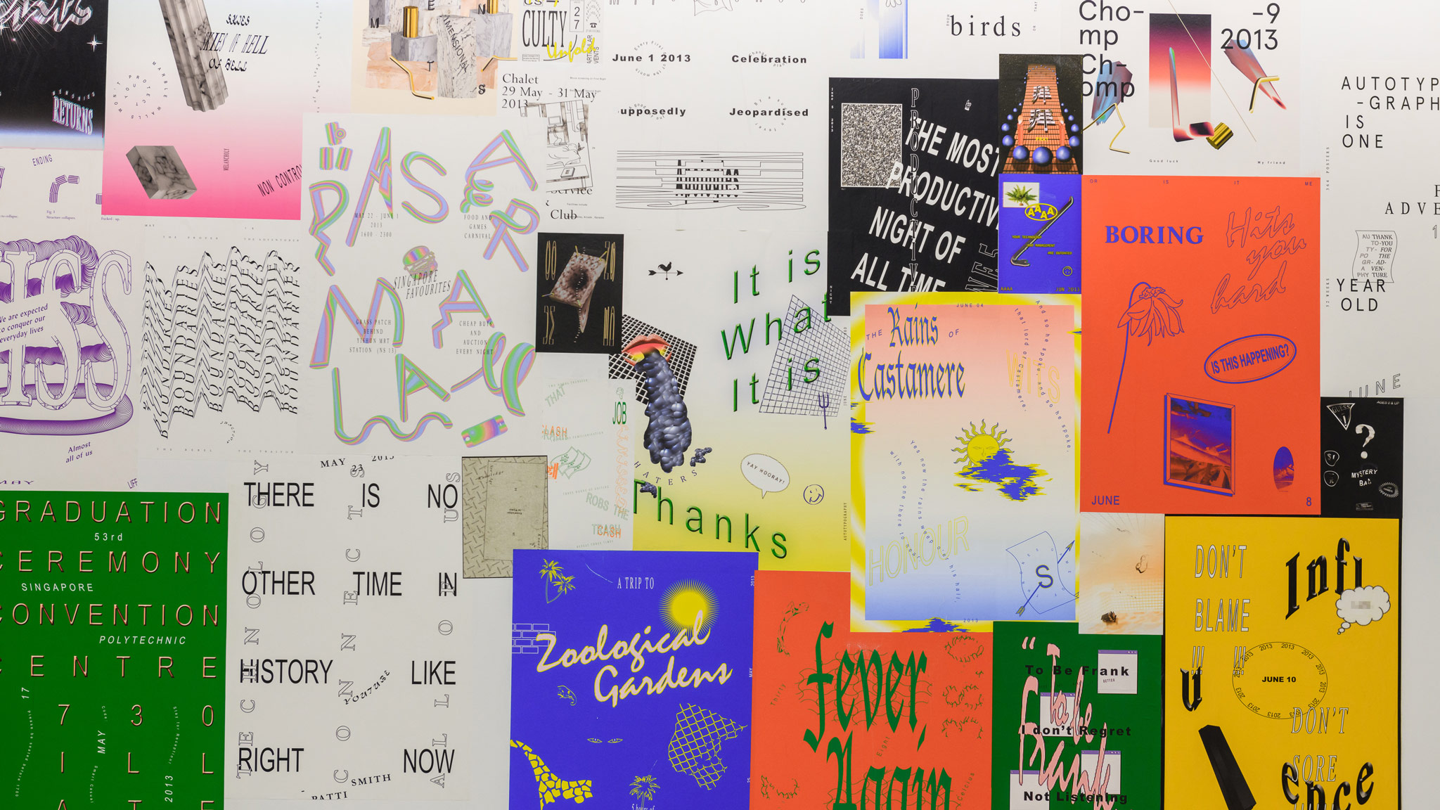
Sometimes the best projects start on a whim. Just ask Singaporean graphic designer Darius Ou: his Autotypography project started six years ago while he was bored at design school, and has since evolved into a collection of 365 posters that have found their way into college study materials, and now are showing as part of the Dissolving Margins exhibition at Lasalle’s Institute of Contemporary Arts Singapore.

Autotypography was born when Ou decided to create one A4 poster a day. Over a year, this “visual diarrhea” of his life—hence the wordplay on “autobiography”—evolved into a “semiotic playground.” At the beginning of the project, Ou experimented with breaking the cardinal principles of “good design” because it looked “cool”—from stretching typefaces to blending amorphous forms—but midway through, the project turned into more of an inquiry into visual culture. Autotypography helped propel Ou to becoming one of the foremost proponents of the “new ugly” in Singapore.

➜ Read the full story in AIGA’s Eye on Design

What Hitting Rock Bottom Taught Singapore Studio Liba About Love and Design

Handbook for TELC. Courtesy LIBA

Two years into running his graphic design studio Liba, Aaron Wong hit rock bottom. “Business was so bad to the point that I started to doubt whether my beliefs made any sense,” he says. “I was looking at a project and wondering, does the aesthetic not fit? Is my way of working not valuable to clients? Or, is it that I’m just not good enough?”

It didn’t help that Wong was working solo for the first time and felt uncertain about practising in Singapore after returning from a two-week summer school in Europe. During the revelatory ISIA Urbino / Werkplaats Typografie course he’d seen a “different synergy” that he felt would be compromised back home. Liba’s financial struggle seemed only to confirm this: Wong’s dogged pursuit of process and having a point of view—key takeaways from his stopover in Europe—were not working out in what he saw as Singapore’s trends-driven, solutions-based market.

➜ Read the full story in AIGA’s Eye on Design


Tracing 20th Century Aussie Graphic Design: A Blend of Modernism + “Relaxed Irreverence”

Metric conversion (1977) stamps by Bruce Weatherhead and Alex Stitt. Courtesy Re:collection

Around ten years ago, designer Dominic Hofstede witnessed the induction of veteran practitioners Alistair Morrison and Geoff Digby into the Australian Graphic Design Association’s Hall of Fame. He realized he knew next to nothing about the pair; then discovered there were very few resources around to change that.

That’s how Australian graphic design archive Re:collectionwas born. “I began a fruitless search for information on their careers. There was a dearth of research relating to not just them, but Australian graphic design history in general,” recalls Hofstede, now the design director of MAUD Melbourne, and who previously ran his own studio for almost two decades.

What started as a personal blog has since grown into a resource featuring more than 200 works including books, posters, album covers, stamps, and other miscellany painstakingly sourced from personal collections, secondhand shops, and eBay. These are displayed alongside biographies and articles focusing on Aus [pronounced “Oz”] graphic design from the years 1960-1990.

Read the full story in AIGA’s Eye on Design