Tag: D-Crit

Monocle magazine: Advertising its singular view of the city

Monocle-SCCM2

A monocle is a single eyeglass kept in position by the muscles around the eye. The same can be said of Monocle magazine, a publication fixated on how cities should all be built in style and for conspicuous consumption.

Since launching in 2007, this publication by journalist-turned-media entrepreneur Tyler Brûlé has become a celebrated design bible for urban planners and the elite. Before Monocle, creating an attractive city worth living in never seemed so simple and stylish.

From its format down to design and content, Monocle smoothens over the complex subject of urbanism in a smart and attractive-looking publication. It’s Brûlé’s vision of a cross between the The Economist and GQ, a perfect status accessory for the modern executive—best displayed when one is dressed in tailored suits and leather shoes.

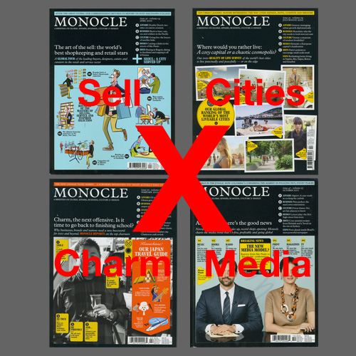
Monocle calls itself “A briefing on global affairs, business, culture & design”, but each issue reads more like Brûlé’s personal travel blog (he is known to travel more than 250 days in a year) printed on uncoated stock — all 300 pages of it, including booklet inserts and advertisements. A glossy spirit of optimism pervades throughout this magazine stuffed with informative blurbs, clever lists, one-page profiles, as well as question-and-answer interviews. Whether it is a survey on the world’s most livable cities, an interview with a politician or a shopkeeper, or an advertorial on Samsung’s latest phone, there is little difference. Everyone and everything on Monocle is selling their suggestions in creating a better city. Nothing seems problematic, not even the fact that almost everything Monocle features as good examples of city living are unaffordable to the rest of the 99%.

Despite its marketing stance, Monocle tries to look like it is delivering on its promise of “quality journalism” through design and art direction. Its commissioned photography borrow the visual language of objectivity, while its illustrations project a sense of simplicity. Documentary style photos of places run alongside straight-up style portraits of business owners, shops and products, creating a veneer of honesty over the fact that Monocle is promoting them to readers. Many of the magazine’s illustrations of city life display a charming LEGO-like simplicity, rendered in a uncomplicated style of elemental forms reminiscent of Isotype. Like this international picture language, Monocle’s illustrations smoothen out differences and diversity within and across cities, falling back on outmoded national costumes and stereotypes to fit a trans-national universe the magazine is building. From page to page, the images and short texts are packed into a three-column grid creating a sense of sameness regardless of who, what or where, which only encourages reader to skim rather than read seriously.

Most telling of Monocle’s journalistic aspirations is the typeface the magazine and brand has chosen to be set in: Plantin. The magazine’s creative director Richard Spencer Powell wanted a nod to “old journalistic values”, and this early 20th century typeface also gives the brand instant tradition, reinforcing why Brûlé had picked the archaic object of the monocle as its name. Despite establishing such origins, Monocle is uninterested in practicing journalism the old school way. The profession’s cardinal rule of separating editorial from advertising is discarded because Brûlé once said that “all good journalists are good salespeople too”, and Monocle’s editors often accompany ad directors to sales calls. It shows. This magazine’s advertorials are difficult to distinguish from editorial content. The only indication is a “(Brand name) X MONOCLE” tag at the bottom of the page, an ambiguous line that could also read as endorsed by Monocle.

But this magazine has no qualms about mixing the two. It is good business for Brûlé, who is also chairman of the branding and design agency, Winkreative. Monocle is a great advertising platform for the agency, as editorial subjects such as the government of Thailand have become clients too. In Monocle, Brûlé has created a marketing darling that has been recognized by Advertising Age which awarded him “Editor of the Year” in 2011, as well as, Adweek which named Monocle the “Best brand for living the good life” in 2012.

This commercial success is undoubtedly Monocle’s great achievement in a print media industry puzzling over how to survive in the digital age and has made it a model for many publications to follow since. But it comes at a cost: real quality journalism that helps us understand cities as citizens and not just consumers. Unlike those who live in Monocle city, these are ideals most of us cannot afford to buy nor lose.

———–
Written for Rick Poynor’s Critical Takedown workshop at D-Crit. This essay was later published on Design Observer.

Planet Hillary: A great meme, not cover

Planet-Hillary

It looks like a head about to explode. Smack in the middle of a recent cover of The New York Times Magazine was the face of Hillary Clinton blown up into planetary proportions. This was for “Planet Hillary”, a story on the vast network of allies, friends and supporters that Hillary must manage if she was to successfully run for president in 2016.

Using the analogy of the universe, the cover turned Hillary into a planet surrounded by other cosmic elements such as “The Super-PAC Nebula” and “The Friends-of-Bill Black Hole”. While this concept sounds decent in theory, the cover looks less than stellar in reality.

Instead of resembling a celestial object, “Planet Hillary” looks more like a bloated orange juxtaposed against an image of the galaxy. The background is what defines the context and cover. It is also not immediately obvious whose face this is as we are only given a pair of eyes, a nose and a mouth to identify the subject. Even though the planet is the anchor element of this cover, it is the title, “Planet Hillary”, that tell us what we’re looking at.

Although some may take issue with this unflattering portrayal of the politician — and one wonders if there is an intention to poke fun at Hillary — the bigger problem is the cover is not very pretty. Not that all design has to be beautiful, but this looks like a crude rendering of the very first concept that came to the designer’s mind. Perhaps it was also a poor choice to use photography to execute this. It sets up an expectation of realism that is let down by how unreal this image looks. An illustrator might have been better in bringing out the fantasy universe this cover is trying to take us to.

The overall direction of this image also looks out of place with the style of Times Magazine covers. A glance through past issues show an intelligent use of photography and typography, as well as covers that have more depth and are open to interpretations. In contrast, the “Planet Hillary” cover is literal and one-dimensional, offering nothing more after the first look.

The one redeeming factor of this image is how absurd it looks — Hillary as a planet? While it fails to impress as a cover for the Times Magazine, its gimmicky visual messaging makes it prime for a few rounds of sharing and retweeting as just another slick Internet meme.

———–
Written for Steven Heller’s Researching Design class at D-Crit.

HHH: Vote for Hubert Horatio Humphrey!

HHH-Final

Just three letters said it all. In 1968, “HHH” could mean only one thing in the United States: Hubert Horatio Humphrey. He was the vice-president of the country, and more importantly, the Democratic Party candidate for the upcoming presidential elections.

503px-H_Humphrey

Like countless candidates before him, Humphrey’s face and name became integral visual elements of an election campaign. From picture posters to matchbooks, ceramic plates to calendars, and even cushions—Humphrey appeared everywhere and anywhere that year.

One of the cheapest and most widely available platform for advertising then was the button. Candidates gave out this small fashion accessory for free, and supporters who wore them became personal billboards for their campaign. The button is usually circular, although it has also been produced as tabs, lapels and other forms. Regardless of shape, the size of a button is always limited—typically ranging between 1 to 4 inches—so the message it carries has to be effective and economical.

LBJ

Recognizing what a mouthful his name was, Humphrey condensed it to “HHH” for the ‘68 campaign. He must have learnt from President Lyndon Baines Johnson, better known as LBJ, whom he had successfully run for office with just four years before. While the portrait of a candidate or his name was commonly used on a button since this marketing device was first introduced in the 1896 elections, the times were a’changing. As television took over the role of giving a face to the candidate from the 1950s, buttons could look more abstract. “HHH” not only fitted easily into a button, it combined to create a distinct logotype that was paired with different designs in various styles

This particular set of buttons have nothing else on them except “HHH” set in what looks like an extra condensed version of typeface News Gothic Bold. While the buttons of his competitor, Richard Nixon, came in the traditional patriotic colors of red, blue, and white, this set of Humphrey pins were unusual with their colorful mustard yellow and aqua green background. Perhaps it was a reminder of how Humphrey stood  up for the colored and was the main author of the Civil Rights Act. Or had the psychedelic ‘60s crept into the politics of this liberal candidate?

Additionally, these buttons do not match the official ones given out by the Democrats’ national committees. They could have been issued by local offices or commercial companies eager to cash in on the growing popularity of collecting campaign buttons. Just as how money and politics are so intertwined in the US, campaign buttons were commoditized. By 1973, a Hobby Protection Act was even enacted to protect collectors from imitation items that had flooded the market.

Several clues on these buttons suggest they are legitimate. Instead of having a separate safety pin on their backs, these buttons have bent pins integrated in them just like early designs. The edges of the buttons also have printed labels that read “Allied Printing”, presumably a historical union printer.

Pin+Allied

One thing is for sure: Humphrey’s campaign was unlike the orderly arrangement of the buttons’ design and their celebratory colors. In 1968, he not only struggled to overcome a Democratic party divided by the Vietnam War, the nominee kept coming up against angry anti-war protestors, which even led to police violence. Humphrey narrowly lost to Nixon, rendering “HHH” just another slogan of a failed presidential campaign.

———–
Written for Steven Heller’s Researching Design class at D-Crit.