“If we always follow the rules set by designers who lived in the 20th century—but we live in the 21st century—then what are we blindly following?”
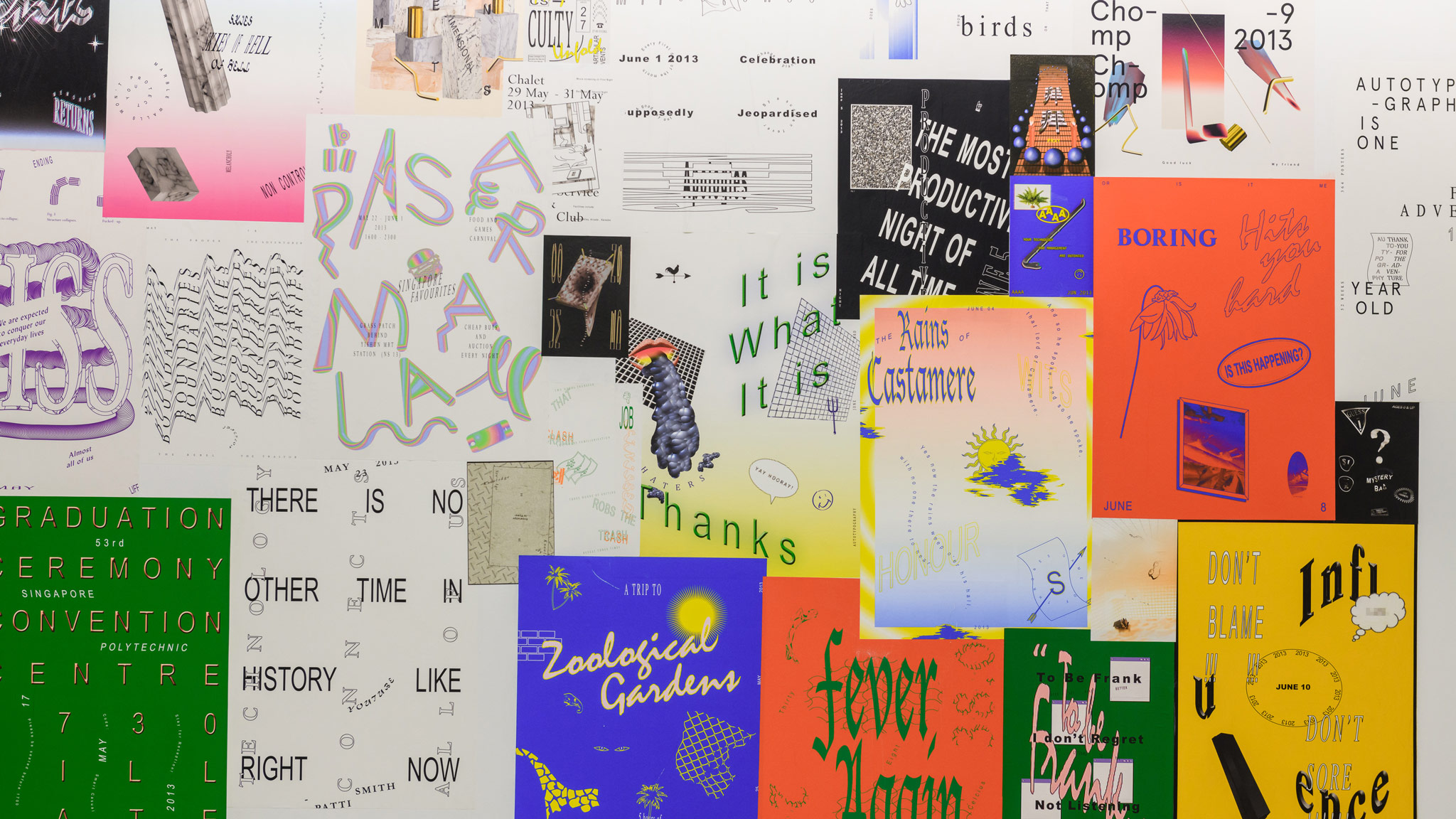
Sometimes the best projects start on a whim. Just ask Singaporean graphic designer Darius Ou: his Autotypography project started six years ago while he was bored at design school, and has since evolved into a collection of 365 posters that have found their way into college study materials, and now are showing as part of the Dissolving Margins exhibition at Lasalle’s Institute of Contemporary Arts Singapore.
Autotypography was born when Ou decided to create one A4 poster a day. Over a year, this “visual diarrhea” of his life—hence the wordplay on “autobiography”—evolved into a “semiotic playground.” At the beginning of the project, Ou experimented with breaking the cardinal principles of “good design” because it looked “cool”—from stretching typefaces to blending amorphous forms—but midway through, the project turned into more of an inquiry into visual culture. Autotypography helped propel Ou to becoming one of the foremost proponents of the “new ugly” in Singapore.
 Curiosity for what graphic design could be was the catalyst that first brought Currency together in 2012. Like many young designers, the Singaporean duo were connected by what they saw online. While their contemporaries picked up visual languages like modernist graphic design, Melvin Tan and Darius Ou were attracted to the emerging critical graphic design movement, led by the likes of David Rudnick and Eric Hu. Their shared interests sparked a Facebook conversation between the two students while they studied at different design schools, which eventually evolved into the ad-hoc collaboration of two freelance designers who come together as Currency as and when projects require.