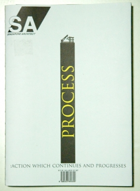
 It was by pure coincidence that I chanced upon the newly-revamped Singapore Architect,and despite being only remotely interested in architecture, I forked out S$13.90 for the magazine that claims to be “the only magazine, produced and written by architects, for architects, in South East Asia”. Even though the magazine was all wrapped up, I was sold simply by its cover, the binding and the theme of this issue.
The theme of “process” comes out very strongly in its cover. Using a graphic, an intriguing choice for an architecture magazine, the building process is deconstructed to its individual components: the land, the crane and the pillars that communicates the message in a clear and simple form. This deconstructive approach is also applied to the choice of binding: a stripped-down look — I think it’s called book spine stitching —that alludes to the process of making a magazine.
The coherence of the theme continues beyond its cover and into its layout beginning with a page, “Processing The New SA”, that is devoted to explaining the rationale and inner workings of the re-design. One detail I liked a lot was how I got to see covers that did not make it as it shows me the designer’s thought process. To top it off, even the magazine’s colour scheme follows the conceptual theme of “process” as it stuck to Cyan, Magenta, Yellow and Black — the four process colours of printing.
 The theme aside, I liked the new logo and how a third dimension as compared to the previous logo was added with the parallelogram. In a sense, architecture is about creating the 3-D form and the new logo communicates this very well. Moreover, the parallelogram behind “SA” acts as a very strong identifying symbol and is used at the end of all its articles.
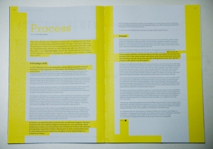
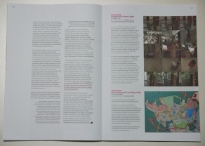
Here are just two peeks at the inside, I especially love the left one where the page and text are unified by the yellow colour because it is applied in a manner that serves as a hierarchy for the text too. While we would conventionally bold the sub-heads and separate the pull-out quotes, throughout this magazine, there seems to be a concious design choice of seamlessly highlighting them out instead with underlines, circles and in this instance, highlights. This is one trend that I’m increasingly seeing in publishing design, perhaps it just seems more poetic?
Published by Singapore Institute of Architects, the magazine’s redesign was done by Night and Day and its Creative Director is Kelley Cheng. Based on some Google searches, I believe Kelley is also the editorial director of another design/architecture magazine, iSH, and Page One. I am now wondering if Night and Day is actually the same bar and gallery opened by her and fellow architect, Randy Chan.

