Social media has been regarded by many as one of the most interesting and forceful expressions of Singapore’s General Elections (GE) 2011. This trend was predicted by several social media monitoring companies who used this once-in-five-years event to showcase their abilities to harness this internet chatter and make sense of it all. Their medium of choice for expressing the deluge of Facebook postings, tweets and blog posts and Foursquare check-ins? Information Visualisation. Here’s a quick run-down on three projects that ran during this GE.
Singapore GE2011 Tracker by Swarm and JamiQ
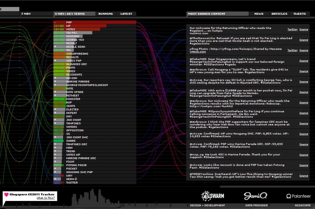
The infographic uses one of its most common elements — bars and charts — to track the rise and fall of what was “trending” during each day since elections campaigning began. If you actually match the infographic against a blow-by-blow account of the elections, I think you’ll probably get to see how certain topics played out on social media. The infographic also points you to the link that generated all the buzz. It was confusing to navigate at first because there was so much going on, but the amount of information it contains is also why it is the most useful amongst the three.
— — —
It’s Party Time! by Tribal DDB and Brandtology
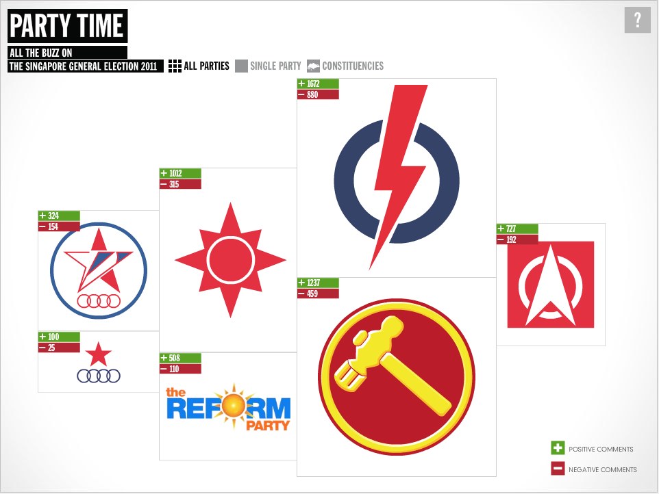
Clearly more irreverent and reader-friendly, this infographic attempted to track the ‘positive’ and ‘negative’ comments about the various parties as well as how much talk was going on about them online. This one also points you to the links generating the buzz. While it’s highly interactive and was fun to click around, there have been some concerns expressed as to how accurate it was to place a value on the data — as positive or negative — since this is done automatically.
— — —
onefiveseven by Thoughtbuzz and The Blue Bridge
The most straightforward of the three projects. This infographic provides you a directory to all social media related to parties, candidates and constituencies. This site also tracked location-based data, integrating the use of Four Square check-in during the rallies.
— — —
These three projects are the few major information visualisation projects that have appeared on the local scene, and it’ll be interesting to see if the medium is adopted to play a bigger role in understanding life in Singapore. I see this medium as an extension of infographics, which is playing an increasing role in our newspapers, especially seen in The New Paper. A more recent print project that uses has made use of this medium to look at this country is Singapore Transcripts, which graphically expresses data pertaining to the landscape here. This age of the information explosion calls for us to get a better grasp of all the data that’s flying at us, and information visualisation is a very useful tool to easily communicate to the masses important trends and forecasts.

