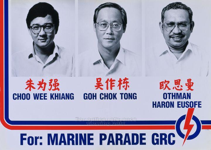
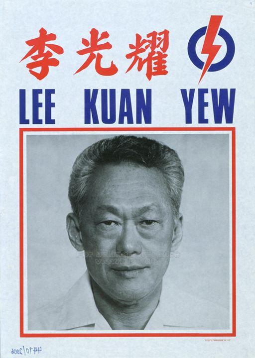
Here’s a sure sign that the general elections has begun: when elections posters start popping up all over your neighbourhood! Besides rallies and media reports, posters are the most visible form of an election campaign. These traditionally come in three forms, depicting the party’s logo, its manifesto, and the candidate contesting. This is a set from the People’s Action Party (PAP) General Elections campaign in 1980.


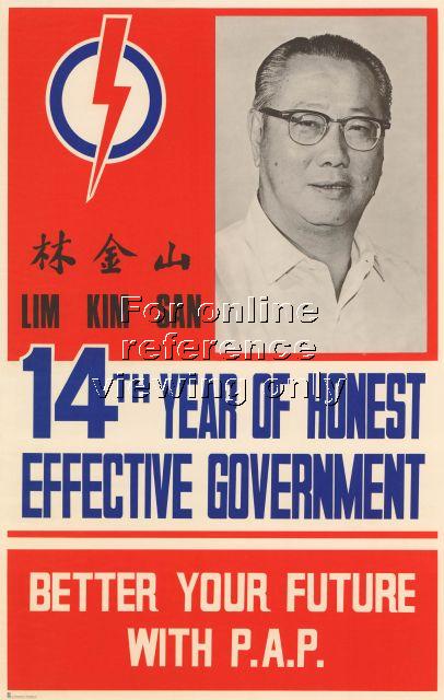
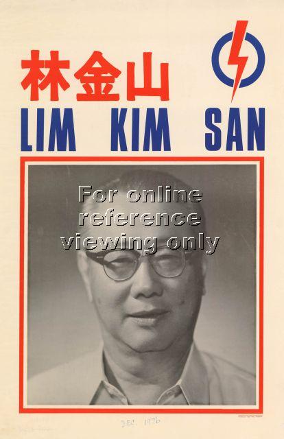
In the first of this two-part post, I’ll be looking at the manifesto posters of the parties since 1972. It starts from Singapore’s second post-independence election as it is the earliest poster I could find in the National Archive’s POSTERS Database, where I have got all the images from. In this 1972 poster of candidate Lim Kim San, the three elements of party logo, manifesto, and candidate are all rolled into one, but by the next election in 1976, posters came in three separate forms as depicted above.
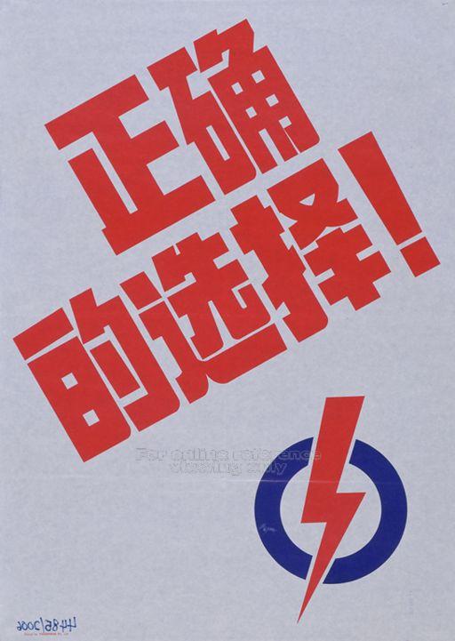
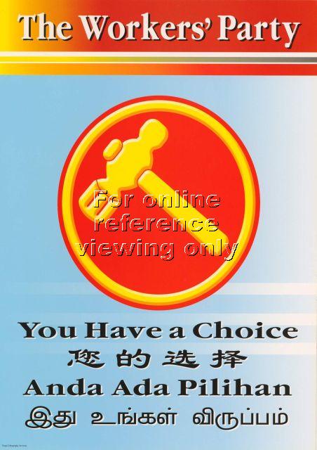
As with most visual culture for the public here, a unique element of election posters here is the use of Singapore’s four official languages. These are 1980 posters from PAP’s “The Right Choice” campaign.
Over the years, the PAP has used various visual forms to express its platform of material progress in its manifesto posters. The 1980 poster depicts its oft-used rhetoric of past versus progress, and so do the posters used in the next two elections of 1984 and 1988.


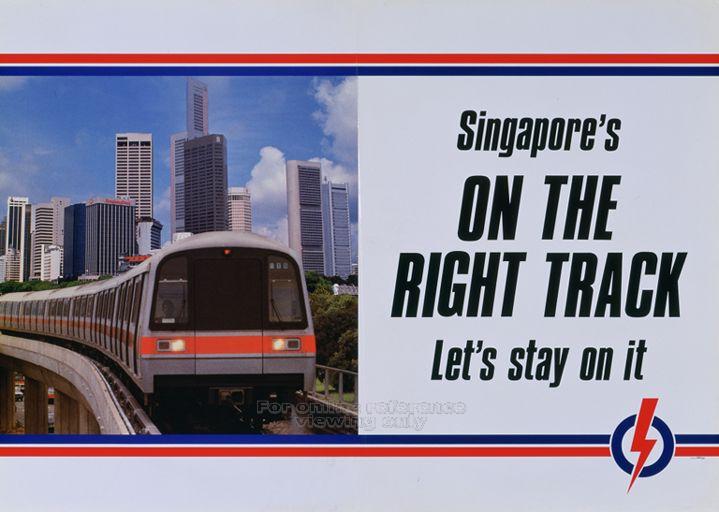
In 1988, the PAP also took advantage of the official launch of Singapore’s MRT system that year to come up a smart campaign poster.
The PAP’s election posters though the 1990s became more dull under the leadership of Goh Chok Tong.

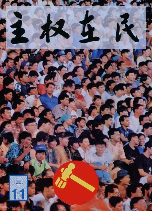
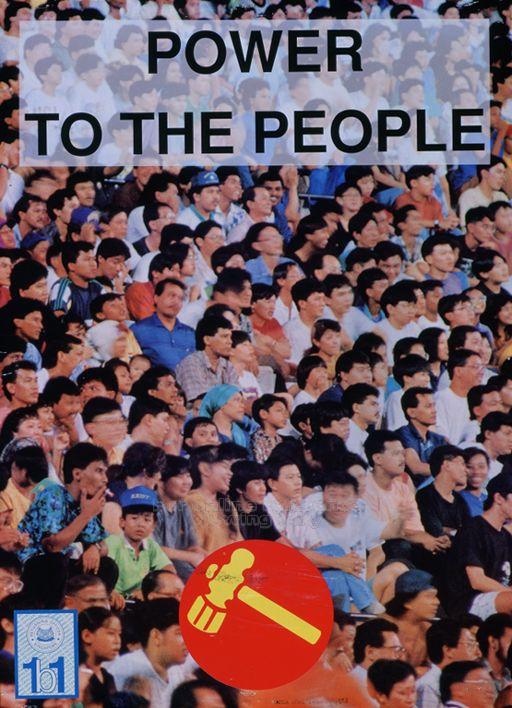
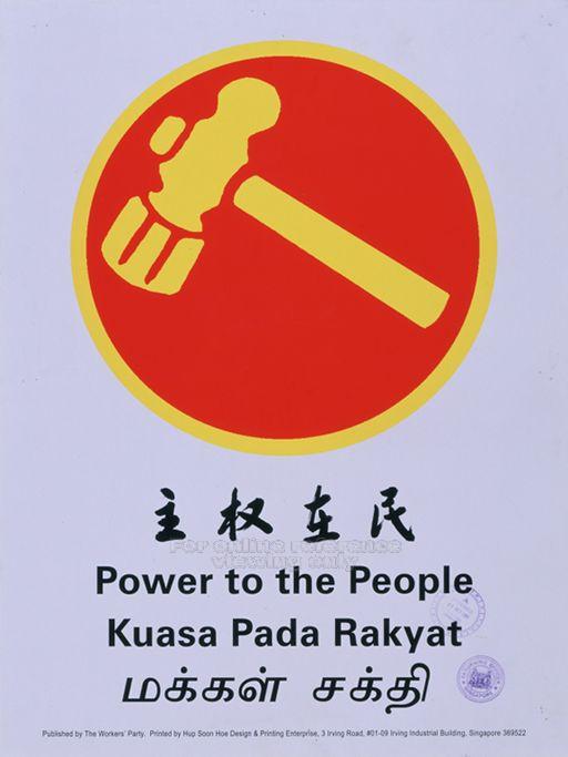
In contrast, posters of opposition party The Workers Party’s seemed to capture the voice of its leader J B Jeyaretnam, the first opposition candidate to break the PAP monopoly in the 1981 by-elections. WP’s slogan of “Power To The People” was easily translated into a powerful visual rhetoric as first seen in this 1991 poster. However, the photo used seems to be a stock photo of people in a Western country.

For the next elections in 1997, WP improved on this poster. The Chinese version with its forceful calligraphy matches memories of WP candidate Tang Liang Hong’s controversial speeches that got him labelled by the PAP candidates as a ‘Chinese Chauvinist’. After the elections, he got sued for defamation and has since fled Singapore.
Despite these highly memorable posters, the WP was unable to convince the people to power it into power, garnering only one Parliamentary seat in both elections. Perhaps, this was why it toned down its visual rhetoric in the subsequent elections. Moreover, the rise of Low Thia Khiang to become leader of the WP and the ousting of the fiery J B Jeyaretnam also ushered in a quieter form of politics as seen in these 2001 and 2006 posters.
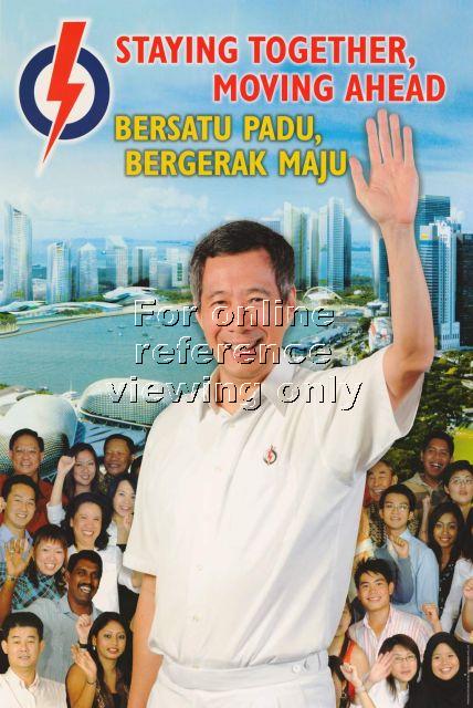
The PAP has also adopted a more sophisticated visual language with its manifesto posters in the new millennium. One reason for this change seems to be the availability of technology such as Photoshop and cheap colour printing. As seen in the 2001 poster of Goh Chok Tong and the 2006 poster of current prime minister Lee Hsein Loong, these are clearly creations of the times, and they’ve been crafted to depict the PAP’s belief that the way to govern Singapore is through a strong leadership backed by the support of the people.

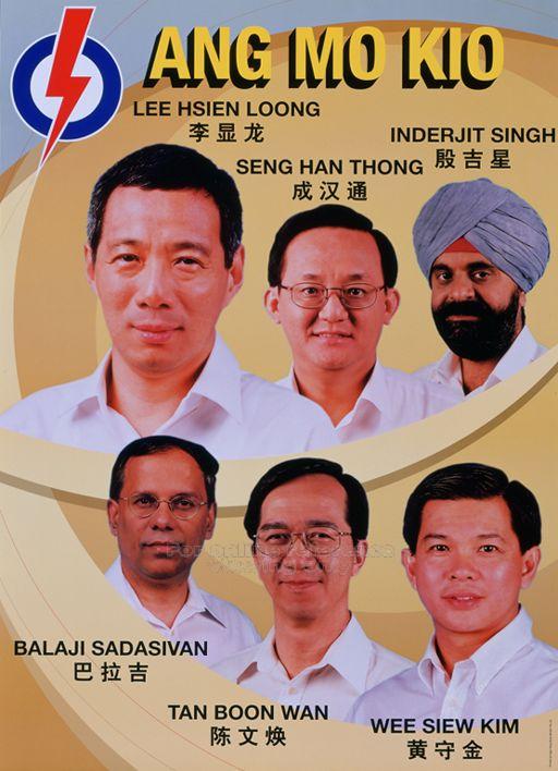
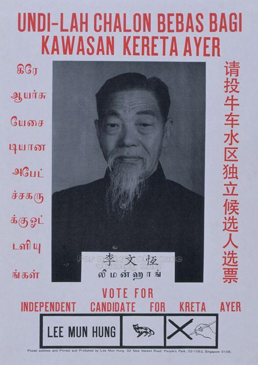
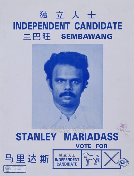
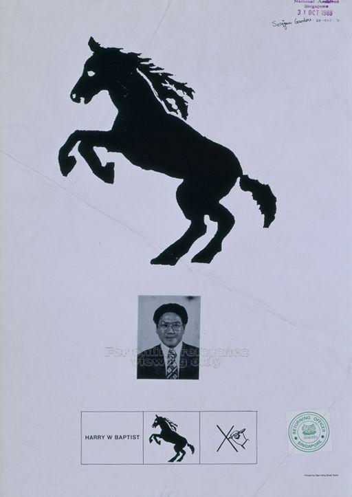
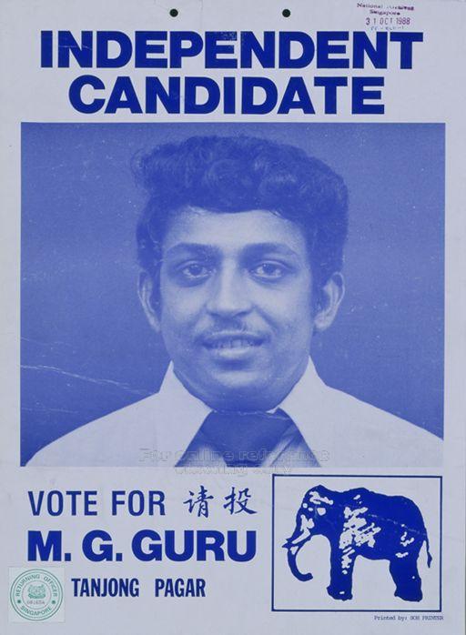
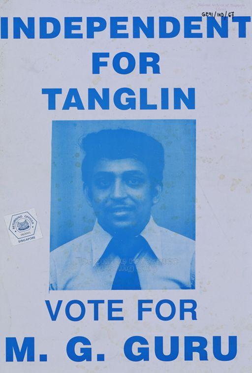
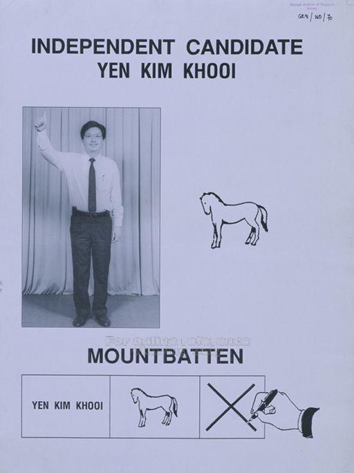
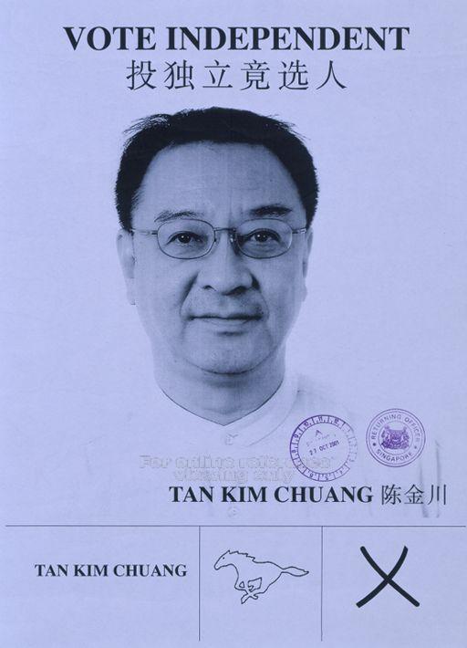
In the next post, I’ll be looking at the posters depicting the party’s logo and their candidates, including some whacky ones from independent candidates!