Tag: TODAY

Explaining the Budget 2009

Lots of of numbers and something for everyone, the Budget 2009 announcement yesterday was a great opportunity for the use of information graphics — so which local English paper did it best?

tnpbudget

Most engaging concept: The New Paper

You have to give it to the tabloid paper for always trying to make the news accessible and interesting for its readers. Conceptually, the umbrella, an everyday object, to protect you from bad weather is a great analogy of the Budget announcement and something anyone can relate to. And instead of going for the big numbers, it divides the details into neat packages depending on who you are, a businessman, a tax-payer, an adult Singaporean…

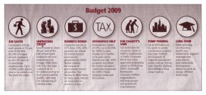
todaybudgetMost efficient concept: TODAY

This paper covered all the necessary details in a quarter of a page and with an interesting concept to boot! It clearly knows who its readers are as it divides the budget coverage into clear sections that are represented as “pills”. Not only are you able to get the information in a glance, the graphic also points you to the pages if you plan to read more on the given section.

stbudgetcover

Most grand concept: The Straits Times (ST)

A full cover and big numbers — when the Budget is discussed in terms of billions, it is hard to relate to it as a person on the street. The paper decided to go for the helicopter-view of things and emphasise on the massive figures as the news point. Unlike TODAY, the infographic does not serve to lead on to the other sections but in its special Budget section, it does divide it to relevant parts for different readers. The paper is definitely aiming to provide depth with an individual section just for the Budget and it clearly expects its readers to read everything on it. Whether this actually pans out in reality, I remain sceptical.

Most no-frills concept: Business Times (BT) & My Paper

btbudget

mypaperbudget

Both papers chose to keep things simple, limiting any graphic to just a box and relevant sections. My Paper (right) is clearly more people-oriented while BT’s (left) angle was more for the businessmen.

How do other newspapers cover the Budget? Here is the Spanish 2008 Budget as covered by a Spanish newspaper, Público

1205526392752gastos_estado

This is definitely not something that would work for a TNP reader, but I would hope to see out of ST, BT or TODAY.  It is a sophisicated infographic that shows the complexity and massive figures of the budget instead of telling it by using different colours and sizes for its “pipes”.

Since ST went for the helicopter-view of things, such a graphic would have been a great companion to its pages and pages of text. In fact, it would be something I want to pull out and keep just so I know the Budget 2009 inside out!

New-look ST: Really A Better Read?

If there is one thing that I already knew after reading the redesigned Straits Times was that the next day, the would run a self-congratulatory article about how its readers liked it. One thing that surprised me, was how they ran promotional articles about the new look on its cover page a few days before the launch. In what way would those articles constitute news that the reader must know first thing in the morning? If that’s not enough, a blogger pointed out that the new ST Homepage launched with a video of bikini babes…

I think such self-promotion, or selling of the ST brand, is telling of how it had become much more concerned about its commercial viability as a corporation and not just being a newspaper. I would suggest that this concern manifests in its re-design.

Indecisive masthead
The masthead embodies a newspaper’s “identity”, and ST’s feeble attempt to mix the old and the new, only suggests how a lot of this newspaper is a compromise. The root of ST’s problem is its compromised answer to who does it want to attract? Time and again, the answer seems to be, we want to be 
the newspaper for all English readers. After all, the Singapore market is so small and the newspaper market is in decline, hence it must be kiasu: to survive, target everyone! Its attempt to be everything to everyone shows in its re-design — colourful, mix-and-match, yet really indistinguishable. As for the token nod to its heritage with the “.”, I’ll say that some things die with time for a reason, and bringing something back from the dead doesn’t make it a “comeback”. 

Blurring the distinction between news and advertisements
While some would argue that the paper looks more vibrant with its multitude of colours, it is this very explosion of palate — in terms of colours, fonts, and styles — that give the presentation of news a “glossy” sheen that I would associate with advertisements. While I like the use of a bigger headline size, the choice of the font, Rocky, is distracting because it has distinct serifs that call attention to the individual letters than to read as a word. In fact, I would think the font is fanciful and associate with use in advertisements, and as a reader I feel I cannot quickly and clearly distinguish where is the news and what it is about. This failure (deliberate or not) to clearly demarcate news and advertisement gets especially troublesome in the advertorials. In the Aug 8 issue in the Life! section, there was a “Special: Corporate Milestones” report, one can see that the distinction in design elements are very subtle. 

More white space, not just line space
The news stories now have more line space that make reading breezier, but does that mean stories suffer from the lack of space? How does the bigger headline size restrict the number of stories as well as their depth? I think these are some interesting posers that will be answered in time. For me, it’s more important that a design gives me enough white space to ponder between stories and breathe amidst the claustrophobia induced by the kaleidoscope of colours and advertisements in this new design.

So three of the English newspapers had a re-design this year, Sunday Times, TODAY and now The Straits Times. In my opinion, TODAY, did the best because it came out cleaner, more modern, and more distinguishable. The last I heard, a little bird said The New Paper was going to be re-designed too. That would be interesting, how would a tabloid targeting the professional English-speaking class look like?

P.S. I’ll bet in the next few days we’ll see stories about new-highs in viewership for all the other online forms of ST…

Advertising for serious journalism

SOMETHING was missing from my Straits Times (ST). Where were my “Home” and “Life” sections? It took me a while, but when I finally found them, I was shocked.

The two sections were covered by full-page advertisements and the only clue of what the real covers underneath looked like were at the corner of the page.

While it only took a flip of the page to bring order back into my daily read, this “cover-up” of news was definitely the headline of my day.

Firstly, the move to allow advertisers to take up page one of sections of the newspaper gives them more clout. It’s similar to the way new initiatives like weekly supplements diverts resources of the newspaper away from serious journalism and distracts readers from the issues of the day. ST appears to be trading responsibility to the reader for advertiser cash.

Newspapers have always had an uneasy relationship with the people who pay for them. Advertisers pay most, but they’re only there as long as the paper has readers. Alienate the readers, and the advertisers walk too.

This move to “cover-up” looks symbolic of a shift in the balance towards advertisers and away from its readers.

While newspapers and advertisers are interested in readers, they are selective about which kind of readers they want. Again, this “cover-up” could lead to a newspaper losing its responsibility and relevance to the general public, and end up pandering only to readers that serve the interest of advertisers.

Just before the “cover-up”, Cheong Yip Seng, the editor-in-chief of ST wrote how the survival of a newspaper hinges on its credibility and ability to practise serious journalism. Serious journalism costs money; who will pay for it?

One answer appears to be allowing advertisements on the front of two sections. Today has been putting advertisements all over its page one for some time, so it is not surprising that ST gets requests from advertisers for the same treatment.

Unlike Today, though, ST is not dependent on money from advertisers as it has revenue from subscribers and news-stand sales, too.

So, while ST has yet to allow a full-page advertisement to front its cover page, with this latest move, who is to say it will not happen tomorrow? The “Home” section contains serious news. By allowing advertisers to buy page one of a serious news section, ST has weakened its position if an advertiser wants to buy page one of the whole paper.

And there are other signs that ST is going the extra mile to get advertisers.

The decision to introduce Urban, Mind Your Body and Digital Lifestyle has been said to better cater to readers. But aren’t ST’s supplements equally a sign that it is trying to cater to specific advertisers, too?

Also, while ST has introduced more critical sections like Insight as well as this consumer-friendly fare, the fact that the former only has two pages while the latter runs on its own speaks volumes about where ST has chosen to place new resources.

Some argue that these new sections serve popular interests, and I do not dispute that. Yet, there has been a myth that separates what is “popular” and “serious”. Can serious journalism that is popular not exist? The reports on the NKF scandal last year were a piece of serious journalism, followed closely by many readers. This, I feel, is the way for ST to go.

It should take advantage of the fact that it is the most widely read broadsheet English paper in Singapore, and pour in more resources to deliver more critical content.

ST should be careful to balance this precarious relationship with advertisers and readers. In any case, the readers should wield the most influence.

Advertisers are after all interested in getting to the readers and readers themselves will only read newspapers that are credible. Serious journalism is the way to go, and if it matters, the readers will willingly pay for it.

As Mr. Cheong expressed, popular journalism caters to readers while serious journalism enhances a newspaper’s credibility, and helps ST in a world being overtaken by the Internet.

I think that ST straddles between being a popular and critical paper. At the end of the day it is up the editors and stakeholders to choose which direction they want to take.

The Nanyang Chronicle, 6th Mar 2006