Various covers of exhibition catalogues Antonucci designed for then Museum of Contemporary Crafts between 1965 to 1972. Courtesy American Craft Council
The Four Seasons Restaurant in New York is celebrated by many as a temple of modern design. Housed in a restrained interior designed by architect Philip Johnson are the elegant furniture of his collaborator Mies van der Rohe, elemental tableware by architecture critic Ada Louise Huxtable and her industrial designer husband Garth, artist Richard Lippold’s abstract ceiling sculpture, and the shimmering aluminum curtains of textile artist Marie Nichols.
But much less talked about is the landmark restaurant’s logo, a design of the late Emil Antonucci—a mid-century American illustrator who has been forgotten with time.
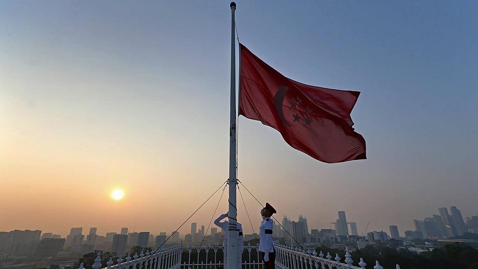
A flag at half-mast at the Istana on March 23, 2015. BY MINISTRY OF COMMUNICATIONS AND INFORMATION / TERENCE TAN
Flying the state flag in half-mast is how countries have traditionally symbolised the passing of a national figure. Since Singapore’s founding prime minister Lee Kuan Yew died on Monday, state flags on all government buildings have flown at half-mast, an act no different to when other Singaporean leaders—including Ong Teng Cheong (2002), Wee Kim Wee (2005), Goh Keng Swee (2010) and Toh Chin Chye (2012)—passed on.
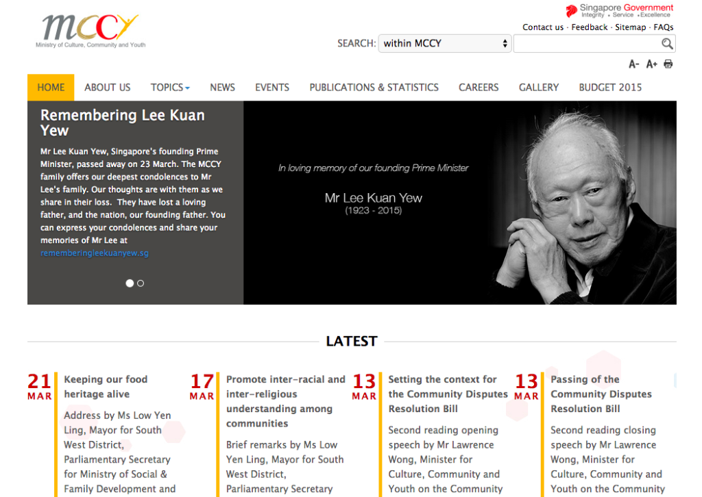
But this time around, there was also mourning online. Not only was a website Remembering Lee Kuan Yew set up within hours, many government organizations also turned to “greying” or “blackening” their typically colorful websites and logos on their social media accounts.
While not every organization did so—indicating it probably wasn’t a coordinated whole-of-government directive—all of them referred to the Remembering Lee Kuan Yew campaign in some way.
The Ministry of Culture, Community and Youth did not grey or blacken their digital presence, but did refer to the passing of Lee Kuan Yew.
Could this become a new digital tradition in how states mourn? As governments expand their digital presence to stay relevant to citizens, new practices like this come to play. For one, the government building is not the main medium of interaction between the state and its citizens. Particularly today, it’s often websites, Facebook pages, Twitter accounts that are the communication channels citizens hear from, which makes the logo akin to the flag on the mast of a building for the online audience.
In reaction to the digital mourning, many Facebook users interacted liked the change in logos and even commented with condolences. In contrast, it’s harder to imagine someone saluting the state flag in half-mast today.
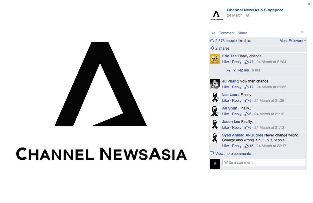
In one non-government case, the media organisation ChannelNewsAsia was even slammed for making the change a day late. While a logo was once seen as static and fixed, there is almost an assumption that it will morph with the times—just as what AirAsia did when its airplane crashed last last year or how Google does almost daily to commemorate anniversaries.
Getting fingers burnt by hot wax was once all in a day’s work for a graphic designer. Before the computer came along, designers used a tool known as a waxer to coat a paper with the hot adhesive before sticking it on a page layout in a manual process known as the paste-up. No doubt designers are only too happy to leave this and other labor-intensive production methods in the past, but for those who still get misty-eyed over rapidographs and Diatype machines, the new documentary, Graphic Means, promises to take you back to the days before desktop publishing and the digital revolution of the late ’80s.