Category: Cities

When Two Universes Collide In A City


eccentric city

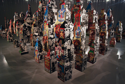
Take some time out on Sunday to catch the last day of Eccentric City: Rise and Fall, a paper city created out of a collaboration between Japanese artist Keiichi Tanaami and Singapore design collective :phunk studio. This “eccentric” city was built out of paper buildings created using the traditional Japanese paper craft of “Tatebanko”, and each one of the buildings brings together the distinctive illustrations of the two collaborators and their vastly different cultural upbringings. On one side is Tanammi’s psychedelic works that are heavily influenced by his traumatic childhood experiences of World War II and growing up as part of the countercultural movement in the 1960s. In stark contrast, is the black and white work of :phunk whom depicted the technological city of Singapore they grew up in. Though the exhibition is small, the paper city is quite a sight to marvel at.

TanaamiTimesABesides the paper city with :phunk, Tanammi has also worked with local design agency WORK to produce two free issues of The Tanaami Times, a beautifully crafted newspaper that profiles all three collaborators and some of their work. The agency’s latest issue of its limited run WERK magazine, issue number 18, also features the work Tanammi as well.

Finally, here’s a video shot by the team that shows how each of the buildings in Eccentric City was built using Tatebanko:

A TATEBANKO (ECCENTRIC CITY : RISE AND FALL) from ferdi trihadi on Vimeo.

— — —
Eccentric City: Rise and Fall
19 Aug – 19 Sep, 10am – 6pm
ICA Gallery 1, #B1-04, LASALLE College of the Arts

Uniquely Singapore – Distinctively London?

Could a city’s uniqueness be found in its most generic and banal spaces? This is what Generi-City, a project that I was recently involved in, attempts to investigate through a series of photos comparing six spaces in Singapore with similar ones in London. I worked together with London-based correspondent Chong Lingxiu to explore eating spaces in the two cities. The project is headed by Calvin Chua and Johnny Gao who I’m grateful for roping me in.

You can see the result of our investigation at an exhibition in London between 16 to 19 September 2010 as part of The London Design Festival. It might also travel to another gallery there before coming to Singapore in October as part of ArchiFest 2010. Do check it out if you’re free!

Take that Helvetica! Battling Globalised Culture

Delhi

Worried about how visual culture like Helvetica has become a “universal typeface” that is homogenising our environment, graphic designer Sanchita Jain decided to wage war against globalisation. For her final-year Masters project at the LASALLE College of Art, Sanchita embarked on Decoding Culture, a project that is a “reaction to that homogenity” caused by the easy spread of ideas globally that were replacing unique places and cultures with one that looked the same no matter how far apart they were physically.

The ammo for her battle was a series of signs that she designed that highlighted unique aspects of her hometown in Delhi. Sanchita then put up these signs in Delhi to catch the attention of those living in the city and hopefully, igniting a discussion. The aim: to bring Delhi’s culture out to the open in order to remind those living in it about how unique it was. “My project brings people back to the tangible environment and uses cultural idiosynracies as an inside joke,” says the 24-year-old. “For example, there are two Singaporeans, and you both know Singlish, then Singlish is what unites you. You won’t talk about it much or say it out loud, but it is like a knowledge that unites a culture.”


fee_Delhi_04

Some of her signboards did attract much attention. Meter or Cheater? for instance refers to Delhi’s popular form of public transport auto rickshaws that are infamous for overcharging as they don’t use their meters. “I almost got mobbed,” she said. Though the auto drivers weren’t very happy with the sign, she feels that it has become a unique aspect of Delhi. Some of her signs — Fee to Pee refers to the practice of urinating in public and Death Trap Corp refers to the how dangerous it is to take Delhi buses — do showcase the negative aspects of her city, but they are also what makes it unique.

But there were signs that hardly got a reaction, and this Sanchita says, shows how these aspects of Delhi culture were lost to globalisation. Family Reunion depicts the practice of families going out at night to eat ice cream from street hawkers. Today, these families head straight to global chains like Baskin Robbins instead.

The signs themselves are also reminders of a dying Delhi culture. They are based on public signs in Delhi and were all hand-painted by Delhi signmakers like in the past. Today, these signs are printed by machines instead.
lego_Sing_02

As part of the project, Sanchita also created a series of signs for Singapore. These were based on discussions with her Singaporean friends about what was unique about this city. Unlike the colourful signs of Delhi, the Singapore ones look plain with just a hint of colour. This was a visual look she noticed in a lot of the advertisements found in our local newspapers. As it turned out, they must have looked right to Singaporeans. After putting up postcards of these Singapore signs at the LASALLE Show, they were all taken up in just 15 minutes!