“I find that when two or three minds come together, there is always an element of doubt that will encourage a different way of thinking.” — Ko Shiou Hee, K2LD
Why did you move into this studio last year and how did you find this space?
We had outgrown our previous space where we were for about eight years. Although we liked it a lot because there was a courtyard and it was cosy, having the office split into two floors made communication a bit of a problem. It was a miracle finding this space. I had been on a lookout for one in the city centre for two years. One day, I found myself driving into this district for some reason and while trying to make my way out, I decided to stop at the street outside this office and I saw a sign that says this space was ‘For Rent’. I came up to find that it wasn’t just one, but three units! I took down the number, but it turned out to be the wrong one, although we eventually tracked down the owner. However, he wasn’t interested in selling at first. We were looking elsewhere when I received a call two months later saying that he was interested again. This time we got it at a much lower price.
Singapore graphic design studios like fFurious, PHUNK, Asylum, and Kinetic may have different styles and approaches, but there’s one thing that binds their practices: music. The founders of these studios grew up listening to bands like New Order and Joy Division that had record and CD covers designed by the likes of Peter Saville and Vaughan Oliver. They also watched animation graphics on television channel MTV and browsed magazines such as The Face and Ray Gun, which were designed by Neville Brody and David Carson respectively.
These studios, established in the late ’90s and early 2000s, have acknowledged the influence of music on their designs, whether it was introducing them to the profession or inspiring them to work on music-related projects — PHUNK originally started as a music band and still refer to themselves as a ‘visual rock band’; one of Asylum’s goals was to design record covers such as 4AD, and they started a music label; the founders of Kinetic were also in the band Concave Scream and work with local band The Observatory; while fFurious designed album covers for Singapore music bands and also worked on legendary local music magazine BigO.
But with the slow death of albums, the design scene today, however, seems to have found a new muse. In the last few years, many younger designers have gotten involved in self-publishing. Just this weekend, Galavant, an annual magazine focusing on collaborative and curated content from around the world, was founded by photographer Dilys Ng and designer Nathalia Kasman. The inaugural issue uses a mix of poems, short stories and images to explore the theme of “Absence”.
It is a familiar format found in UNDERSCORE Magazine, Casual Days, Ceriph,kult, Bracket, and Terroir Magazine— independent publications started in Singapore by designers or design-conscious founders over the last three years. By and large, these publications focus on literature as well as arts and culture from Singapore and around the world. And as I’ve written elsewhere, these magazines share a similar outlook and ethos.
Could self-published projects become the definitive element in the portfolio of Singapore’s future graphic designers? It fits into the global trend of designers becoming authors, and magazines have proven to be one of the best mediums for projecting a distinctive “voice” with images and text.
Two Singapore studios are already taking self-publishing further than just magazines. Epigram has been working on annual reports and occasionally published books since it founded in 1991, but last year in July, it started a separate entity Epigram Books to publish its own books, including literature, photography and children’s books.
A much younger entity is Studio Kaleido, which is behind Ceriph. The magazine preceded the studio’s founding last year, but since then, the founders Amanda Lee and Winnie Goh have gone on to initiate several publishing projects including GRAPHME, a zine lab, while busying themselves with design work too.
Of course, the one major difference with publishing a magazine as compared to designing a record is it is continuous. You got to regularly come up with the next issue. So it’s not very surprising that many of these magazines are annuals, and the most prolific is quarterly. Will these publishing efforts sustain in the following years? Read on.
Just 10 days after The Straits Times unveiled their redesign at the end of May, TODAY announced they had spent the last nine months undergoing a redesign led by internationally-acclaimed newspaper designers DaniloBlack. I recently caught up with TODAY’s night editor Razali Abdullah to find out what went on behind-the-scenes.
What prompted this redesign? It’s been three years since the last redesign, and it seems like a long time. In the last three years, a lot of things have happened. The way people consume news has changed, more people now are reading news from their smartphones and mobile devices than three years ago. And three years ago, the iPad wasn’t born! For us, it wasn’t just about changing the look and feel, but also the content. We wanted to re-engage our readers and attract new ones. The redesign is more than just an overhaul of the look, we wanted to relook the way we produce content. We needed new tools to showcase new content.
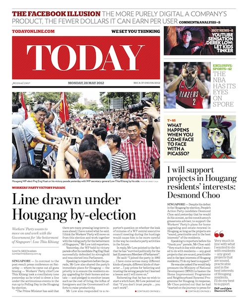
What are some of the main changes in this redesign? First we have the floating column — the white space between stories that also serves as a place where we can put value adds to stories. This design element is a tool for us to include nuggets of information. This device forces our sub-editors to think of what to fill it with.
We also have new sections such as “Youth”, “Education”, “Silver” and even “China & India”. Having these sections ensure that we constantly have content dedicated to these segments.
Cover of “T”, the culture and lifestyle section of TODAY.
We have different colour schemes for different sections. And the new suite of colours that the designers have come up with is very refreshing.
A lot of readers also said they couldn’t find our sports pages, so we added a green background to differentiate the section. Plus headlines in sports are now in uppercase, which adds to the drama and the emotion that sports stories bring.
The body text has also been increased by a point because we have received feedback that it was too small in the old design.
Of course, the biggest change is in the masthead, for both the main paper as well as the “T” section.
We used to divide the paper into eight columns, it is now nine to give us the floating column. As our ad sizes have stayed the same, this means there is also more white space between ads and editorials, which reduces clutter and helps readers navigate through the paper better.
Does this mean TODAY will no longer do innovative ads that intrude into editorial? We will still do creative advertising, where advertisers who want association with certain types of content can buy into the environment.
What were some issues with the previous design? We wanted the new design to take the paper forward. We wanted devices that can serve as a window to cyberspace, so we now have boxed elements about what’s trending and what’s hot in cyberspace. Knowing that space for stories will be less, we needed new tools to flesh out various points in the story. So the reader has various entry points, as not every information is contained in the story. The old design didn’t have such tools.
One thing about the floating column is it gives readers a lot of breathing room, something the old design didn’t have. In the past, we tried to cramp too much into the space we had, often at the expense of pictures and infographics. There was a reluctance to cut text and you could see it in the old paper. Design wasn’t really a key thing then.
A photo essay in the Sports section of TODAY about Singapore Olympic weighlifter Helena Wong.
With the addition of the floating column and more white space, did you have to sacrifice the number of stories as well as their length?
Yes, the stories have become shorter but readers get more bite-sized information in the sidebars and info boxes. We have fewer stories but the trade-off is the quality of the stories has gone up as only the best ones will make it. The story selection is tighter now.Also, there is more real estate for photos. A common gripe from our photographers in the past was they would shoot an event, but we’ll crop their picture into a face cut. That doesn’t happen anymore.
Did you consider becoming a bigger paper to fit the design and the content? I think the advertisement ratio is very important because it keeps us profitable. It’s what has kept us afloat. We broke even in four years, which is very rare if you look at newspapers around the world. If we open up more pages or become bigger, it means the paper’s ad ratio will drop.
What were some of the main guiding principles in this redesign? We wanted it to be more reader-friendly. It’s got to be easy on the eyes. I wasn’t involved in the initial discussions. My involvement began when DaniloBlack came back to us with two sets of designs. That was when the editors picked the elements they liked from each design and we reached some sort of compromise. One of the designs was more contemporary, while the other was more cutting edge. The final design is a nice blend between the two.
Why work with DaniloBlack? How was the experience? We wanted to freshen the paper up, we needed a design that will tie all our products together — newspaper, mobile app and website — and DaniloBlack is perfect for this. They don’t just do print design. They design apps for tablets and all kinds of digital applications for some of the world’s biggest papers.
It was overall a great experience. They were very accommodating and understood our needs and were able to come up with solutions to our problems. We worked via Basecamp, they would send us PDFs of what they had done and we would revert with our comments every week or so. The final month before the launch, it became more intensive because we started to test the designs with real content, and real ads. It took about nine months in total.
Besides design, what else has changed about the paper? The approach for the stories has changed. Because of how fresh the paper looks now, we can’t rely on the old way of doing things. A big challenge for us is competition from online sources, people are now getting their stories from everywhere. What are we doing so different that readers will come back to us? It’s the thinking behind the news selection, and how to take stories forward.
Was your redesign also reacting against your competitor, The Straits Times? It’s not just about The Straits Times, but also about how news consumption has changed. You can get news from anywhere, what we try to do is to find our unique selling point. The old thinking was that we could not miss any stories that were published elsewhere. Now it’s not so much about missing stories, but do we have a better story?
In the last redesign, the masthead/nameplate set in Times New Roman was one element that could not be changed. Why the change of heart? We wanted a total overhaul, so we basically told them there were no sacred cows. We wanted something fresh that could tie the whole paper together. So you see the stripes in the background of the masthead, those appear in our “Business” pages too.
TODAY’s previous logo since its establishment in 2000 (left) and its new logo (right).
Do you think the new sections are unnecessary? Some of them are just one- or two-pages. We feel that some segments deserve a section of their own. The youth, for example, many of them are doing good things, coming up with good initiatives, that don’t get highlighted enough because they’re competing with hard news stories. The “China & India” section is also crucial because people are looking at these two emerging economies very closely — whatever happens there tend to have an impact on the rest of the world. In terms of advertising, it is crucial for us. Some advertisers want to be associated with certain sections, so we try to give advertisers a wide spread.
What is one element about the redesign you like to highlight? For me, it’s the way information is being presented now. You don’t have to read the entire story to be able to pick out the key facts and figures: Those you would find in the sidebars, or presented as bullet points, or in the info boxes in the floating columns. We are doing a lot more value adds: Adding video links, web links to stories, providing background information to stories. It’s a refreshing change from the past where we tried to cramp everything into the main copy. For someone who comes from a design background, these are exciting times. I hope the readers like it.