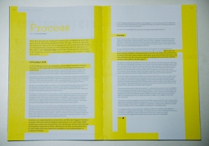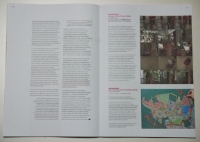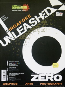
The media is often regarded as the first scribes of history, and is a resource in understanding what things looked like at a certain period of time. A friend recently shared Singapore Unleashed, a 2008 publication that prided itself as the “The first magazine featuring only local designers<artists<photographers”. In it, founders Remie Ng and Eric Wan lamented on the fact that there are “so many wonderful designers, artists and photographers in Singapore”, but most people could not name any. Its magazine would be “a platform for our creative people to showcase their works” and it was a firm believer in the ability of print to show graphics and photographs even though it recognised the power of the Internet. In its inaugural issue, the magazine conducted interviews with artists who were part of the Singapore Biennale 2008 that year, design agency 19Blossom and also then a newly-opened 2902 Gallery.
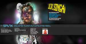 This publication stands in contrast to another Singapore-based magazine, SPUNK UNITED, which showcases art and culture around the world. This annual online-only publication run by editor Max Hancock seems to have started around 2005, and featured interviews with local creatives such as fFurious, Daniel Koh, and Eeshaun, providing a fascinating insight to their beginnings.
Sadly, neither of these two magazines are still around today — it seems Singapore Unleashed never went on to its second issue, while SPUNK‘s last update was in 2009. There were perhaps two other Singapore-based design magazines that made a deeper impression and impact. iSh magazine was a forerunner when it first came out in 1999, featuring “fragments from an urbanscape” including architecture, interiors, design and art all in one publication, a rare view of design as multi-disciplinary and surrounding our everyday lives then. Kelley Cheng started this bi-monthly on her own and continued to run it for a decade, even after she joined the Page One Group, a Singapore publishing house, in 2001.
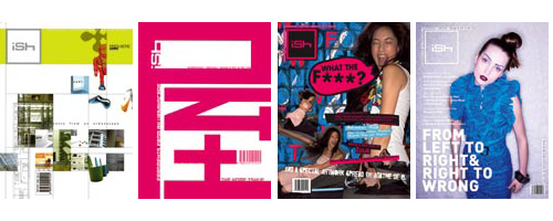
Kelley was also involved in the founding of designer, which she co-published with the Designers Association Singapore (DAS) in 2001.

This non-profit quarterly publication aimed to be “a forum for discussion and the exploration of new ideas in design from Asia and further afield”. (Read DAS president Nigel Smith’s first editorial message here). Later on, local design pioneer Allein Moore tried to run designer as a commercial title, but it closed in 2008.
While it seems Singapore design magazines have struggled in the past to survive, more publications that focus on design in Asia and Singapore have emerged in recent years. This genre includes magazines that document and, to a certain extent, analyse the creative scene, rather than ‘sell design’ such as in consumer-oriented publications including Home and Decor (since 1987!), Lookbox Living, and more recently Dwell Asia. Instead, think of the Asian edition of Surface magazine (by New Media Investments (Asia) Pte Ltd, same company that brings in Dwell Asia), Cubes, (started by Concepts Asia Publishing Pte Ltd in 2001 and recently bought over by Australian-based Indesign Media. Also sister publication of Lookbox), Culturepush (since 2007), and Thailand-based magazine art4d’s latest regional offering online, art4d.asia.
What’s driving the emergence of these new titles? The expansion of design in this part of the world is possibly making it a very lucrative market financially. Whether these titles will still be around in the years to come and they kind of impact they will make in Asia’s design scene and designers — besides selling design — remains to be seen.
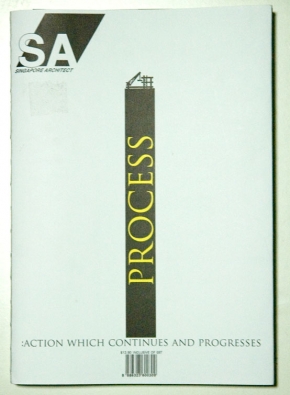 It was by pure coincidence that I chanced upon the newly-revamped
  The theme aside, I liked the new logo and how a third dimension as compared to the previous logo was added with the parallelogram. In a sense, architecture is about creating the 3-D form and the new logo communicates this very well. Moreover, the parallelogram behind “SA” acts as a very strong identifying symbol and is used at the end of all its articles.