Tag: Singapore Design

What is a book?

In the past few months, Borders Bookshop in Singapore has literally “cheapen” books with its seemingly never-ending weekly offers. It’s got me really curious about what is actually going on in Borders. Is it closing down? Is this a sign that people will no longer pay for good books? Are books going extinct?

While I have no idea if Borders is closing down (my guess: yes), I’ll suggest you attend a book art exhibition just a 5 minute walk from the Borders in Wheelock Place to find answers to my other two questions. In Centre to Periphery at the Japan Creative Centre, you will find no bookshelves. In fact, you might not even find books — those with a cover, spine, page and words on them. Instead, you find yourself lifting up an empty book to capture text projections…


book projection

Enlightenment (2009), Goh Qidi Jonathan

… staring into a pinhole camera made out of a book to find out its ending…

book camera

Shin Mitsu (2001), Miyuki Kido

… wondering how solid books can be…

book concrete

The Ground Book (1998), Rie Takeuchi

… seeing a book scene come to life…


book homeAll About Her Story, Masako Kobayashi

… going through the “elements” of what makes a book’s character…

book periodic

The Ele men tal In ter ludes (2009), Hazel Lim

… and contemplating how 10,000 years of life is so efficiently reduced to a tome you can carry home.

book 10000

Byo-Koku-Tetsu-Cho (2002), Hirose Tsuyoshi

You won’t find any discounts for books at this exhibition organised by the Japan Creative Centre and La Liberia, but you will find, for free, that books are much more than just for your reading pleasure.

A Design of Its Time

Keeping up with the times – the changing look of Singapore’s longest surviving English newspaper The Straits Times.

— — — —
First published in  The Design Society Journal,
and edited into seven posts for this site.
— — — —

A newspaper is often seen as a mirror of its society. While this usually refers to the content of the paper, what is often passed over is how its appearance is part of that reflection too.

If you stop reading the newspaper for a moment and examine its overall look and individual elements instead, you would notice how its nameplate, the type of underlying grid, choice of typefaces, and even the paper’s size come together to shape the experience of the newspaper that we take for granted in our daily read.

“Any newspaper we read conveys its personality through the accumulation of these visual cues,” writes visual communications professor Kevin G. Barnhurst.[i] “We assume that it is the writing that makes the difference, but that is only partly true.”

Yet newspaper design is more than its aesthetics, it is a means to convey a message, summed up in former editor of Britain’s The Sunday Times Harold Evans’ observation, “[D]esign is part of journalism. Design is not decoration. It is communication.”[ii]

It for this reason that newspapers, like The Straits Times (ST) in Singapore, have periodically spent money and time to redesign its product.

Explaining ST’s 1998 redesign, then editor Leslie Fong wrote: “The short answer is that we have to – if we wish to stay on top of the competition and give you a better paper.” He adds, “And the competition is not just against other media or information providers but also, increasingly, for your time.”[iii]

A newspaper’s design thus becomes a visual expression of its readers’ values and environment that the paper operates within. Each design change is a deliberate move driven by the need to stay relevant to its readers. In a sense the changing looks of the 164-year-old ST, the oldest English newspaper still around, serves as an archive of how Singapore has changed from a British colony to an independent First-World nation today.

— — — — — — — — — — — — — — — — — — — — — — — —
Introduction } 1960s } 1970s } 1980s } 1989 } 1998 } 2000s
— — — — — — — — — — — — — — — — — — — — — — — —

  • [i] Kevin G. Barnhurst, Seeing the Newspaper, New York: St. Martin’s Press, 1994.
  • [ii] Harold Evans, Book Five: Newspaper Design, 5 vols., Editing and Design: A Five-Volume Manual of English, Typography and Layout, London: Heinemann, 1973.
  • [iii] Leslie Fong, “The Aim: To Give You a Better Paper ” The Straits Times, March 22 1998, HOME, 23.

— — — —

A Design of Its Time — 1970s

Keeping up with the times – the changing look of Singapore’s longest surviving English newspaper The Straits Times.

— — — — — — — — — — — — — — — — — — — — — — — —
Introduction } 1960s } 1970s } 1980s } 1989 } 1998 } 2000s
— — — — — — — — — — — — — — — — — — — — — — — —

ST1972cover

The Herald of a new face

The arrival of the Singapore Herald into the local newspaper market in July 1970 introduced competition to ST for the first time since its last competitor, The Tiger Standard, closed in 1959.

To take on the Herald, Khoo was sent back to Singapore from its Malaysian office to “brighten up” ST.[i] But the competition never quite materialised as the Singapore Herald was closed down amidst much controversy a year later.

As if assured of its monopoly, the paper stayed largely the same. In September 1972, ST became a Singapore-based paper when it parted company with its Malaysian assets, which became the New Straits Times.

ST’s design was changed to reflect this new status. To distinguish itself as a Singaporean paper, news from Malaysia was grouped into a section, Across the Causeway. In September 1973, the paper unveiled a new nameplate typeset in the modern-looking Bodoni and dropped its tagline altogether.

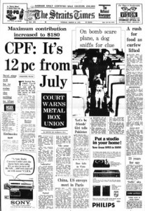
But the new nameplate was overshadowed by the paper changing to a ten-column grid from its previous eight because of a world-shortage of newsprint[ii]. An earlier switch to nine-columns was deemed insufficient with worsening strikes in the paper mills. With narrower columns and no luxury of white space, the paper became harder to read. Moreover, it was still using a mixture of typefaces to express variety and dramatisation of news, creating a cacophony of headlines for the reader.

By the second half of the 1970s, the paper had grown to over 30 pages from a 20-page read in 1959. It now had a regular Forum section to house readers’ letters. To aid the reader’s navigation of the thicker paper, an index, INSIDE, was introduced on the cover in March 1972.[iii] As and when it was necessary, the paper would also come in two parts.

One year after ST adopted its first formal editorial policy in 1977, it began carrying out its new stated mission “to inform, to educate, to activate and to entertain.”[iv]

The second part of ST was officially designated its leisure and educational supplement known as Section Two[v]. Inside, were the Leisure Page, Woman Plus, and the Bilingual page where readers could learn Chinese. However, the bulk of this new four to twenty-page section were actually just pages chock-full of advertisements.

To succeed in the Singapore market, ST wanted to provide content with mass appeal and quality to garner a maximum readership to attract advertisers, but its design, which was largely unchanged since 1959, was not keeping up with this new vision.

— — — —

  • [i] Turnbull, 287.
  • [ii] “From Today a Tenth Column,” The Straits Times, September 3 1978.
  • [iii] First observed in The Straits Times, March 14 1972.
  • [iv] Turnbull, 318.
  • [v] “Change with the Times for Easier Reading,” The Straits Times, September 25 1978.

— — — —