Keeping up with the times – the changing look of Singapore’s longest surviving English newspaper The Straits Times.
— — — — — — — — — — — — — — — — — — — — — — — —
Introduction } 1960s } 1970s } 1980s } 1989 } 1998 } 2000s
— — — — — — — — — — — — — — — — — — — — — — — —
 Looking like the competition
In November 2000, Singapore’s broadcasting company Mediacorp launched its free daily Today, while SPH countered with Streats in addition to setting up two television channels. However four years after, battered by competition and an economic recession, a ceasefire was called. The only survivor was Today, which continues as Mediacorp’s alternative paper to ST.
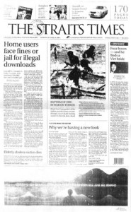
A month after the announcement, ST unveiled a redesign done entirely by in-house designers. For the first time, news on Asia came ahead of world news with the ASIA section following after the day’s prime news. This was “to reflect the growing importance of the region”[i] to ST’s readers.
More importantly, the paper went “big on lifestyle” as it claimed that readers wanted this more than the news.[ii] Its thirty-one year old nameplate was replaced and typeset in Trajan – a typeface choice for popular Hollywood movies. A feature story section, Upfront, started on the cover and three new weekly lifestyle magazines, Digital Life, Mind Your Body and Urban were also introduced for a more affluent society hungry for information on how to live in a First-World country.
In line with ST’s philosophy for the paper to appeal to the masses, news reports were extracted into full-blown magazines. A format that helped readers quickly get what they wanted and offering the many advertisers from the computer, health and fashion industry a more targeted approach to reach out to its readers.
The fight for the advertising dollar was more competitive now with the extremely advertiser-friendly Today. As the free paper depended entirely on advertisers for revenue, Today had no qualms about having its cover wrapped up in advertisements, and ST soon followed suit. By 2006, the over 100-page paper came in multiple parts each fronted by a section cover. Advertisers were offered to command the cover on any of these sections, except the main section, leaving just a corner flap to indicate that there was still news inside.

A Digital Look
The rise of new media and the Internet led the paper to redesign once more in 2008, the third within a decade. “The pressure newspapers face to remain relevant and attractive to readers has intensified over the last ten years. We can no longer take our readers for granted because there are so many other alternatives available today, especially on the Internet,” said editor Han.[iii]
The redesigned paper would mimic its competition online. The cover was packed with promos of inside stories that resembled links on the front page of a website with broken-up news stories on the cover and jump pages becoming a norm. Mirroring the popularity of online blogs, ST replaced Upfront with a daily commentary column on page two.
Launched together with its latest Internet offerings, the paper created space for the new online ‘section’, Every section cover advertised the most commented and read story from its online website.
By now, Singapore was also gearing up for a greying population. To better serve this audience that probably read the printed ST more than youths, it became elderly-friendly. To aid reading, the paper switched to a five-column grid that meant wider columns. The body text size of its new typefaces was also increased. ST even changed its nameplate, claiming to have been inspired by what it looked like when it first began.[iv]
Like Singapore, today’s ST looks nothing like it did 50 years ago. After all, the newspaper is a cultural product specific to its time of production. “What is significant is not the particulars of the dress but the overall pattern, which reveals our assumptions about the role of the newspaper in culture and its use by common people,” wrote Barnhurst.[v]
To survive in Singapore, ST has increasingly adapted itself along commercial interests, redesigning over the past decade to stay relevant to its readers and advertisers. As a modern business organisation, it now operates on the values of production efficiency, with design and layout increasingly becoming automated and computerised. The daily pages come to designers already laid out with standard-sized advertisements. However, the ubiquity of advertisements limits the variety of overall design and it is arguable that this is why ST has rarely won design accolades given by aesthetically driven organisations like the Society of News Design.
That said, ST’s design works here. In a country, where design is seen a function of aesthetics instead of a functional aesthetic, where design is rooted in trends and driven by commercial imperatives, what we find designed into the pages of the ST is finally but a reflection of the values of the community it serves.
— — — —
- [i] Fook Kwang Han, “Why We’re Having a New Look,” The Straits Times, October 19 2004.
- [ii] Ibid.
- [iii] Fook Kwang Han, The Straits Times, October 19 2004.
- [iv] Ibid.
- [v] Barnhurst, 11.
— — — — — — — — — — — — — — — — — — — — — — — —
First published in The Design Society Journal.
— — — — — — — — — — — — — — — — — — — — — — — —

