Author: Justin Zhuang

Picturing Home, Wherever We May Be

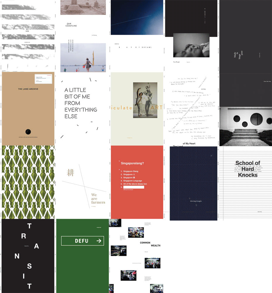
18 of the 20 TwentyFifteen covers. Designed by Jonathan Yuen of ROOTS.

Wherever we go, we carry pictures of home.

Framed up, wedged in a wallet, on a phone, shared online, etched in our minds—we hang on to these references that remind us of where we’ve come from.

It’s been almost two years since I’ve last seen Singapore. Away from home, all I’ve had apart from my own pictures are those from the news and what friends and family share online—snapshots of how home has grown through the lenses of my fellow citizens.

Marina Bay with its iconic “integrated resort” has overshadowed the Singapore River’s line of shophouses and skyscrapers as the shorthand for the nation’s success. Our list of old places has matured beyond colonial relics to include modernist complexes and even the iconic dragon playground. The index for the city’s pace of development is no longer the skyline of towering cranes, but how crowded our trains and streets have become.

The frames Singaporeans use to look at their home are changing. It shows in the subjects we picture, but also in what photography means to us today. Is picturing a Chinese, Malay, Indian and Eurasian still the quintessential portrait of Singapore society? When did photographing and shaming online become our way of handling outrageous acts we encounter in public? Should photos of our nation’s late founding prime minister Lee Kuan Yew be restricted from public use?

These questions capture some of the issues Singapore faces today. Pictures of home are not just illustrations but also reflections of who we are, projections of how we see the world, and symbols of our community. A photograph’s flat surface belies its third dimension: as a platform for discussions on the people, places and things that matter to each one of us.

This social element is what defines contemporary photography. Making a picture is not just framing a subject and pressing the camera shutter (or in today’s case, tapping a screen), but also sharing it with others—a process that envelopes pictures with meanings beyond just the photographer’s point of view.

This is how our pictures of home are made: through the conversations we share about what we see, what we remember seeing, and even what we hope to see. While the realities depicted in pictures will one day fade or even be challenged, the meanings they hold for each one of us is what helps us see home clearly, wherever we may be.

A essay written for the upcoming TwentyFifteen.SG The Exhibition at Esplanade.
Déjà vu: A review of I Have A Room With Everything Too

COURTESY I HAVE A ROOM WITH EVERYTHING

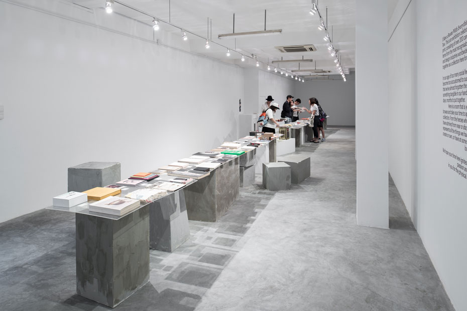
Many would have recognized, but few actually seen IRL (in real life) the works displayed in I Have A Room With Everything Too. This recent exhibition at The Substation Gallery (2-12 July) showcased over a hundred books, magazines, and printed ephemera by design studios around the world—offering a rare opportunity to appreciate avant-garde graphic design outside the digital screen. Instead of viewing endless studio shots on infinite scroll and click thumbs up, graphic design aficionados could actually pick up design and flip, stroke, or even smell.

An annual report retold as a travel diary by Singapore design duo Couple, an art catalogue with a cover made from amusement park tickets by Indonesian studio Artnivora, and a calendar resembling a miniature pallet of printed sheets by Hong Kong based Co.Design were part of a line-up of eclectic projects assembled by curator Yanda Tan. Laid out across a single row of makeshift tables spanning the 23-metres long gallery were the mostly arts and cultural projects Tan had acquired from bookstores and designers via his art and design blog THEARTISTANDHISMODEL and recent travels to other cities.

The collection is a diverse portfolio of graphic design production possibilities which reminded visitors of “the joy of holding something tangible in our hands that took hours, days, months to put together.” But this worked only up to a point. There was little context besides the name of the designer and their city of origin in order for visitors to appreciate the works beyond design as a process of production. This was particularly telling for the foreign language publications whose contents were indecipherable, rendering them no different from a mockup by printers. Even as many of the works wowed with their cool surfaces and exteriors, the lack of details on production processes or a nod to the printers meant how the designs were created remained a mystery unless the curator was on hold to conduct a walk-through. For instance, Yoshie Watanabe’s One Plus One Crossing book is an intriguing flip book of die-cut pages, but what makes it even more impressive is it was actually a packaging designed in 2006 to hold the story behind an engagement or wedding ring. 

COURTESY I HAVE A ROOM WITH EVERYTHING TOO

As the exhibition title suggests, the showcase is the personal inspiration library of Tan who runs the creative studio DO NOT DESIGN. The self-taught designer has clearly studied his materials well, as seen in his works which also feature in the showcase. The elaborate cut-out cover of his latest DEAR magazine and the hand-scrawled marks plus torn edges of his album design for Monster Cat both echo Tan’s obsession for the materiality of design—an aspect that the exhibition rightly points out isn’t always evident in a time where the digital image is our most common encounter of graphic design. I Have A Room With Everything Too presents graphic design in third-dimension, but still keeps it on a pedestal that is to be appreciated as an objet, rather than a material we encounter in our everyday lives.

Visitors may have felt déjà vu at the exhibition for another reason. In 2011, Tan held the first edition of a similar exhibition featuring several of the same works, such as Theseus Chan’s WERK magazines and Stefan Sagmeister’s 1998 album design for song-writer Jamie Block. Back then, Tans’ exhibition was larger and even had a day of presentations by designers. This time around there was a printed supplement featuring question-and-answer interview with designers, as well as personal essays by lovers of print.

Without the shock of the new from four years ago, I Have A Room With Everything Too was less fresh, but still a welcome relief in a city where exhibitions on graphic design remain few and far between. 

Exhibition Björk

PHOTO: Jonathan Muzikar

Twenty-two years is a long period of time. Styles evolve, trends come and go, and even tastes change—all fascinating material for any career retrospective. Even more so when your subject is Björk, the critically acclaimed Icelandic composer, musician and singer. Not only has she won countless music awards (nominated 13 times for the Grammys, but yet to win), but Björk has also produced over eight full-length albums of tunes, music videos and performances where she has reinvented herself time and again. As a robot or a geisha, living underwater or with a cat as a partner—Björk has built an utterly fascinating universe of signs and symbols around her music in collaboration with a stellar cast of creatives ranging from the innovative film directors Michel Gondry and Spike Jones to edgy fashion designers including the late Alexander McQueen, and more recently, Iris Van Herpen. So when the Museum of Modern Art (MoMA) in New York City announced it was organizing her retrospective—coming after its stagings of German electronic music pioneers Kraftwerk and performance artist Marina Abramovic —it seemed like a dream exhibition come through for her legions of fans.

Read the rest in art4d‘s issue 225