Category: Design

THE LASALLE SHOW ’10


LaSalle Show

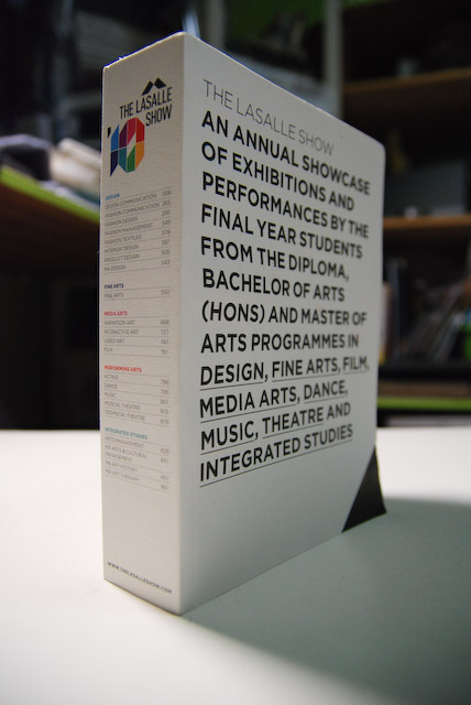
It’s the season for graduate shows. After feeling a little disappointed with Nanyang Academy Fine Arts show, I was wowed by what I saw at THE LASALLE SHOW 2010. I’ll come back with some of the more interesting works from its Design Communication graduates, but check it out if you can. The show ends this Thursday, June 10. Meanwhile, just look at the fine show catalog done by MAKE.

Tanjong Pagar Railway Signage


tanjong pagar railway

One of the things that makes Tanjong Pagar railway station distinctly Malaysian for me is its signage. Like the Malaysian flag, the signs are in blue and yellow.

tanjong pagar railway 2

tanjong pagar railway 4

tanjong pagar railway 1


The typeface used in the signs also evokes memories of another era. The guys at Typophile have correctly nailed the typeface as ITC Serif Gothic, which was designed in 1972 by Herb Lubalin and Tony DeSpigna. This was forty year after the station was completed, so the signs are actually quite a recent installation.

WIKIMEDIA COMMONS \ Jason Devadason

This sign was removed in 2004.

Singapore in a Visual

A few months ago I explored the idea of Singapore being represented by its own typeface. Here’s a project, CitID, that is attempting to visually represent every city in the world! So far it has managed to get each continent covered and it is working towards having every country, capitals and cities represented. It is also now open to public submissions and two have come from Singapore:


singapore_new2

Interestingly, even a town in Singapore have been represented…


kat_logo

It’ll be interesting to see how other parts of Singapore will be represented…