Been busy of late with several projects on hand, some to keep me going financially, some to keep myself challenged, and others just because I’m excited about them. Here’s one that will be on-going for a long time to come:

Been busy of late with several projects on hand, some to keep me going financially, some to keep myself challenged, and others just because I’m excited about them. Here’s one that will be on-going for a long time to come:
While trawling through the Picture Archives Singapore Database for some research on past elections, I came across these two comics that were part of the People’s Action Party (PAP) 1963 elections campaign.

This comic resembles a polling card and persuades voters to choose the PAP (marked with a ‘X’) by equating its logo with a modern city of schools, HDB flats, infrastructure and religious sites. As this elections was held just five days after Singapore merged with Malaysia, the city’s background appropriately depicts the Malaysian flag.
In contrast to the PAP, the comic also illustrates its opponents the Barisan Sosialis and the Singapore Alliance as communists and corrupt respectively. The Barisan’s logo becomes a two-headed snake and is accompanied with a graphic that shows them presenting Singapore to the communists. As for the Singapore Alliance, its boat logo has weak sails, while its candidates are depicted as rich people who give away money to hooligans.

This second comic promotes the progress Singapore has made under PAP’s rule since it came into power in 1959. Again, the image of the modern city is used, this time in the background, while the foreground shows how corruption, lies and the unpatriotic have been crushed or surrendered.
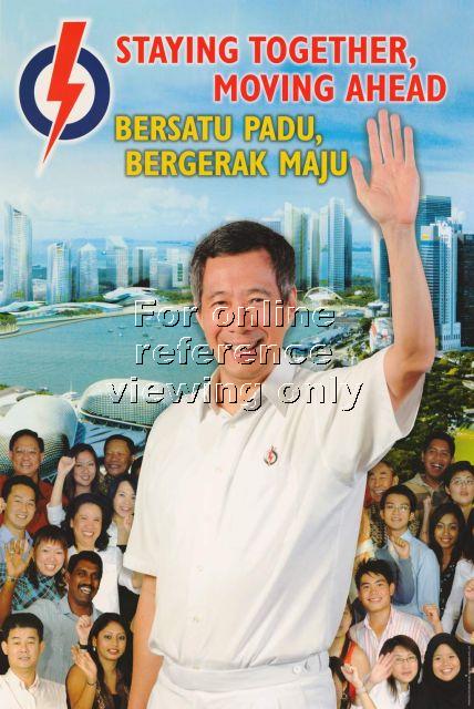
Comparing these comics with how election posters evolved over the years, there is a shift towards ‘looking objective’ and ‘professional’. Nowadays, campaign materials make no reference to the opponents, and photographs are used instead, even if it’s a composed image like the this 2006 poster. Of course, another reason is because these technology (e.g. Photoshop, photography) are now more readily available than in the ’60s.
If there’s one thing that hasn’t changed in these posters is the use of the modern city as a backdrop in a PAP election visual — a reflection of urbanism as a integral tool of this political party.
To many people today, something that is “designed” is more expensive and above what the common man can afford. Think about how we refer to “designer jeans” as opposed to just “jeans” — there is something extra on top of the necessary. Such a notion of design has also been expressed by then Prime Minister Lee Kuan Yew during first-ever International Design Forum held here in 1988.
“Good design is more than just pleasing to the eye. A functional, elegant product can be cheaper to produce and sell for a better price, because it is of greater value to users.”
A question here is, what exactly is good design’s “greater value to users”? One value here seems to be “symbolic status”. I was reminded of this during a conversation with a stranger who complained that there is a lot of bad design in Singapore “even though she lives in the good part of town”. (I vaguely remember it as the Orchard/Tanglin area or something to that effect). In other words, this lady was suggesting that “good” design is to be expected for those who can afford it, while “bad” design is more forgivable for those who can’t.
This equation of good design with luxury is also how many products differentiate themselves not only from one another, but also justifies why they cost so much more than items of similar function but are not “designed”. But is good design exclusive to luxury and should it always be of higher monetary value? While it raise the profession’s economic value, it also makes design exclusive and detached from public life. Perhaps one of the biggest challenge in growing a design industry anywhere is how designers don’t end up just serving those who are willing to pay for it. If not, design will just be a communicator of status and symbol — just pleasing to the eye.