This was my first year attending graduate showcases of graphic design students. My first visit was to NAFA’s Be A Good Creative, which was disappointing. It didn’t help that my designer friend had warned me beforehand that local graduation shows were a waste of time. So, I didn’t expect too much when I visited THE LASALLE SHOW ’10 for the graduates of LASALLE College of the Arts. And, I’m glad I did. To be fair, LASALLE seems to have a much wider pool of graphic design students judging by the number of exhibits. Their Design Communication certificates, which you can specialise in Advertising Communication, Graphic Communication and Image & Communication, begin from diploma level and go up to a Master of Arts in Design.
The show left me with the impression that LASALLE graphic design graduates were educated with an approach to graphic design that was more conceptual than mere ‘styling’. Their Diploma level students worked on real-world problems, such as designing way-finding systems for People’s Park Complex and Toa Payoh bus interchange, and advertising concepts for National Museum Singapore and Yellow Pages. Their graduates’ work brought that to another level by tackling the issues of graphic design’s application in the real world.
 A project that literally stood out (left) was Richard Phua’s White Ink, a series of visuals that shows the negative spaces that one usually doesn’t “see”, but is all around us. One thing he did was to print a book of newspaper pages on transparencies. This eliminated the white space and made you realise how difficult reading is without white space! Unfortunately, Richard’s website hardly says anything (actually, nothing).

Stella Clarissa’s Dyslexia: I See Words Differently (right) introduces graphic design to investigate a community’s specific problem — reading. Even as graphic designers constantly argue about legibility issues, we often forget that the argument is based on the vision of a normal person. Her work inserts this community’s concern to nudge graphic design towards a more inclusive form of communication.
 The Papercy Project (left), by Benjamin Koh, brings alive the medium of paper in a series of posters that are just beautiful and interactive. As part of this project, he created an astronomy calendar and posters that celebrate a origami typeface and the year of biodiversity. In an era where it’s so easy to do design digitally, it’s great to still see graphic designers showing the beauty of what a pair of hands can do.
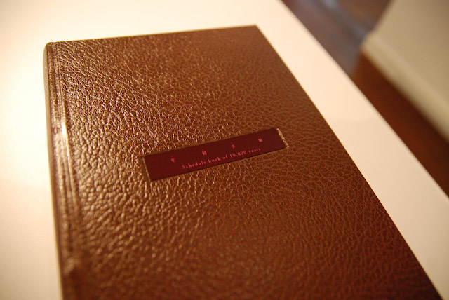
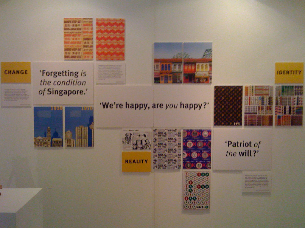 While the graduates works showed the possibilities of graphic design, LASALLE’s Masters students used it as an intellectual tool to understand our culture. Aditi Bhari’s Impressions of a City: Singapore created a visually exciting book of what shapes this country. He’s managed to appropriate images of our everyday visual culture and matched them with observations from some of Singapore’s best intellectual minds. I’ll love to get hold of the book!
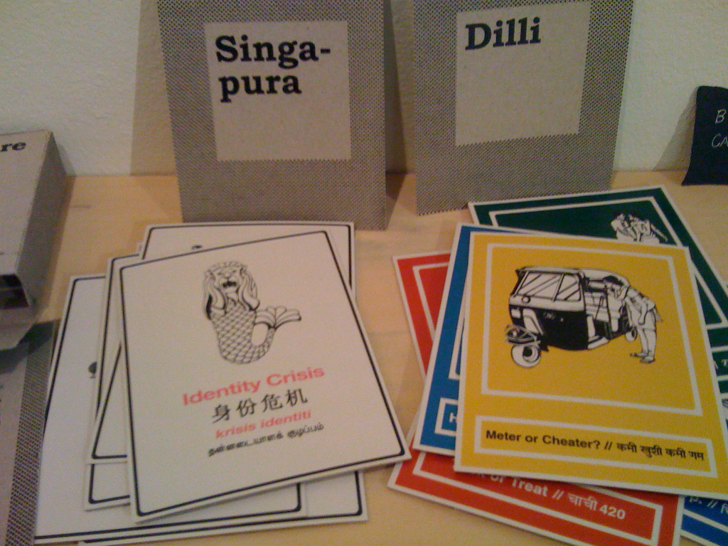 Finally, Sanchita Jain’s Decoding Culture combines graphic design with intervention in public spaces as a kind of experiment to pin down India’s culture. She created a series of public signs that are beautiful, hilarious and sometimes puzzling (as viewed from a different culture) and put them up in India to see how people react. This was all cut into a short film. She actually created similar signs for Singapore, but unfortunately she did not have time to conduct a similar experiment here. Although, I wonder if she might get into trouble if she carried out such a Situationist act here.
And that’s my take on THE LASALLE SHOW ’10. In a way, it’s restored my belief that students’ work can be exciting and great. Plus, it was only a year ago when I was a student, so I can totally understand how comments, both good and bad, can shape the journey ahead!