This is a speech I gave at the launch party of POSKOD.SG, an online magazine about modern Singapore. Thanks to the team for hosting my writing in the last few months and giving me this opportunity to write a speech that summarises what I’ve learnt about this city in the last two years of my life.
— — — —
P.ARTY Talks: Justin Zhuang on The Possibilities of Visual Culture in Singapore from POSKOD.SG on Vimeo.
— — — —
I’m a writer, and writing is how I share my curiosity about a city’s visual culture.
Generally speaking, visual culture refers to a study of the things you can see around us, ranging from the patten on your clothes, to a street sign and the form of an entire building.
What interests me about visual culture is:
- it’s beautiful to look
- it’s an everyday encounter, you can’t escape it.
- but most importantly, I’m interested in what does it says about us as a society
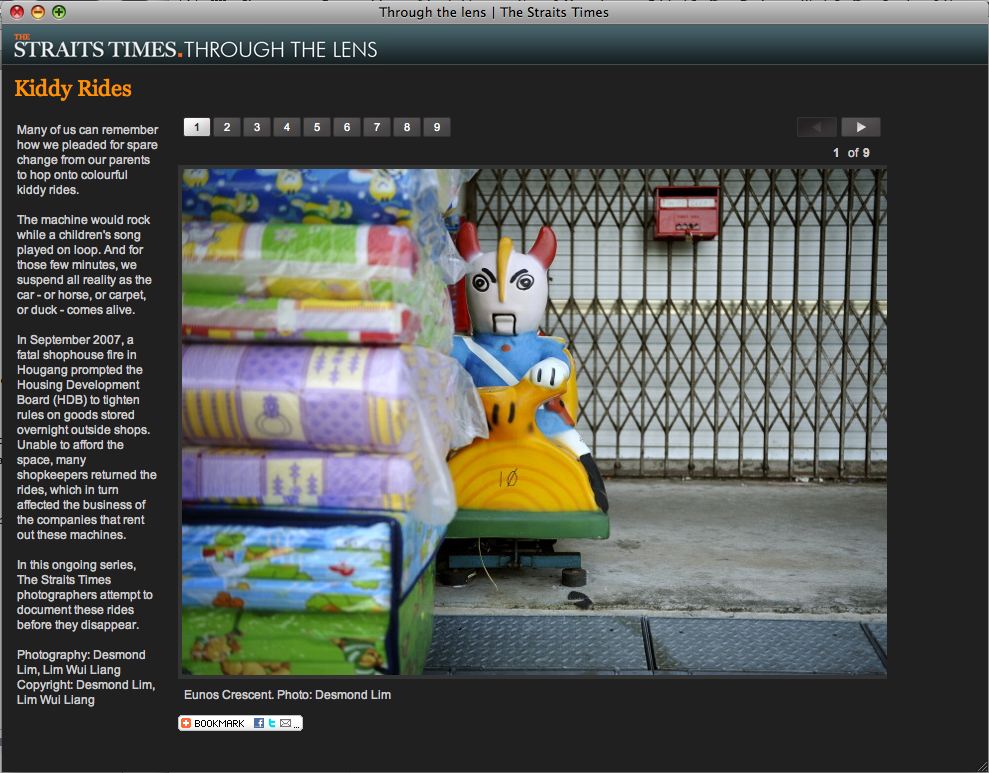
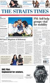
So some of the things that I’ve written about include why the Straits Times looks so dull, the evolution of our public transport signage system and how you could tell the recent General Election was a watershed one just by looking at the posters, pamphlets and souvenirs created.
What I’m going to talk about…
About a month ago, POSKOD.SG invited me to speak at this launch party. It just so happened that I was to be visiting Nepal for the first time. I would like to have said that I was inspired by a climb up to the mountains, but sadly or not, I spent most of my time in its capital city Kathmandu. The almost two weeks in somewhere foreign, and away from Singapore, helped me re-examine how visual culture shapes my experience in my home city.
So I’ll like to tell you about new visual possibilities in Singapore inspired by my experience in Nepal. Before I go on, I like to say that this vision I’m outlining cannot completely escape a certain romanticisation. But, I’m not interested in creating a Nepal in Singapore, but rather bits of the wonderful experience I had in a city.
And, in the spirit of POSKOD.SG, I’ve broken it down to three main observations: people, places and phenomenoa.
People
I met a photographer at Nepal who told me the newly-elected government there planned to divide the country into regions so the different ethnic groups could govern on their own. But she didn’t agree that Nepals could be so neatly categorised, so she started a photography project to counter this idea that Nepalis could be cleanly divided into separate ethnicities..
This got me thinking: who was a Nepali? And just by looking around the city, it was really hard to tell. This is unlike Singapore where I just have to look at the National Day banners along the street and I’m presented with who is a Singaporean: the formulaic four people of different races: Chinese, Malay, Indian, Others (Usually Eurasian-looking).
This is a visual representation of the CMIO-model, a reflection that Singapore society is multicultural and all races are equal. But this model also pigeonholes each one of us, and cuts our deeper ties as the descendants of a Hainanese, Javanese or Punjabi. It’s not just the past that we are alienated from, but the CMIO model prevents the possibilities of an evolving society. With the sudden influx of foreigners in the last few years, we suddenly have to distinguish between a Singaporean Indian and an India Indian, and we’ve even introduced hyphenated races because an increasing number of mixed marriages.
So, a question I have is what will a National Day banner look like 50 years from now? How will we represent Singaporeans visually? I think if we’re a truly multicultural society then I’ll say we have to abandon any grand ideas that we can. And maybe that’s okay, because I feel that with the CMIO, it’s like a multiple-choice society instead of an open ended one.
Places
As a less developed city, Kathmandu lacks the grandeur and bright lights that Singapore has, and is full of what we might call traditional architecture. Buildings are just two or three-stories high, similar-looking, and so many of the streets look identical. It doesn’t help that most areas only have a general name and there are many, many small streets within without. In a sense, Kathmandu is clearly a place where the streets have no names. And unlike Singapore, there is a lack of urban planning and order. Residential and retail are all mixed up, homes and shops are side-by-side or one and the same. Once, I even ate dinner at a restaurant which was also the dining area of someone’s home.
But rather than say the city was poorly designed and ugly, I would say it wasn’t designed to be seen. While in Singapore we obsess with whether our architecture and designs are iconic, in a relatively “un-designed” Kathmandu, I started paying more attention to what was happening in and around the spaces. Instead of being in awe at how tall a building might go, I spied a family watching television on their second floor home. Instead of admiring beautiful furniture, I sat on aged chairs and enjoyed wonderful dinner and drinking milky chai.
Sure, Singapore looks visually stunning with its skyscrapers and designer architecture, but all this can only be admired from a distance between you and the city. What happens when you are living inside it? Is our city experience distracted by visual forms that keep us apart as people? With the financial power and abilities to pay for design and architecture, it’s almost as if we’ve built a city where we cocoon ourselves with our own images so that we don’t have to look at anything, or anyone else.
The Nepalis I met expressed their admiration for Singapore as a city, so I wonder if all Singaporeans moved into Kathmandu, will it help make it a Singapore city? Probably not. I suspect people love Singapore not so much because of who lives in it, but what it is: a dazzling metropolis, clean, and green — a perfect destination and model city to visit.
But do these visual attractions make Singapore a home? Do you feel at home living in this city? I find it hard to say with pride that Singapore is my home. We spend more time and money looking after our city rather than one another. The city has to be kept so clean and orderly that we would rather not use it, and we spend millions of dollars branding and building images of a vibrant and global city, instead of helping Singaporeans nurture one.
Phenomena
Finally, how do people navigate a seemingly chaotic Kathmandu? My friend described to me how he delivered invitations in the city. Remember, Kathmandu is where the streets have no name? Well, the houses often have no addresses too. To find out where someone lives, my friend needs to walk up to a perfect stranger to ask for directions. If they knew, they would point you to it, if not, they’ll find someone who would. At times, these conversations even become long tea sessions!
Sure, it’s less efficient and slower without a well-designed street system, fanciful street signage, and Google maps. But without all these designed visual culture, we end up relying more on one another. The lack of precision makes the city more interactive not only between people, but you and the city. You can’t fall back on visual aids, but you need to notice and remember details like what a store is next to, or have a personal memory inscribed to it. It’s like how you might tell people where Goodman Arts Centre is: near Old Airport Road, where the old Lasalle is.
So how can we actually create a more interactive Singapore? If you look around, the present and future city is clearly visible around us. The road signs tell you where a place is, and construction sites are plastered with what the new condominium will look like when completed. But what about Singapore’s past and heritage? We have an odd marker here and there that tells us the historical importance of a site, but it’s in each of us that a piece of personal memory is held, and collectively, it’s these memories that give life to a space.
But in order to unlock these memories, we need to be talking to one another, and it seems to me, that without the mediums of design and architecture as practiced here, people become more sensitive to the city. When solutions are not readily planned and designed for them, we talk to one another to figure things out, and its these conversations that are like archaeological digs, where the layers of a place unravel onto a single plane.
Visualising a city of possibilities
My trip to Nepal has led me to arrive at this conclusion: Everyone sees their own Nepal. Because of how chaotic and open it is, people find their own way to live in it. Their personal vision of what their city looks like, and how to map it is so much stronger.
Over here, we easily fall into the city that has been designed and planned with a certain order in mind. Want to cross the road? Look out for the traffic lights. While there is a level of comfort not having to constantly zig-zag traffic just to get across the road, it also lulls each of us into a certain robotic-ness. You don’t think as much as you should, you just follow the signs and paths drawn out in the city for you.
Maybe what Singapore needs is to aim for imperfection, loosen up and let things run a little wild. Not every piece of empty land needs a sign to remind us that it is owned by the state, not every street has to be named by committee, and not every house has to celebrate National Day by hanging out the state flag, how about letting us redesign it?
Again, I like to say that my observations are not about saying which is a better city, but I think even as we might be happy and comfortable living in modern Singapore, let’s not forget there are other possibilities that this city could take. After all, as Singapore Tourism Board likes to proclaim to the world, this is YourSingapore, go out there and make it your own.
Thank you.
 Masthead (1973)