Tag: Typography

What type of newspaper are you?

stnameplate

A day before ST’s latest redesign launch, the typeface for its masthead was changed from Popular (only shred of it left is in ‘THE’) to Big Caslon, said Peter Thomas Williams who was part of the redesign team. While Popular failed to live up to its name, because it was thought to be “western” and “old-looking”, Peter, who is also design editor of my paper, said that the biggest factor when he chooses typefaces in his eight years of working in Singapore Press Holdings (SPH), is actually cost.

While he declined to go into specifics, one can do the math based on price lists online. Purchasing one typeface like Big Caslon for use on up to 1000 computers would already cost more than S$5,000. Considering the ST redesign itself involved about four typefaces, multiply that to the cost of installation for more than a thousand computers in SPH and one begins to see how cost becomes a major factor in his typeface choices.

tabla_logo

It was on such an “extreme budget” that led Peter, who used to work in a design consultancy in Ireland and as a visual communications lecturer in South Africa, to draw the nameplate of SPH’s Indian diaspora newspaper, Tabla, instead of purchasing a typeface. This was based on three different typefaces: Popular and Calvert for Tabla and the exclamation mark from Bauer Bodoni, which he felt looked like the Indian architectural style.

Costs aside, another important factor is the amount of space a typeface takes up, especially for use as body copy. If it is designed for newspaper use, a typeface is usually efficient in its space management, having a shorter x- and y- height (think shorter x and y and applied to all 26 letters) and kerning (space between letters) is even. A typeface that takes up too much space would mean story lengths have to be shortened to keep the same amount of news on a page. “If you choose a typeface that is beautiful but it is knocking off four paragraphs, it is useless.” he said.

A final factor in choosing a newspaper typeface is how intricate it is as newspapers are printed on paper quality that is “like toilet paper”.  Thus, a font with intricate serfis would not come out looking good as the ink is likely to seep causing such details to be lost.

In the next part of this interview, The Paginator asks Peter how it was like redesigning ST twice, The Sunday Times and My Paper.

Directions Poster

recycledpaperdirectionprocess

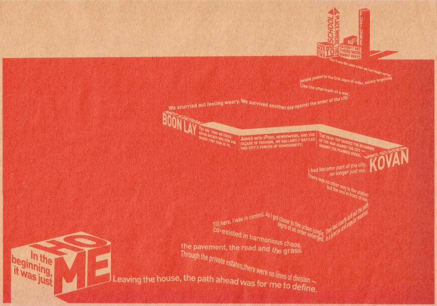
How do I get from home to school?

Using only typography, this work (above) explored a spatial mapping of my journey to school through the lens of power as I sought to express a battle for control between the planned urbanscape versus my personal imagination of the route.

The work was printed on an A2 sized Kraft paper.

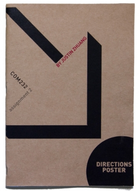
On the left is the process book that shows the production of this work from its conceptualisation to its eventual production.

Need to organise the diversity

Of late, I have not been able to gather my thoughts and thread something deeper out of them. Maybe I miss the long train trips to school, where I could let my mind run and focus, nowadays time is just too short for me to muse. Instead, I’m going to run a short list of thoughts, after all like the director of a short film said, she liked to make short films because if it’s bad, the pain is short, the disappointment after is short and well in general, life is short, isn’t it?

The problem with news
I was just thinking about a friend who graduated in engineering and loves photography and thought she sounds like a news story because that is unusual. But on second thought, that’s not unusual anymore, in the “new” world today, values of the past become unusual again. That’s on top of trying to outdo what was new. Maybe nothing new can be created… wait, I think Jameson or Lyotard talked about it before. Darn, nothing new here.

On the same note, there is one recurring story line that I am getting bored of. Basically, homosexual repressed in a hetrosexual society, rediscovers his homosexuality and lives happily ever after. I think it’s a starting point of such identities becoming included part of society and when enough of us get bored of the theme, it’ll be nothing new.

The 4th Singapore Short Film Festival
I caught the first set of films today. I was really impressed with For a Few Marbles More, a Dutch film about a group of children fighting two bullies for their right to the playground — short, sweet and funny. The Iranian film Cyanosis, about the life of a painter was a bit slow, but how the director used the paintings as part of the story-telling process was interesting.

Finally, the three local films stood out for different reasons. Londres-London had something interesting going on conceptually but it’s delivery was stunted and I only truly appreciated it when the director explained the movie. Kichiro was lots of blood and gore and I had my eyes close for quite a bit and the director did confess that he was simply exploiting the opportunity to feature violence and I have to say kudos to that. The most curious film for the night was My Keys. I was ready to pan it because it did seem quite ridiculous, a man finds out he is locked in because he can’t find his keys then prays to Guan Yin who appears with his keys but never gives it to him and flies off with it. Moreover, it’s cast were both models from some beauty competition which I highly suspected was to allow him to get sponsorship. It was only when the director explained that he wanted to convey the feeling of being cheated to express how he felt when a good friend he lent money to ran away with it. You had to give it to him.

Brochure Collection
What is with the k e r n i n g of the Singapore Short Film Festival brochure? C a n y o u i m a g i n e r e a d i n g t h i s… Postmodern layout can sometimes be so non-functional.

I finally got hold of the 21st Singapore International Film Festival’s brochure too, the cover was not very impressive too, compared to a few years back.

My favourite brochure this time was The Substation’s “What’s On Jan – Mar”, the events are sectionalised into white boxes that allow the reader to interact and make notes on it. It would have worked even better if the boxes contained the dates and times for the events too.

Cool stuff to share
Teabag font for free! <http://www.josbuivenga.demon.nl/fertigo.html>
McSweeney’s
Hilarious intellectual stuff and really beautiful publications
Into the Wild (2007)
Inspiring movie, especially when you’re weary of life, and Sean Penn directs!
Woodneuk House
Read the historical background then see my photos of this abandoned house
StatAttak
Cool T-shirts and information graphics
partofit 
Another nice tote bag and t-shirt site, and your purchase helps a cause