Tag: Elections Ephemera

Urbanism and PAP’s election campaign

While trawling through the Picture Archives Singapore Database for some research on past elections, I came across these two comics that were part of the People’s Action Party (PAP) 1963 elections campaign.

PAP-Comic

This comic resembles a polling card and persuades voters to choose the PAP (marked with a ‘X’) by equating its logo with a modern city of schools, HDB flats, infrastructure and religious sites. As this elections was held just five days after Singapore merged with Malaysia, the city’s background appropriately depicts the Malaysian flag.

In contrast to the PAP, the comic also illustrates its opponents the Barisan Sosialis and the Singapore Alliance as communists and corrupt respectively. The Barisan’s logo becomes a two-headed snake and is accompanied with a graphic that shows them presenting Singapore to the communists. As for the Singapore Alliance, its boat logo has weak sails, while its candidates are depicted as rich people who give away money to hooligans.

PAP-Comic-2

This second comic promotes the progress Singapore has made under PAP’s rule since it came into power in 1959. Again, the image of the modern city is used, this time in the background, while the foreground shows how corruption, lies and the unpatriotic have been crushed or surrendered.


2006 PAP 0

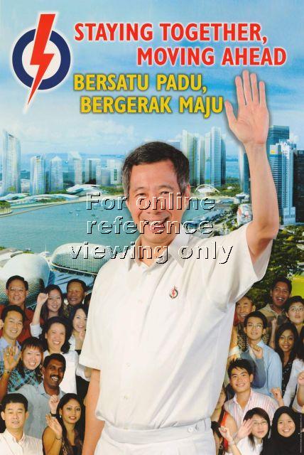
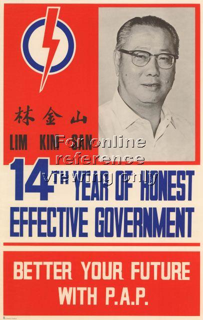
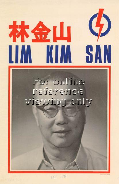
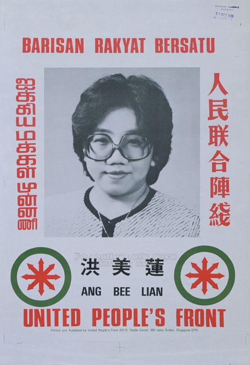
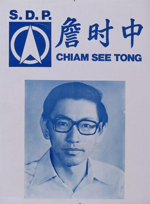
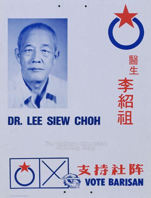
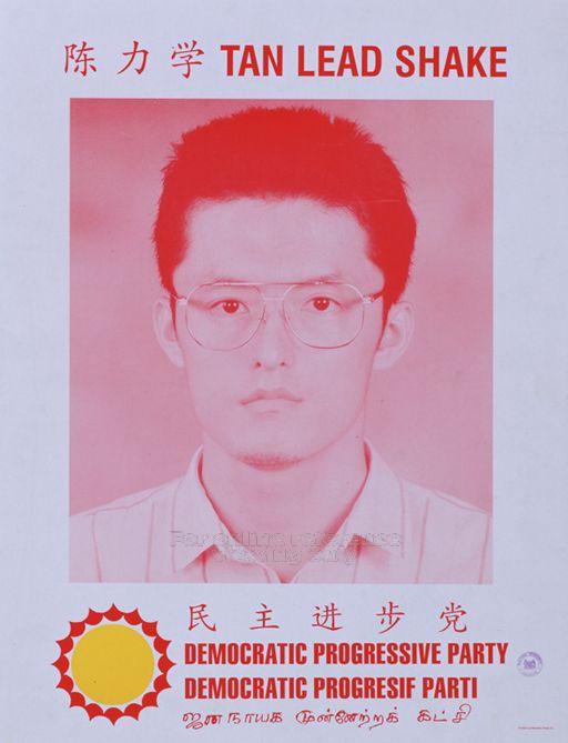
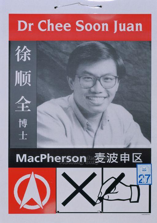
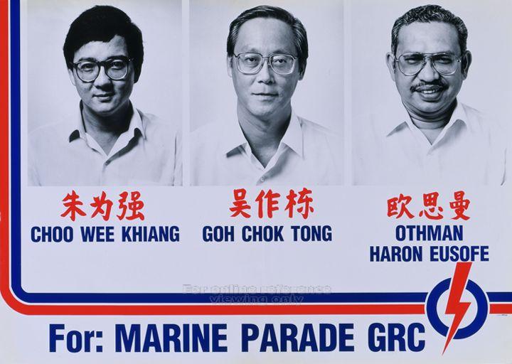
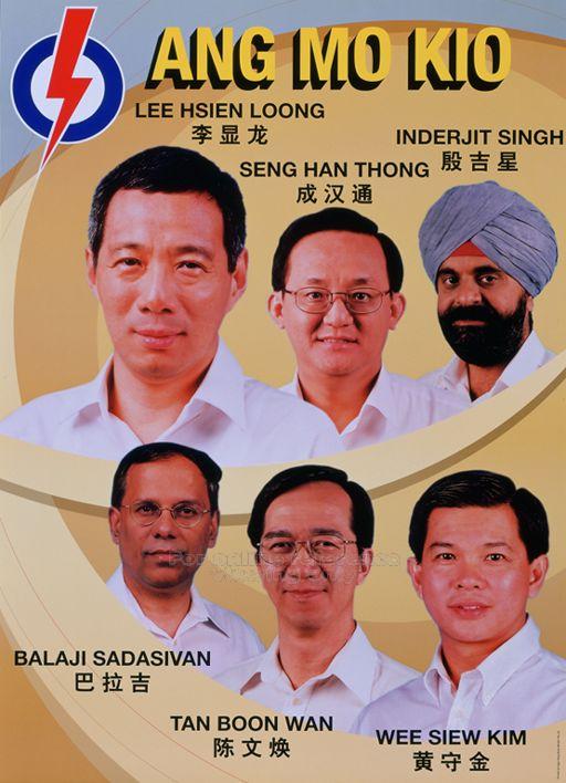
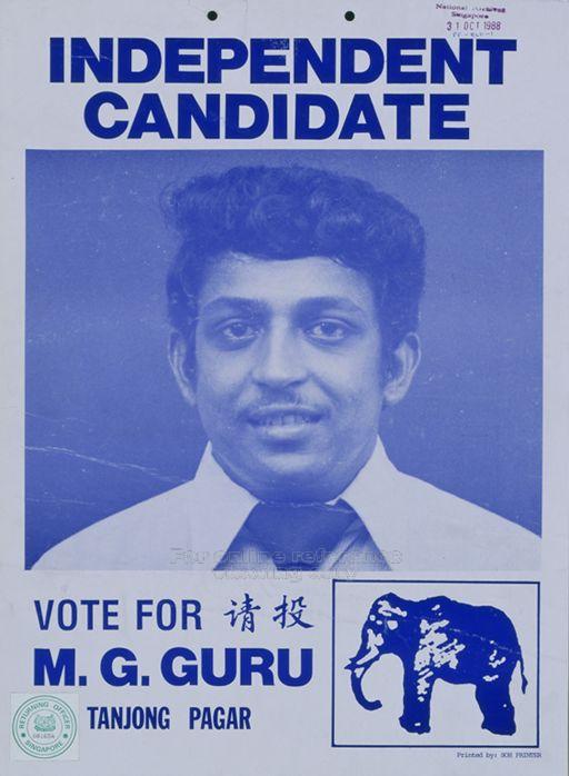
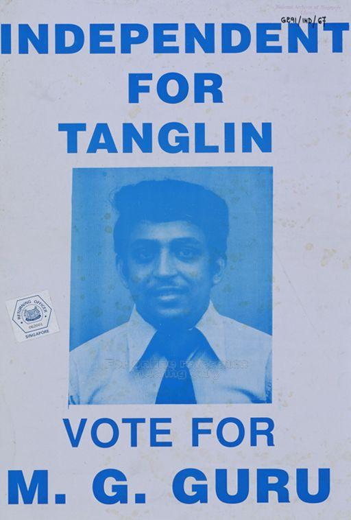
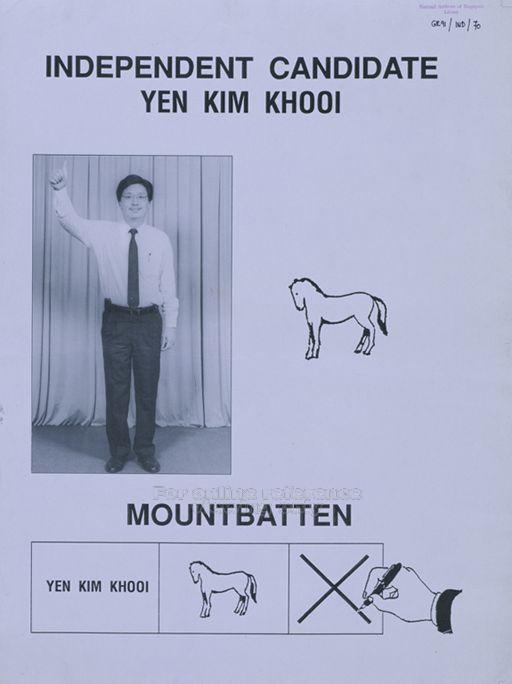
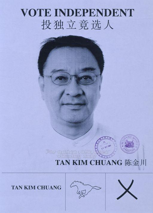
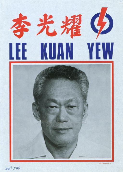
Comparing these comics with how election posters evolved over the years, there is a shift towards ‘looking objective’ and ‘professional’. Nowadays, campaign materials make no reference to the opponents, and photographs are used instead, even if it’s a composed image like the this 2006 poster. Of course, another reason is because these technology (e.g. Photoshop, photography) are now more readily available than in the ’60s.

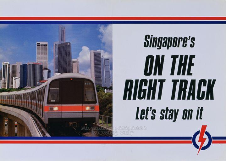
If there’s one thing that hasn’t changed in these posters is the use of the modern city as a backdrop in a PAP election visual —  a reflection of urbanism as a integral tool of this political party.

VOTE FOR ME: Elections Posters in Singapore (2)

In the previous post, I talked about the manifesto posters that the various political parties put up during a General Elections. This time around, I’ll be looking at the posters that feature the candidates. Above are the various poster designs of the People’s Action Party (PAP) in 1972, 1976, 1988 and 1991 respectively. The lack of colour coincides with the period when colour printing wasn’t cheaply available yet. The choice of portraits was also conservative, or maybe even practical, since it is just as likely that these would have used for Identity Cards, or worse, funerals. It was only in the 1997 elections that the candidate photos came in colour, and by 2001, Photoshop also came into the picture.

1972 PAP Lim Kim San

1976 PAP Lim Kim San

1988 PAP LKY

1991 PAP Single

In contrast to these posters of the ruling PAP, the candidate posters of the opposition parties have generally been ‘less designed’, as evident in these posters of the Workers’ Party (WP) (1980), Barisan Sosialis (BS) (1984), Singapore Democratic Party (SDP) (1984), United People’s Front (1988), Democratic Progressive Party (1997) and National Solidarity Party (NSP) (1997). With the exception of NSP’s poster, the other opposition candidates don’t subscribe to the “less is more” attitude of the PAP posters. Instead, they try to squeeze the logo, slogan, party name (in all four languages!), candidate name, and in case you still don’t get it, icon or tagline reminding you to vote for him or her. One might attribute this desire to squeeze as much as they can to the lack of funding to print better posters, but one must also remember that by law, each candidate has a fixed budget for their elections campaign. For the last elections, one could only spend on average, $3 per voter.1980 WP Single

1984 SDP Chiam See Tong

1984 BS Lee Siew Choh

1988 UPF Single

1997 DPP Tan Lead Shake

1997 NSP Christopher Neo

There few exceptions of distinctly designed posters of opposition candidates have come from two controversial ones: SDP’s Chee Soon Juan (1997) and Singapore Democratic Alliance’s Steve Chia (2006 and 2001). For some reason, the latter’s posters reminds me of real estate advertisements. I think it’s the man in a suit with the choice of colours.

1997 SDP Chee Soon Juan

2001 SDA Steve Chia

2006 SDA Steve Chia

A new type of candidate posters had to be designed in 1988 when the Group Representation Constituency (GRC) came about. Suddenly, one candidate had to share the same space with two or more as seen in these posters of the PAP (1988), WP (1997), SDA (2006) and PAP (2001).

1988 PAP GRC


1997 WP GRC

2006 SDA GRC

2001 PAP GRC 1


Finally, just a quick look at a quirky category of posters that belong to the independent candidate, a breed that has not existed since the 2001 elections. Their posters reflects how inadequate they are without the resources and machinery of a party.

1984 IND Lee Mun Hung

1984 IND Stanley

1988 IND Harry

1988 IND MG Guru

1991 IND M G Guru

1991 IND Yen 1

2001 IND Tan Kim Chuang

VOTE FOR ME: Elections Posters in Singapore (1)

Here’s a sure sign that the general elections has begun: when elections posters start popping up all over your neighbourhood! Besides rallies and media reports, posters are the most visible form of an election campaign. These traditionally come in three forms, depicting the party’s logo, its manifesto, and the candidate contesting. This is a set from the People’s Action Party (PAP) General Elections campaign in 1980.

1980 PAP1980 PAP Compare 1980 PAP LKY

In the first of this two-part post, I’ll be looking at the manifesto posters of the parties since 1972. It starts from Singapore’s second post-independence election as it is the earliest poster I could find in the National Archive’s POSTERS Database, where I have got all the images from. In this 1972 poster of candidate Lim Kim San, the three elements of party logo, manifesto, and candidate are all rolled into one, but by the next election in 1976, posters came in three separate forms as depicted above.

1976 PAP Lim Kim San

As with most visual culture for the public here, a unique element of election posters here is the use of Singapore’s four official languages. These are 1980 posters from PAP’s “The Right Choice” campaign.

Over the years, the PAP has used various visual forms to express its platform of material progress in its manifesto posters. The 1980 poster depicts its oft-used rhetoric of past versus progress, and so do the posters used in the next two elections of 1984 and 1988.

1980 PAP 1 1980 PAP 2 1980 PAP 3

In 1988, the PAP also took advantage of the official launch of Singapore’s MRT system that year to come up a smart campaign poster.

1988 PAP A1

The PAP’s election posters though the 1990s became more dull under the leadership of Goh Chok Tong.

1991 PAP 0


In contrast, posters of opposition party The Workers Party’s seemed to capture the voice of its leader J B Jeyaretnam, the first opposition candidate to break the PAP monopoly in the 1981 by-elections. WP’s slogan of “Power To The People”  was easily translated into a powerful visual rhetoric as first seen in this 1991 poster. However, the photo used seems to be a stock photo of people in a Western country.

1991 WP 1

For the next elections in 1997, WP improved on this poster. The Chinese version with its forceful calligraphy matches memories of WP candidate Tang Liang Hong’s controversial speeches that got him labelled by the PAP candidates as a ‘Chinese Chauvinist’. After the elections, he got sued for defamation and has since fled Singapore.

1997 WP A

1997 WP D

Despite these highly memorable posters, the WP was unable to convince the people to power it into power, garnering only one Parliamentary seat in both elections. Perhaps, this was why it toned down its visual rhetoric in the subsequent elections. Moreover, the rise of Low Thia Khiang to become leader of the WP and the ousting of the fiery J B Jeyaretnam also ushered in a quieter form of politics as seen in these 2001 and 2006 posters.

2001 WP A

2006 WP

The PAP has also adopted a more sophisticated visual language with its manifesto posters in the new millennium. One reason for this change seems to be the availability of technology such as Photoshop and cheap colour printing. As seen in the 2001 poster of Goh Chok Tong and the 2006 poster of current prime minister Lee Hsein Loong, these are clearly creations of the times, and they’ve been crafted to depict the PAP’s belief that the way to govern Singapore is through a strong leadership backed by the support of the people.

2001 PAP B

2006 PAP 0


In the next post, I’ll be looking at the posters depicting the party’s logo and their candidates, including some whacky ones from independent candidates!